News   GLOBAL  |  Apr 02, 2020
 8.6K     0 
News   GLOBAL  |  Apr 01, 2020
 39K     0 
News   GLOBAL  |  Apr 01, 2020
 4.8K     0 

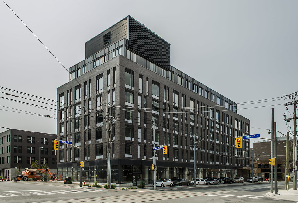
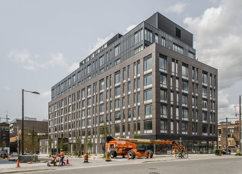
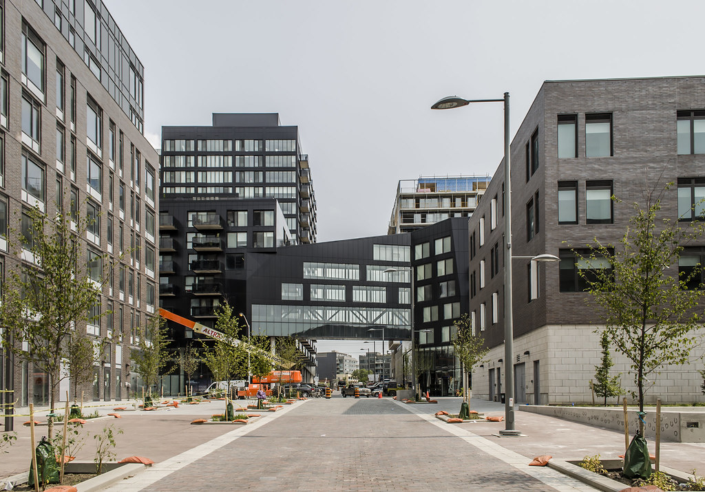
They'll get it together for the waterfront.

This is not only untrue, but we have proof of it. Look at their models and designs for their Bayside project with Hines. Same window-wall and spandrel treatment as any other recent Tridel project.
 
This is not only untrue, but we have proof of it. Look at their models and designs for their Bayside project with Hines. Same window-wall and spandrel treatment as any other recent Tridel project.

I saw some spandrel a long time ago on the Aqualina model, but not that much. Do you have a link?
 
27 July 2014:
53tcQjN.jpg


rx4vCmA.jpg


MVhRePL.jpg


tpp5QtI.jpg


lwn8nm3.jpg


8t9ROQZ.jpg


BTW, it was I who called this area the Grey District first.:D
 
It would have been nice if they used more bright and vibrant colour in this area. Although the overall design is fine the colours are dull and uninspiring. It almost looks like something I would see in some Russian city.
 
There must be some unwritten rule that all the buildings in the West Don Lands must be grey, black or white. All other colour options are strictly forbidden. I wouldn't be surprised if the maker of Prozac had something to do with it. How can being surrounded by a sea of grey spandrel in all directions, not be depressing?
 
Last edited:
There must be some unwritten rule that all the buildings in the West Don Lands must be grey, black or white. All other colour options are strictly forbidden. I wouldn't be surprised if the maker of Prozac had something to do with it. How can being surrounded by a sea of grey spandrel in all directions, not be depressing?

Prozac has long been genericized. It would have to be something newer like Pristiq for example. :p
 
Imagine this area with classic red brick, not even every building, just the odd one, to break up the depressing monotone vibe going on. It would look fantastic. It really is a shame because the area looks well done, the buildings, aside from colour, are nice also.
 
Maybe it's just the photographs but I'm seeing a tinge of brown in those bricks, which makes the scene look a little warmer. I'll have to check these out again.
 
Amen to that!

I really wish they would add some colour and classic Toronto red brick would have been wonderful.

That said, these building look of great quality, interesting design, pedestrian friendly, and we can all thank the maker they aren't more glass boxes. One thing I will say, these buildings and the entire neighbourhood will age VERY nicely. These are quality building with quality construction and it shows. These building and this community will look even better a hundred years from now where as places like CityPlace and Southcore lack any kind of warmth or place making and will look dated in less than 10 years.

It's far more attractive than City Place imo. I'll take grey brick over green/blue glass every day of the week.
 

Back
Top