News   GLOBAL  |  Apr 02, 2020
 9.7K     0 
News   GLOBAL  |  Apr 01, 2020
 41K     0 
News   GLOBAL  |  Apr 01, 2020
 5.5K     0 

Just to be clear that is now TWO TD signs which will be lighting up our night skies in downtown. Because the big, 4 sided 263m high-up sign at Brookfield Place was just not enough of a statement...

Don't forget the TD sign on the top of the old Canada Trust building at 110 Yonge St. (south-west corner at Adelaide). We just can't have enough TD signs around.
 
Everyone needs to get over their righteousness. This is not considered an Van Der Rohe building, but an inspired designed, built in 1992. Considering it has the heritage base it is the only one of the TD Tower centre they could add any signage to.
Consider TD is now sponsoring the shared bikes you will be seeing a lot more of the signs every where. Get used to Toronto looking like NYC.

Good point. There was a price to be paid for putting the bike share program on life support and this seems to be it. There won't be a free lunch today.

But that's a red herring distracting from the real issue. No reputable, self-respecting, self-aware organization would have demolished the Bank of Toronto to go on to tag and deface the world class piece that replaced it. TD is a real life troll.
 
Today from the south:

IVwSnob.jpg


lrlgsyS.jpg


xRWddvY.jpg
 
There's a logo on the (former?) Canadian Pacific tower? I thought Mies stipulated that they weren't allowed to put logos on the buildings he designed? (E&Y being a later, non-Mies addition.)

Also, *sigh*. Any bets on how long it will take for RBP to gain a logo?
 
What is it with so many financial firms and their ghastly, inelegant corporate branding. These cheap, shitty backlit signs are a scourge on the skyline and urban environment in general. It's not just the banks either, but I'd say that most chains have cheap, ugly branding in general. Small independent businesses with a lot less cash flow are often quite creative in their use of materials and design, so there's no excuse for all this plasticky out-of-place crap from huge companies and their much deeper pockets.

Exceptions to this are Scotia's simple, elegant stylized 'S' on Scotia Plaza, and to a lesser extent BMO's well-integrated lettering (the original 'M' was light years ahead though). CIBC's logo on CC West is an example of what TD could've done here: eschewed the clunky background box and used simple embossed lettering.
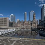

What's worse is when they replace a good designed logo with a new one that is so obviously inferior. The big blue neon "M" on top of FCP actually looked good....I considered it a part of the building. Scotia's big "S" is the same thing...a good logo and designed to be positioned there as part of the building's original design.

Look at the second pic with the Royal York and you can see how even something that is so obviously an add-on, and even obscures the architecture can still look good when done right. The Royal York sign actually makes the building look glamourous.
 
Look at the second pic with the Royal York and you can see how even something that is so obviously an add-on, and even obscures the architecture can still look good when done right. The Royal York sign actually makes the building look glamourous.

Yeah, I have a soft spot for that sign. It's so old-fashioned, in a good way. I wish there were more remnants like this, there were some great brand designs and logos out there (Air Canada, Canadian Club, Canada Dry...). Now it's all BMO-ified. When will that be over??
 
Of course, there was a huge uproar here when they changed the Royal York sign a few years ago...

Yup. Urban Toronto played a role in the outcome. Originally, the proposed sign was just going to say "Fairmont". Through organizing on UT and elsewhere, they were convinced to include "Royal York" on the sign.

I think it worked. Everyone still calls it the Royal York and no one calls it the Fairmont. I don't think that would be true if they had gone ahead with their original plans.
 
Last edited:

Back
Top