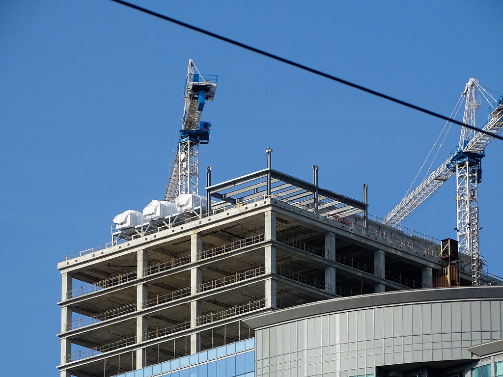
Southcore has an aesthetic and stays pretty true to the surround look. I'm more excited to see the lobby complete as well as the see the overhand finished. This stretch of York needs more prettying-up. Retail spaces in ICE are still yet to be determined. The large retail space in 16 will be an HSBC bank branch.

The landscaping in this area is decent, but more interaction between the buildings and the sidewalks is desparately needed on the ICE-condos side. As well, "The Canopy" art display at 15 York has been down for years now, but provided a much-needed source of animation for this stretch. I'm not really sure what Cadillac Fairview and the City have done to get this back up and running, but it doesn't seem like anyone is in a rush.
 
The landscaping in this area is decent, but more interaction between the buildings and the sidewalks is desparately needed on the ICE-condos side. As well, "The Canopy" art display at 15 York has been down for years now, but provided a much-needed source of animation for this stretch. I'm not really sure what Cadillac Fairview and the City have done to get this back up and running, but it doesn't seem like anyone is in a rush.
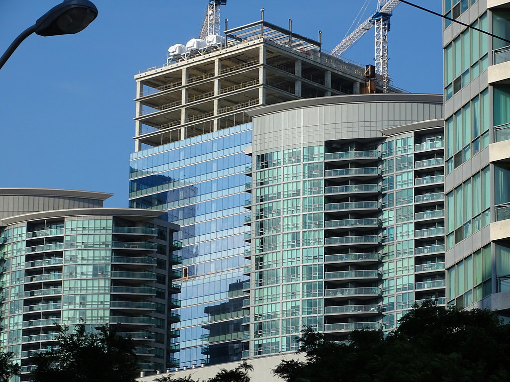
Agreed! the MLS canopy needs to be fixed. I do like the hige amount of trees on that side as well as the restaurant lounge at e11even. Ice needs some more greenery and even planters - I feel it's lifeless on the ICE side. I also hope the illuminated strip lighting under the canopy surround ice and 16 will be used once 16 is complete! Also, I can't wait for the ice side of the sidewalk is back so I can not have to walk around to lakeshore to get into my building!
 
Yesterday:

IMG_4251.jpeg
 
While not being a show-stopper, it's some quality filler for an area that likely wasn't going to get anything taller.
 
This is an 870k building - the economics are there to do something better than this, even if it wasn't going to be taller.
I meant more due to it sharing a podium/overall site plan with two taller residential twins. I think it was unlikely to have the entirety of the south facing views covered and with that they needed to maximize on the floorplates so the massing makes sense in that regards.
 
The massing has been set since this was first proposed 11 years ago. I don't mind bulky, big-floorplate-d towers, but then what gets special attention is the curtain wall module and general detailing.

CF couldn't even be bothered to try that here. It's reflective of a lazy corporate strategy in a booming market. 'Why bother with more, it'll lease anyways...'
 
I would have much preferred a red glass wall, or even black, just to add some character to that interesection. Imagine some brick?!
 

Back
Top