innsertnamehere
Superstar
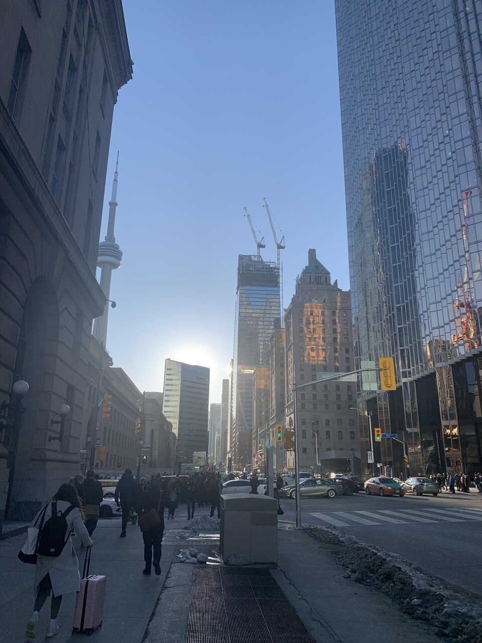
Golden Hour

This building looked so much better in the renders. A stark black facade would have been so much more harmonious with the existing TD Centre
There's plenty of buildings that have gone up in Toronto which could've been much better, this is not one of them.This building looked so much better in the renders. A stark black facade would have been so much more harmonious with the existing TD Centre
A rare picture capturing 2 towers with curved tops - L Tower (curved top sloping north) and this (sloping east)
You're definitely an outlier when it comes to not liking the way this one is coming together, fair enough, but also, this is several buildings away from the TD Centre. Why would you want it to be harmonious with them in particular? Just because they're going to slap their logo up top? Their logo is also atop Brookfield Place, and it looks nothing like the TD Centre.This building looked so much better in the renders. A stark black facade would have been so much more harmonious with the existing TD Centre
You're definitely an outlier when it comes to not liking the way this one is coming together, fair enough,
While I certainly concur with your views on the first bit...I'm not sure they could do that glass as easily back then with the last bit. It seems to me that's on a whole new level, IMO.Add me to the outlier list. Interesting but doesn't blow me away. Might be that I'm tired of all the glass clad buildings being built these days. Certainly not up to the standards of the 70's bank towers in my mind.
Add me to the outlier list. Interesting but doesn't blow me away. Might be that I'm tired of all the glass clad buildings being built these days. Certainly not up to the standards of the 70's bank towers in my mind.