You are using an out of date browser. It may not display this or other websites correctly.
You should upgrade or use an alternative browser.
You should upgrade or use an alternative browser.
- Thread starter Filip
- Start date
C-mac
Senior Member
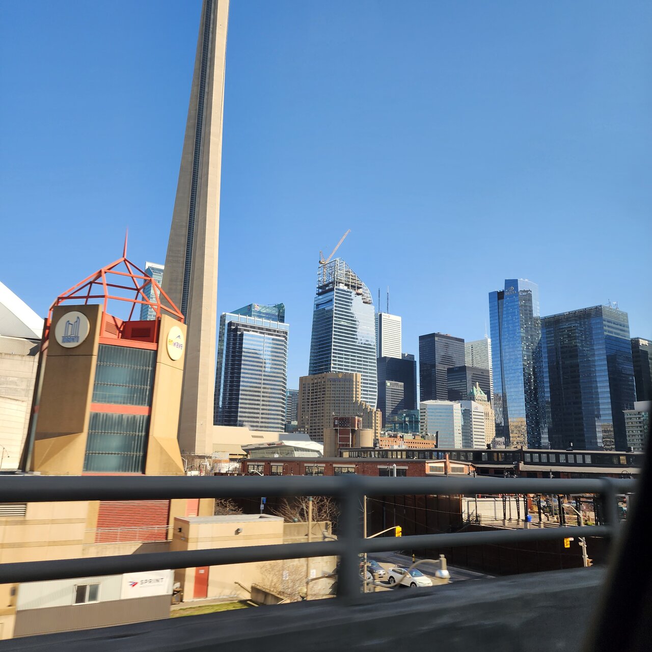
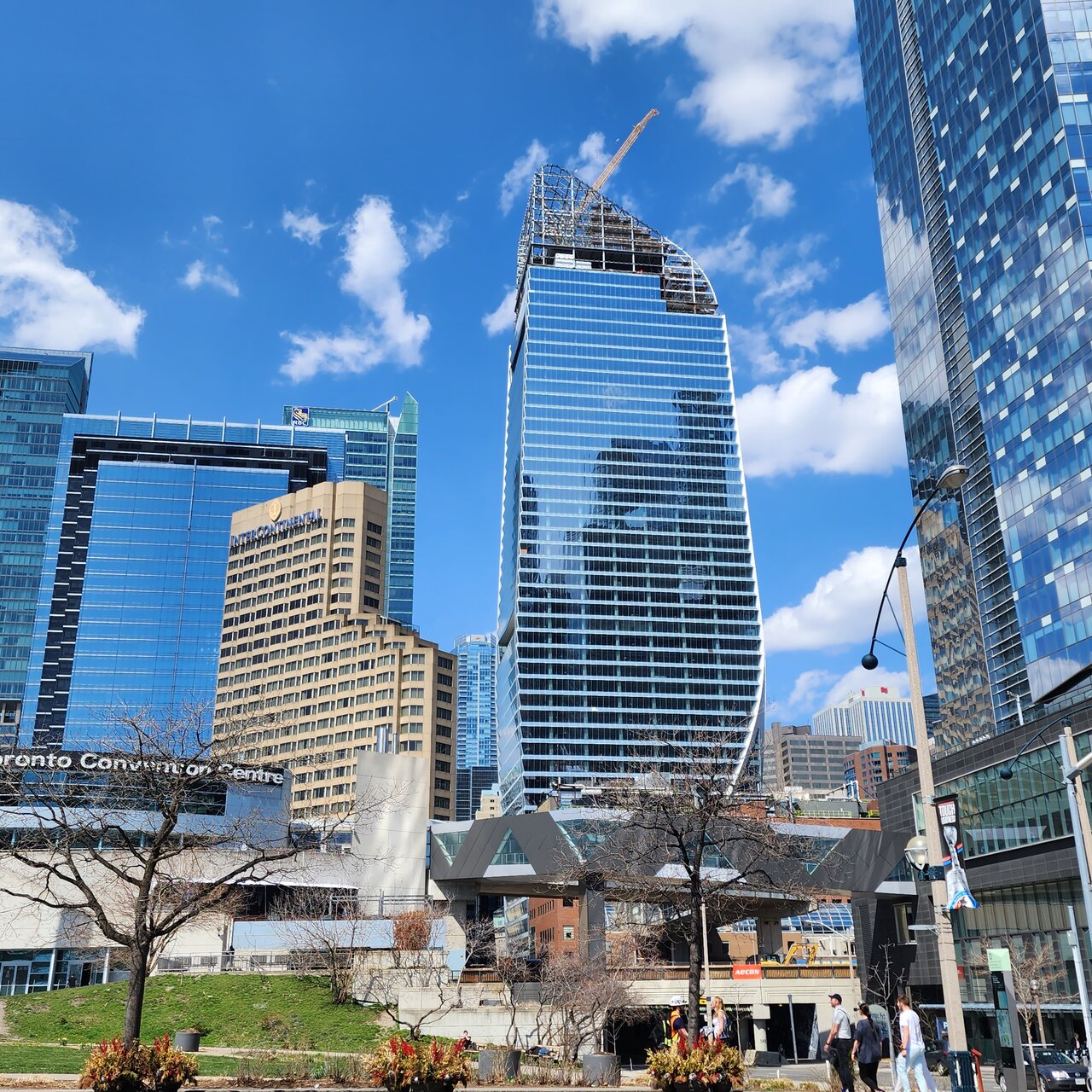
Off topic, but it's this particular area of condos that drives me the most crazy. Those ones on the left. They're soooo ugly. It kills me.
yrt+viva=1system
Senior Member
I agree as well.Off topic, but it's this particular area of condos that drives me the most crazy. Those ones on the left. They're soooo ugly. It kills me.
tstormers
Senior Member
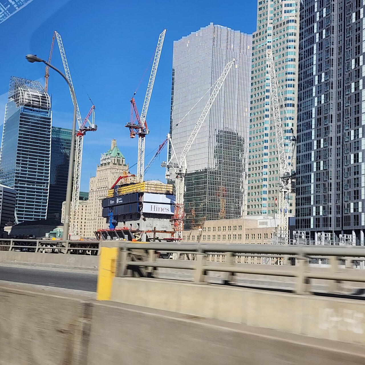
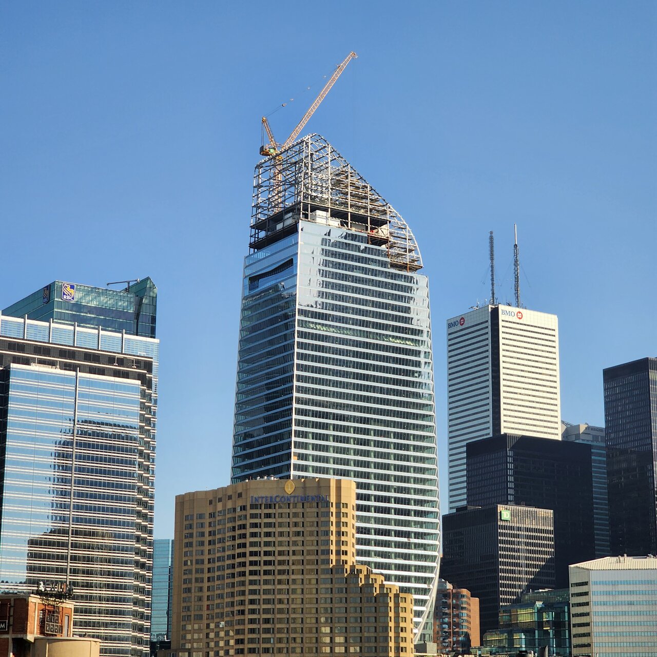
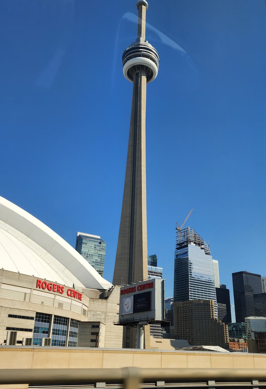
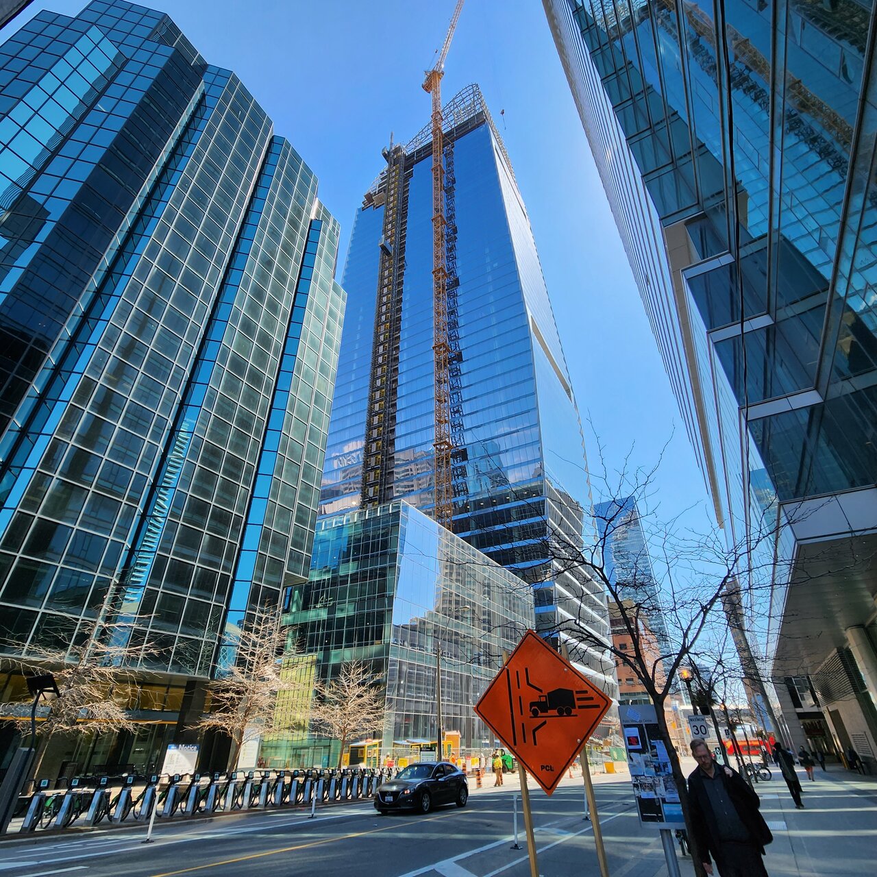
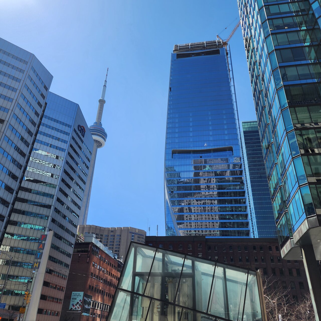
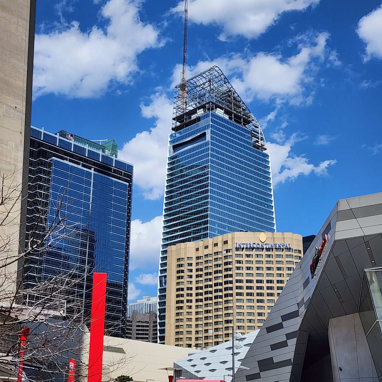
From today...
Cranesinthe6ix
Active Member
Riseth
Senior Member
Just be glad their not very tall and just fade away in the skyline.Off topic, but it's this particular area of condos that drives me the most crazy. Those ones on the left. They're soooo ugly. It kills me.
Dr. Snoot
Active Member
C-mac
Senior Member
Never seen a shot of this building from this area/angle before. Looks great from here. Thanks for posting.
evandyk
Senior Member
DSC
Superstar
Clearly they should have added spires and pinnacles!
Bjays92
Senior Member
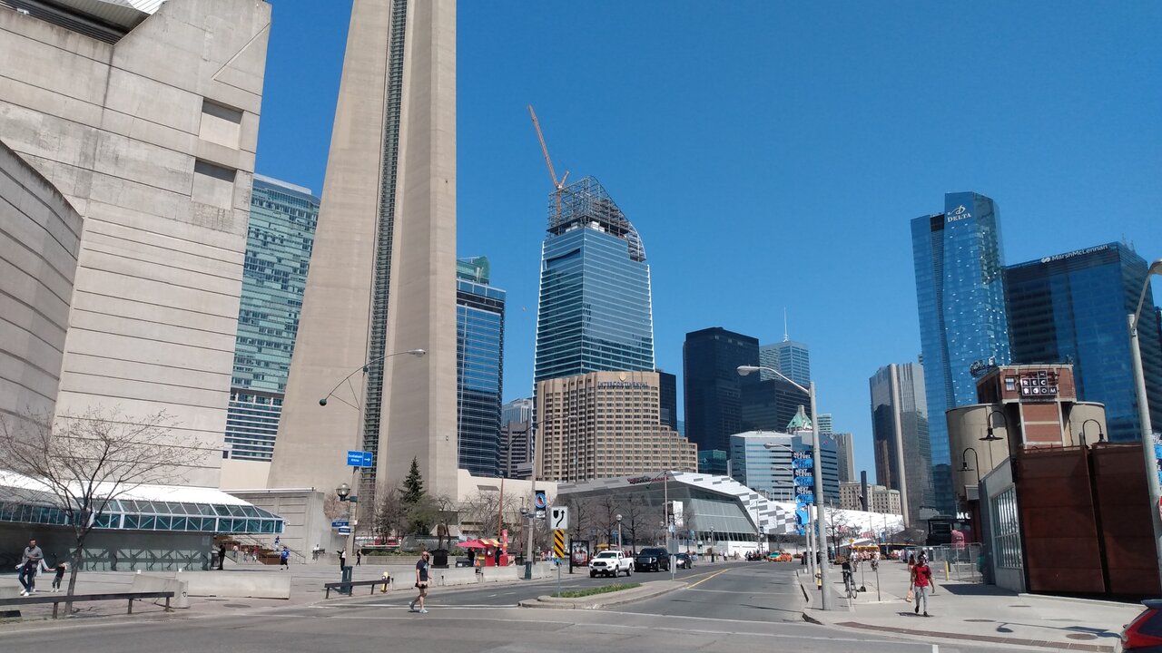
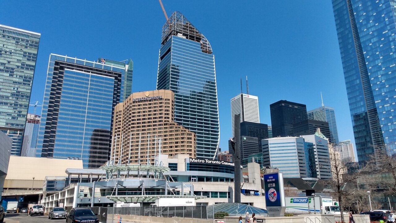
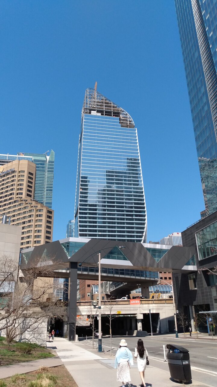
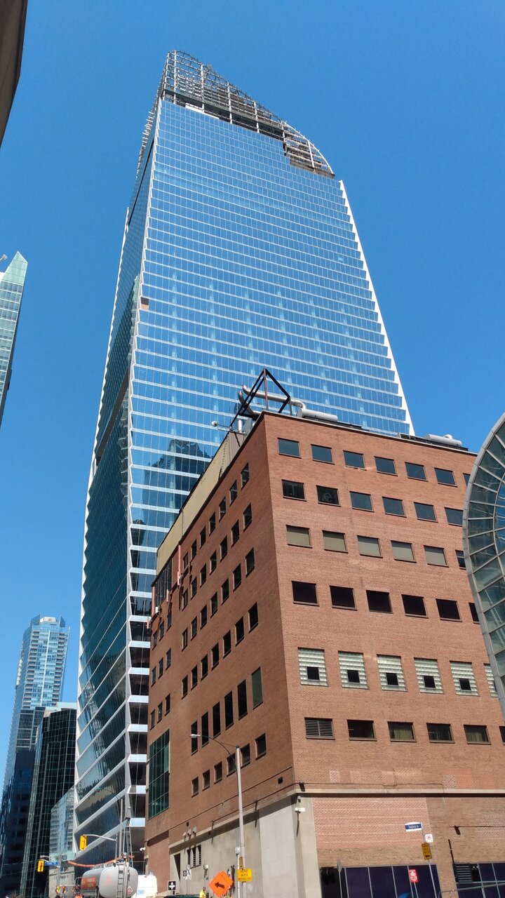
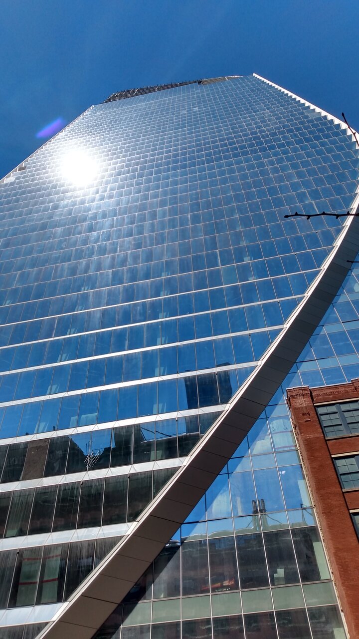
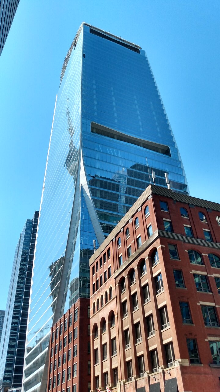
I know we all wish this was taller, so that aside, a few observations:
1. This building really fits and deserves to be a bank tower. It absolutely lives up to the prestige of the rest and tastefully echoes some of their design elements while also being unique and standing out on its one.
2. It is a huge shame the surrounding sea of blue glass diminishes the overall stature of this building. Even if it's only ever so slightly, this is what modern blue glass buildings should look like and shows how the can excellently juxtapose more traditional building styles. Unfortunately that can get lost in the sea of mediocrity around it despite how excellent this building is.
3. This is a great location, and some of those most recent shots really show that. I love CIBC square, but imo this shows up even better on the skyline, and by being on the other side of the train track it can midigate some of the blueness around it depending on the angle.
Towered
Superstar
Towered
Superstar
Riseth
Senior Member
April 14, 2023
urb@ndweller
New Member
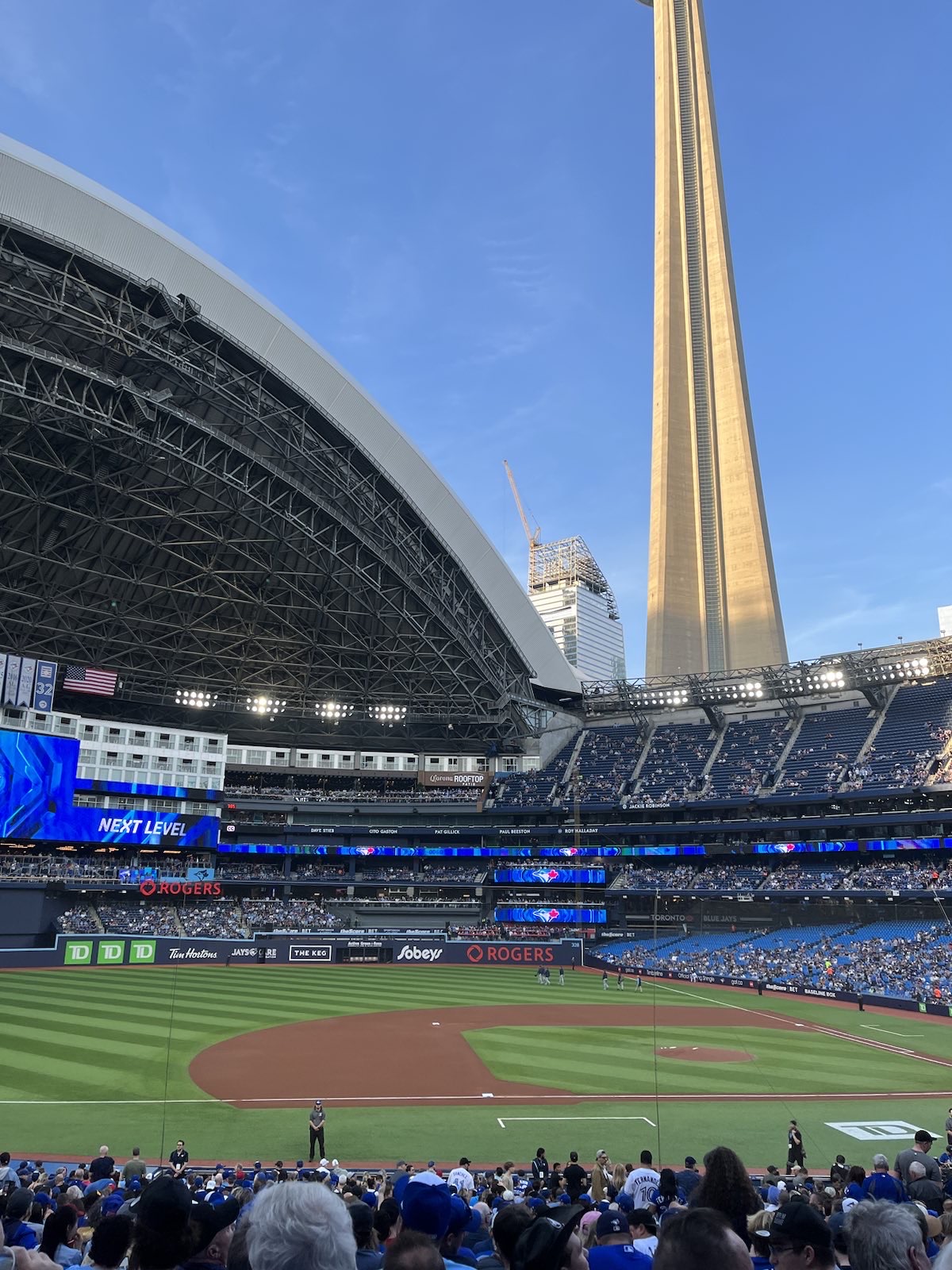
From inside the dome
