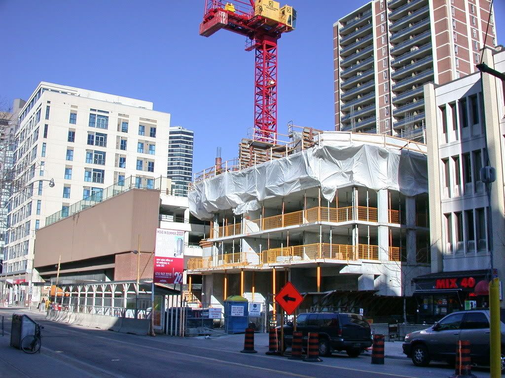
People have been moving into the building all week - the first few floors are now occupied, the majority being north-facing so far.

Also, you can still see the graffiti... I guess they need to use a more powerful agent to remove the paint!
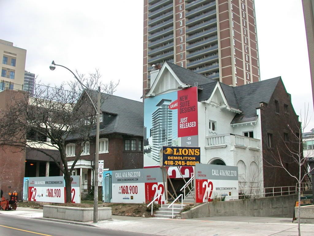
 
A few older photos

... first time posting, hope I didn't mess this up.

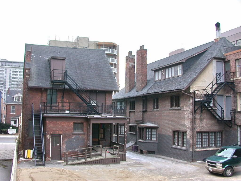
22Wellesley.jpg


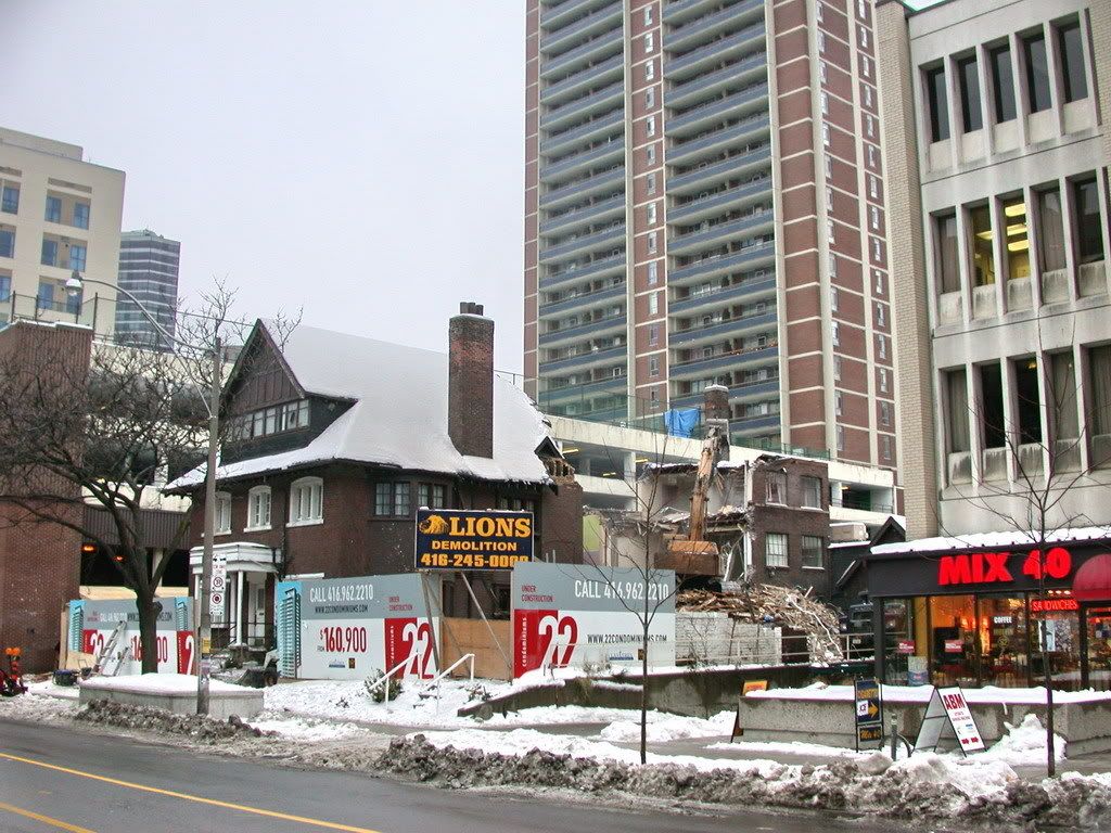
22Wellesley1.jpg


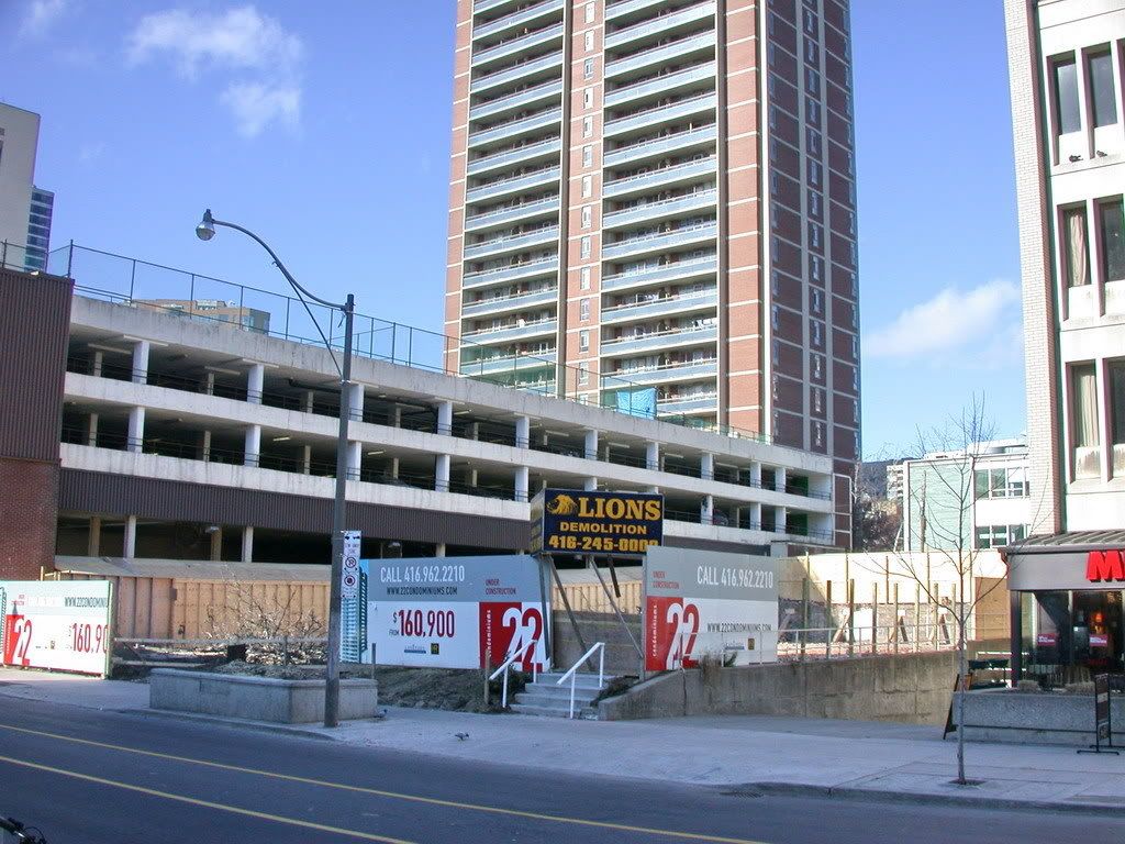
22Wellesley2.jpg


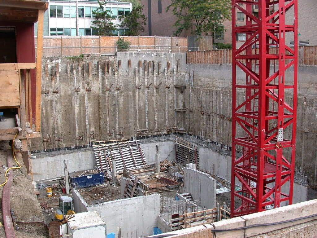
22Wellesley3.jpg


22Wellesley4.jpg


22Wellesley5.jpg
 
Jdot:

I dont think anyone has even moved into this building yet... if they have, it was recent. There is still a lot of finishes to complete on the building. Just because the hording is down doesnt mean that the entire building is complete and will remain as is. It takes up to a year after move-in for most condos to be completely finished.

It's probably good to keep the heat up though - an example of things going wrong is El'vn 21 on Bay St. - the really crude concrete columns are supposed to be clad after the fact, but it never did.

AoD
 
nice pics, cabeman...:)
 
Thanks for the shots. I think I will use the occasion of our discussing '22' to mention something that has been bugging me for a while...that I have a nagging feeling that aA is either slipping a bit in its huge number of on-the-go projects, or maybe was never that great to begin with. I'm pretty dissapointed with '22', as I was with Spire. The current Four Seasons renderings, well, suck, and I am very sceptical about the latest round of Distillery projects. Am I being a little paranoid here? Or is aA over-promising and under-delivering? It's an important question, since the firm has been entrusted with rebuilding so much of the city.

With that said, 18 Yorkville is my favourite new building in Toronto.
 
What, precisely, are you unhappy about? We're not mindreaders.

A nicely proportioned contemporary building with generous open balconies, it reads as a whole rather than an assemblage of parts. Stylistically it is an extension of the post-WW2 style that defines Toronto architecture. At street level it is honest, forthright and uncluttered. The long horizontal stretch of the canopy contrasts with the strong vertical of the central core and echoes the balconies. Only a fool would call this ugliness or see it as doing a disservice to the Modernist roots that inform the design.
 
I'd imagine that the main "problem" with 22 is that it isn't finished yet.
 
Urban Shocker, you're becoming increasingly militant in your pro-Modernist stance. Variety is the spice of life, my friend.
 
Mediocre? Apart from the shoddy finish on the base (something that can easily be fixed) the building looks fine.
 

Back
Top