Will UT educators (moderators) be applying the gold stars, presumably pre-licked hygenically?

Forums typically use polls of course, with fan-boys (moi?) inflating the B+ to A+ metric and haters inflating the bottom D-minus or E "fail" poll results (we know these folks already by UT username and bet they typically will vote quickly, hoping to trump and discourage ). The mid-level scores will probably less populated... due to voter apathy or undecided natures.

Maybe we could out-source a rating strategy to Michellin.

gold-star.jpg

Link
 
Last edited:
I'd be more inclined to go 1-10 for 3 categories; 1) Form (Massing, Shape, Context), 2) Materials (Glazing, Trim, Use of Spandrel etc... ), and 3) Design (Overall Aesthetic; Street-scape, Public Space, Lobby, Pedestal, Tower, Roof Line),

...then divide the result by three.

Heritage retention/integration and balconies (or a lack thereof) float between all three categories. ex. One Bloor East's balconies have a clear and positive impact upon form, materials and overall design. The heritage retention at One Yorkville stood out for it's quality and quantity (namely how much of the interior spaces were saved) but perhaps integration with the overall design was not as successful

From what little we know 421 Church for me is rated 3.3.

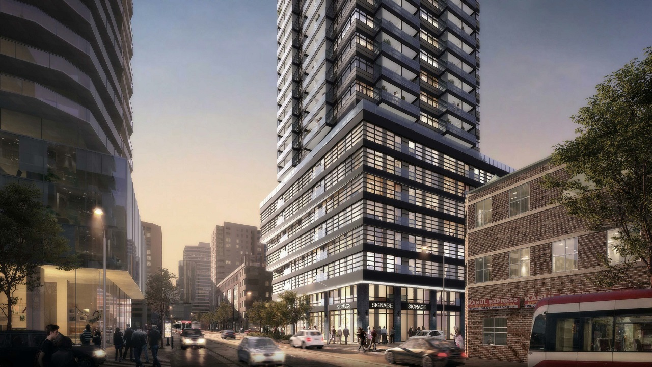
Form: Standard floor plate (3); standard balcony arrangement (3); somewhat interesting podium (5) = 11 /3 = 3.7
Materials: High spandrel potential etc....You know this could really suck (3) = 3
Design: Street-scape (believe it when I see it)) (3); Maybe the podium gives you a Japanese lantern feel? (5?); Bare bones mechanical (2); Standard everything else (3) = 13 /4 = 3.2

Total: Form: 3.7 + Materials 3.0 + Design 3.2 = 9.9 /3 = 3.3

0-2.5 Disaster (Neighbourhood Death to Aesthetic Embarrassment)
2.5 -5.0 Treading Water (Barely to Well)
5.0 - 7.5 Keeping up with the Joneses (College Try to Upping the Ante in at Least One Category)
7.5 - 10 The Asset Class. (Above Average to Best in Class to Creatively Unique to Visionary)

The scale avoids the grading of condo interiors or floor plans, focusing instead on the structure's exterior face and its public spaces.

Open to ideas......it works for me so far.

Cheers.
 
Last edited:
The site is currently a gas station - construction won't start for years (soil remediation, etc). Hopefully Graywood will flip it to another developer who comes up with a better design.
 
why is there such boring lazy modernism allowed for this core neighbourhood , ..the DESIGN REVIEW PANEL sucks , .. PLEASE , demand better
The Design Review Panel offers advice. The panel as a whole and its members individually do not have the power to demand a particular style of architecture, nor can they demand brick over back-painted glass spandrel, nor curtain wall over window wall, as two examples, although they can suggest such things. Their advice, including any dissenting voices among the panelists, is recorded and in most cases results in changes to a proposal, but ultimately developers decide what they'll pay for, so aim most of your concern in their direction.

42
 
not sure about a request for affordable housing in this tower , .. the city completely did a complete-180 on senior housing in 199church condo
 
Bit of a shame there's not a few floors of office/institutional use at the base - with nearby Ryerson University as a likely occupier!
Overall, this looks very mediocre.

96 studio units (18.4%), 200 one-bedroom units (38.4%), 171 two-bedroom units (32.8%), and 54 three-bedroom units (10.4%).
Is there really that much market demand for studios? Nearly 20% seems like a lot! Here in the UK, people much prefer to rent/buy 1 bedroom new builds over studios - especially when the cost isn't much greater.
 

Back
Top