You are using an out of date browser. It may not display this or other websites correctly.
You should upgrade or use an alternative browser.
You should upgrade or use an alternative browser.
- Thread starter Marcanadian
- Start date
ymr9889
New Member
christiesplits
Senior Member
Today.


Collingwoodbuildinglover
Senior Member
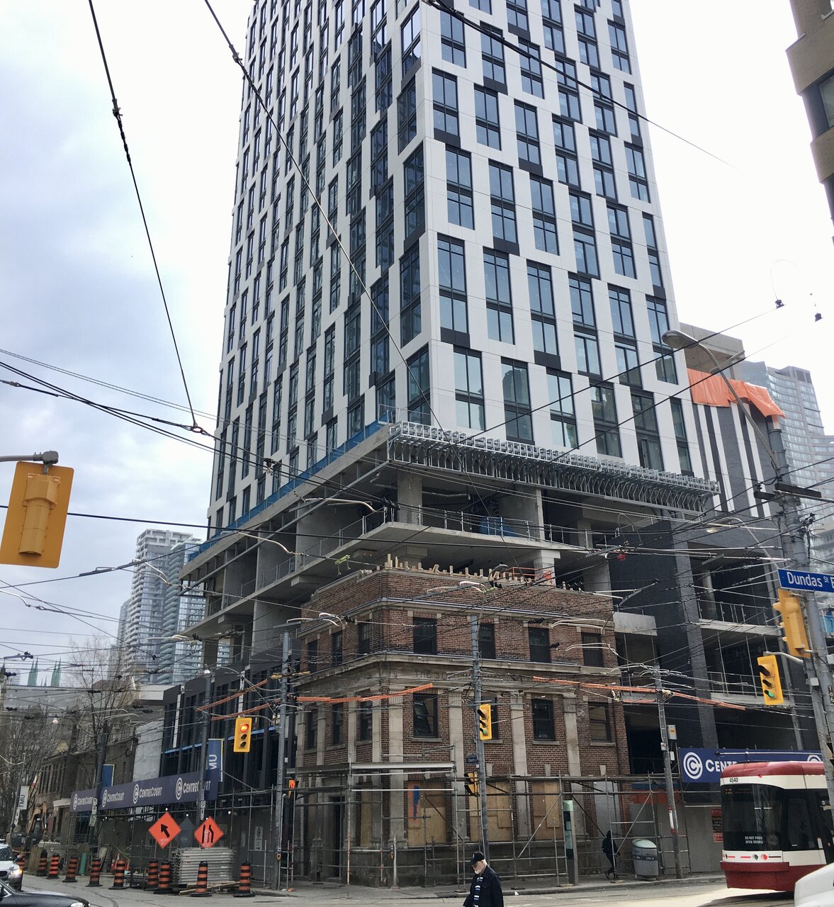
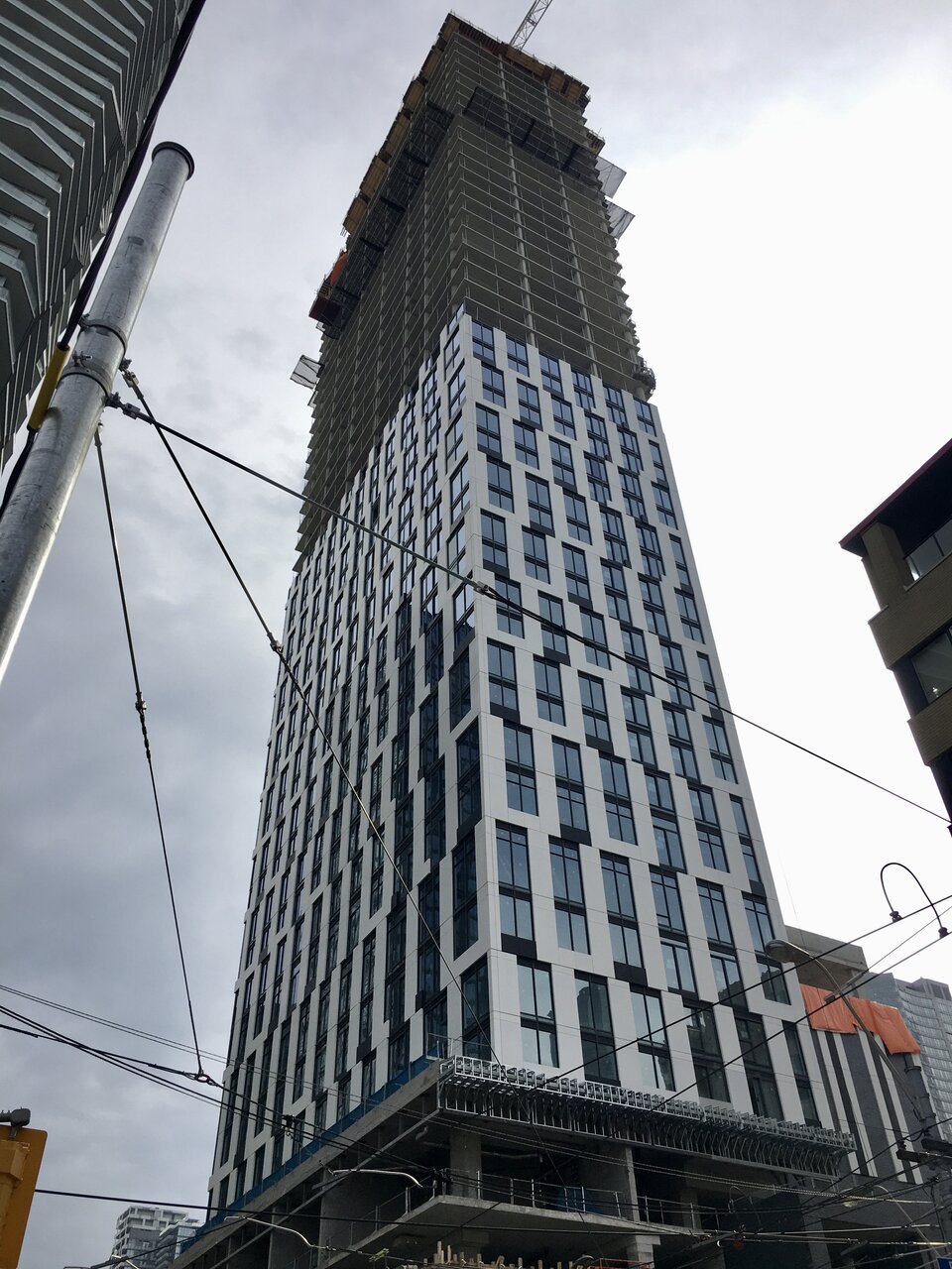
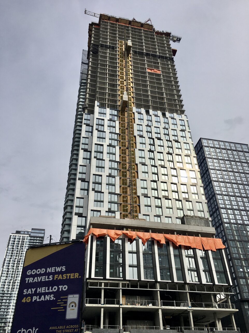
So now that we have more cladding I absolutely love this wasn't sure at first
canadaniel
Active Member
I’m definitely liking this detail
isaidso
Senior Member
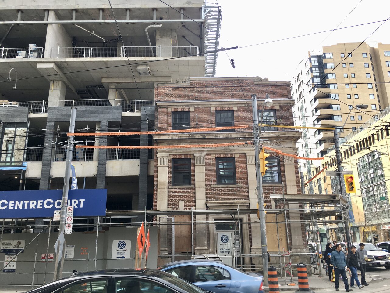
Two thumbs up. Proof that one doesn't need to spend a fortune to make a building look great. And what a blessing to have all that schlock removed from the corner heritage building.
Having no balconies improves the look.
Last edited:
Northern Light
Superstar
^^^^
I think the lot of you are all being too kind.
Yes, the quality of the cladding is above average, and we have a spandrel-minimizing design, those things are to be applauded.
But this business of offsetting the window/cladding positions every couple of floors looks so, so wrong to me. I can't forgive that.
UtakataNoAnnex
Superstar
...yeah, it looks so janky that way that you can almost hear it been played to a chiptune. >.<
Undead
Senior Member
Lenser
Senior Member
I think if it did the offset thing once every four or five floors it would actually work. This way, it's needlessly busy. But I do like the cladding nonetheless.
randommember
New Member
UtakataNoAnnex
Superstar
Admittedly, it does offer a bit of a distraction from the Anti-Social. And for what that is worth.
maestro
Senior Member
It's window wall and aluminum sandwich panels or stucco panels. I don't find it too offensive for what it is. It'll look better with the tower fully clad and the hoist removed but before the Juliet balconies are installed.
Fortunate the overhang isn't red. Someone then may confuse it for a McD's drive thru.
Fortunate the overhang isn't red. Someone then may confuse it for a McD's drive thru.


