Benito
Senior Member
Today.


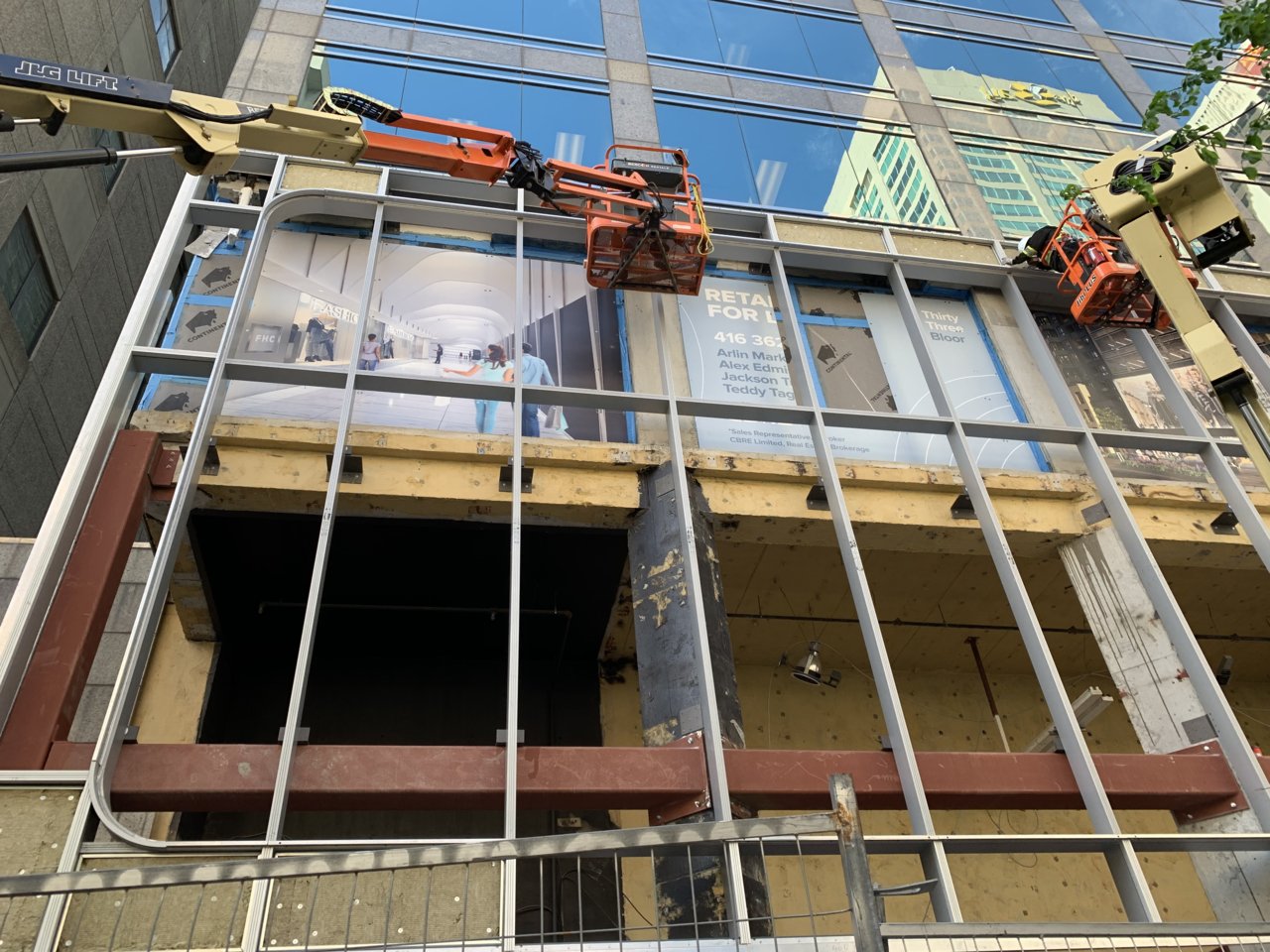
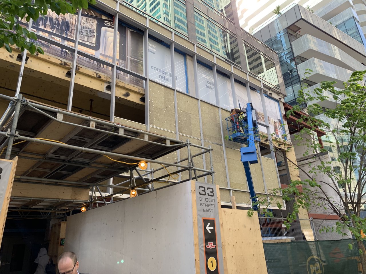
Wow. All that time and money and effort and that much of the frontage is just going to be spandrel? I figured that retail space was going to have big, soaring windows fronting on to Bloor.
I thought it was going to be a screen
There are certainly two tones to the colour in the ad there. The bottom two rows of glazing have a darker tone, indicating some sort of backing, while the top row is more translucent. I wonder if this is the intent here.From the renderings it looks more like see through ads that appear translucent to those inside the building but opaque to those on the street; similar to what 151 Bloor has. You can see the third floor track lighting in this rendering
View attachment 189089