modernizt
Senior Member
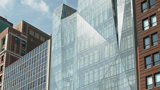
Conventional design: "Another glass box, typical Toronto"
Unusual design: "Are they crazy? stupid design"
Typical UT
There is no issue with it being unusual, it's that it's poorly executed.
Conventional design: "Another glass box, typical Toronto"
Unusual design: "Are they crazy? stupid design"
Typical UT
Conventional design: "Another glass box, typical Toronto"
Unusual design: "Are they crazy? stupid design"
Typical UT
Look at what? a scribble on a napkin? I'll reserve my personal judgment until I see some renderings.Just look at it!!!
Look at what? a scribble on a napkin? I'll reserve my personal judgment until I see some renderings.
No need to jump to conclusions
Look at what? a scribble on a napkin? I'll reserve my personal judgment until I see some renderings.
No need to jump to conclusions

