Northern Light

Superstar
Member Bio
Joined
May 20, 2007
Messages
35,528
Reaction score
103,503
New to the AIC this application to repurpose the site of an existing 20s office tower, the former 'Shell Oil Building', originally completed in 1958, though with a multi-storey add-on in 1966.
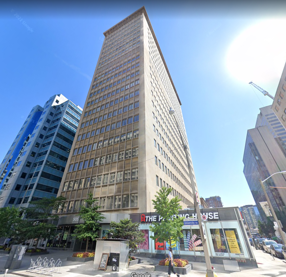
1663654252182.png


This site is the north-east corner of University and Edward, immediately north of 'The United Building' project that we're following here at UT.
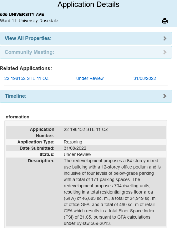
1663654434832.png


***

* Docs are Up *

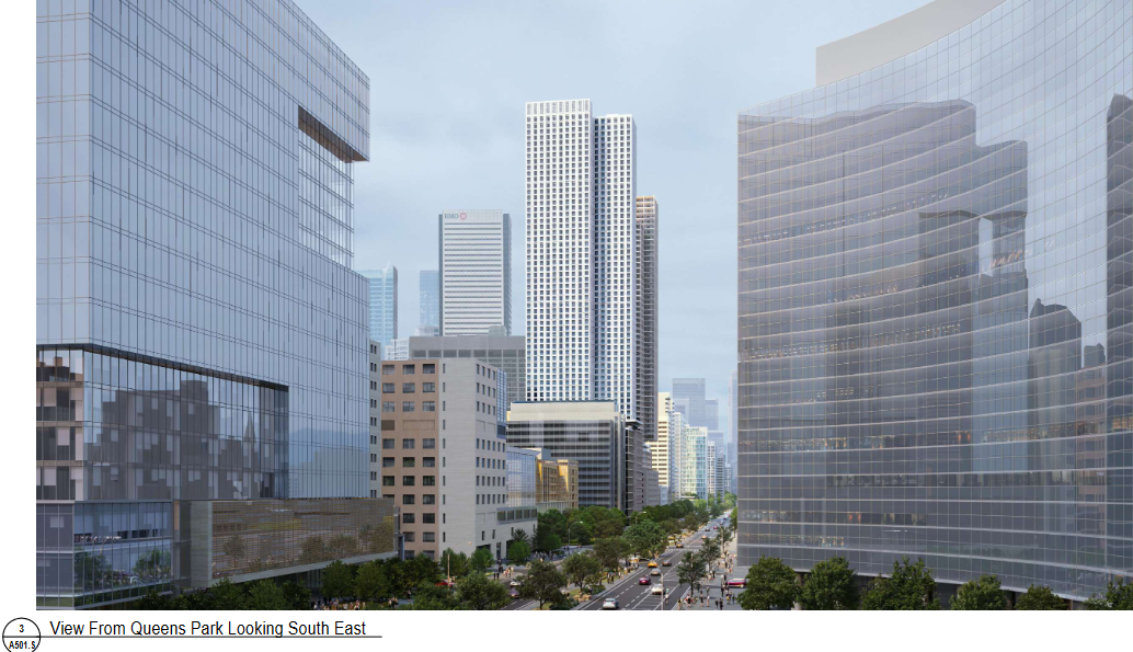
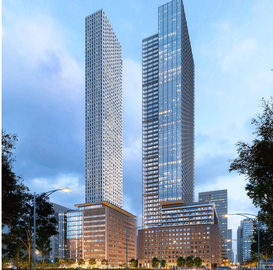
(renders below; first on up is the under construction United Building on the right side of the image, this proposal on the left)

1663654942157.png


1663655002263.png


1663655040537.png


1663654757234.png


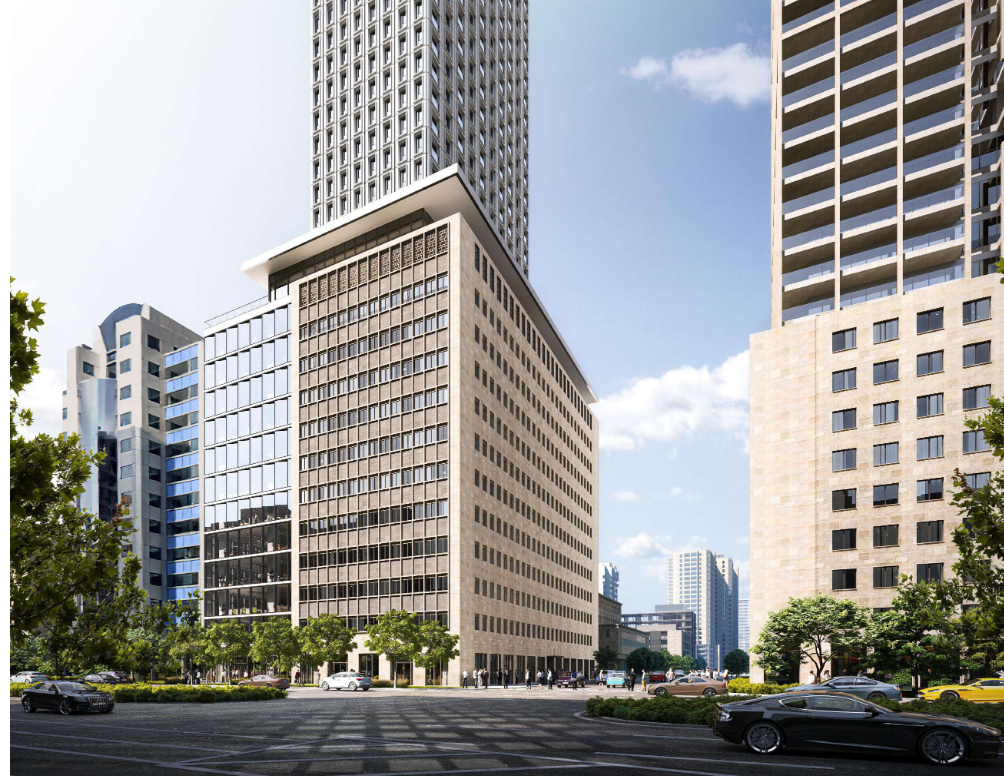
Note in respect of the appearance of the existing building, that at first blush, there appears to be facade retention. On somewhat closer inspection, only for the height of the original 1958 building, not the '66 add-on.....BUT

On closest inspection, not quite that either. These are reconstructed elevations reusing some of the original cladding:

1663655592011.png


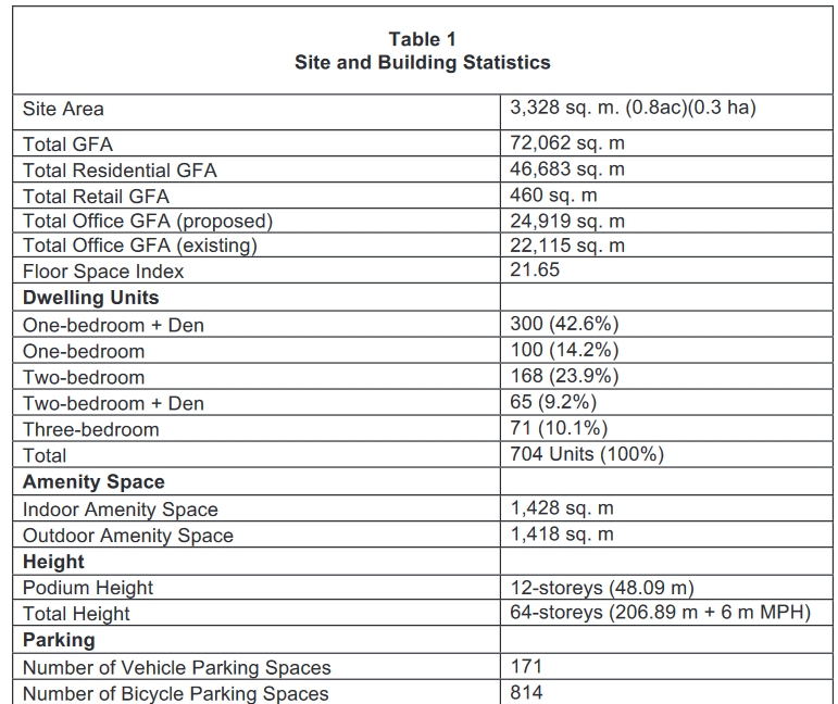
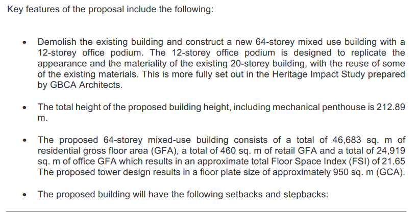
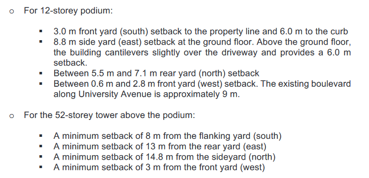
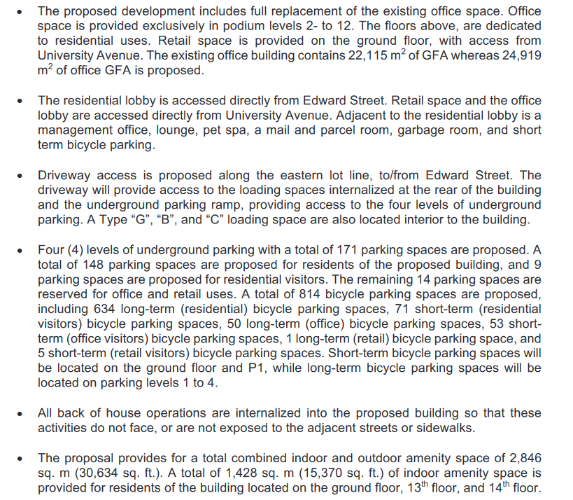
From the Planning Report:

1663655301555.png


1663655355631.png


1663655379813.png


1663655418077.png


* Before anyone asks, this somehow, amazingly skirts any of the SickKids Helicopter flight path (its to the south)

***

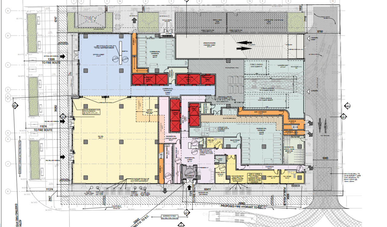
I may need a coffee in the morning to look over the landscape plan again. The render shows trees on the University frontage, but I don't see any in the actual plans, which seems odd.

No vegetation at all seems to be proposed for the Edward frontage.

That's unattractive. I'll add, Edward should be narrowed here, its sized to support the old bus terminal operation which no longer exists.
 
New to the AIC this application to repurpose the site of an existing 20s office tower, the former 'Shell Oil Building', originally completed in 1958, though with a multi-storey add-on in 1966.

View attachment 427791

This site is the north-east corner of University and Edward, immediately north of 'The United Building' project that we're following here at UT.

View attachment 427792


***

* Docs are Up *

(renders below; first on up is the under construction United Building on the right side of the image, this proposal on the left)
View attachment 427794

View attachment 427795

View attachment 427796

View attachment 427793


Note in respect of the appearance of the existing building, that at first blush, there appears to be facade retention. On somewhat closer inspection, only for the height of the original 1958 building, not the '66 add-on.....BUT

On closest inspection, not quite that either. These are reconstructed elevations reusing some of the original cladding:

View attachment 427801

From the Planning Report:

View attachment 427797

View attachment 427798

View attachment 427799

View attachment 427800

* Before anyone asks, this somehow, amazingly skirts any of the SickKids Helicopter flight path (its to the south)

***

I may need a coffee in the morning to look over the landscape plan again. The render shows trees on the University frontage, but I don't see any in the actual plans, which seems odd.

No vegetation at all seems to be proposed for the Edward frontage.

That's unattractive. I'll add, Edward should be narrowed here, its sized to support the old bus terminal operation which no longer exists.
Wonderful! Thanks for the update. The proposals continue to appear weekly, it seems! 😀
 
It astonishes me that this building is not even heritage listed, not even talking about designated. Honestly I ask the question again, what in the hell is wrong with this city that they cant even recognize what's actually heritage? Historical "preservation" is actually just laughably pathetic in this city.

Now that I got that little rant out of the way, initially i wasnt a fan of another tower being popped on top of a pretty sharp existing office tower but the more I look at this, the more I like it. The tower design is very sharp, and this goes much above just facendectomy (and the developer couldve just razed the thing or opted for some cheap nasty facendectomy). So I give serious applause to the developer on this one.

My only critique would be extention to the (what would become) podium level of the build. It looks incredibly bland, but this could be because they arent trying to detract from the existing 60's building.
 
This is absolutely disgraceful. The Shell Oil Building should be considered a significant heritage resource of the highest order. Instead, Heritage Preservation Services continues to busy themselves designating totally unremarkable fabric buildings (see today's Preservation Board agenda) - demonstrating extremely poor judgment and utterly misplaced priorities time and time again. The whole department needs to be overhauled (including removing management) and put onto a different trajectory. Heritage preservation in this City exists primarily to appease NIMBYs and Neighbourhood Associations (one need only look at the membership of the Pres Board and community preservation panels) while gems like 505 University fall through the cracks.
 
No! I've been fearing this day as I absolutely love this building as-is. Can't we leave anything alone in this city?

At least our Grand Central (Ontario Legislative Building) will remain as a view terminus, unless the province decides or allows developers to build a skyscraper on Queen's Park South.
Honestly I wouldn't even be surprised at this point.
 
Last edited by a moderator:
Not distract from the legitimate/passionate debate around the fate of the Shell building... but I can't help wanting to see a better rendering of Northern Light's second pic of the tower floors... very intriguing cladding/framing of windows.

Before I get bombed 💣 for this superficial cladding comment... I'll also suggest that BDPQ save this design for another client and another site (as long as we get a better look at it first ;-).
 

Back
Top