This is a very odd collection of geometry is it not? I think it is shown 'ugly' on purpose as a tease of better things to come.
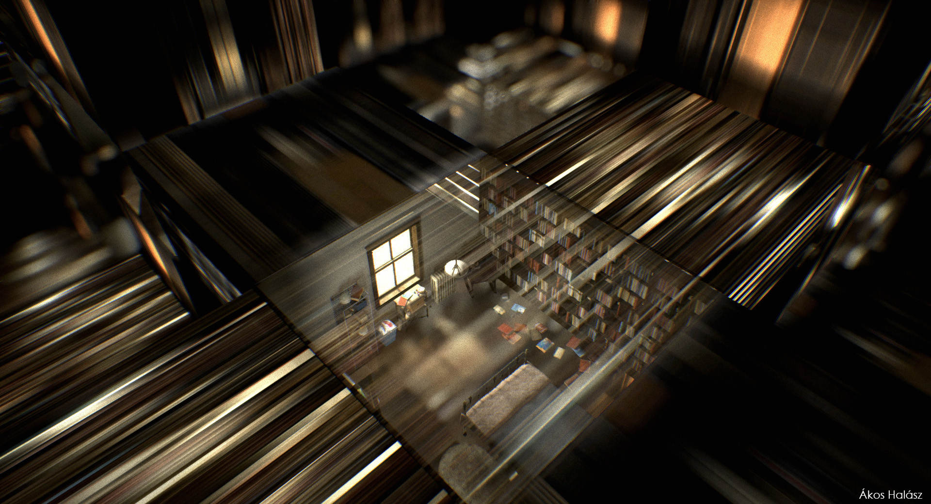
 
Reminds me of the movie, Interstellar where McConaughey was stuck in that tesseract bookshelf scene:

akos-halasz-interstellar9.jpg


https://www.artstation.com/artwork/EJODA
 
Like the small wild range of ornate details you’d find on a Victorian row house in Cabbagetown, it feels like aA is taking that concept on a larger skyscraper scale. Seems like that idea is almost done taking shape at 60 Colborne and now they are doing it here in a different way.

I like how it breaks up the height of the tower into what feels like manageable pieces.
 
aA's designs started to decline once all-glass towers were no longer permitted under building regulations.
 
Really feels like aA has gone downhill over the past couple of years. This is just plain ugly.
 
Yeah. 60 Colbourne's a big failure, right? :rolleyes:

Don't get me wrong - they're still one of the better firms out there, but they used to produce nothing but hits. Now they've got comparative duds like Halo, Alter, 8 Cumberland, 33 Yorkville and this one popping up on a more regular basis.
 
Don't get me wrong - they're still one of the better firms out there, but they used to produce nothing but hits. Now they've got comparative duds like Halo, Alter, 8 Cumberland, 33 Yorkville and this one popping up on a more regular basis.

I agree with you. Been saying this for a while and got flamed. The pack has caught up.
 

Back
Top