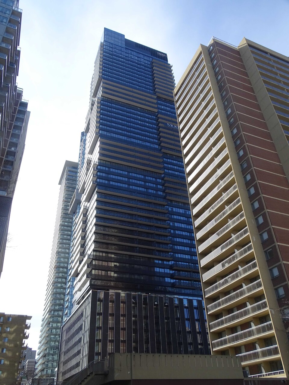
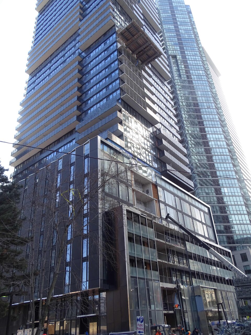
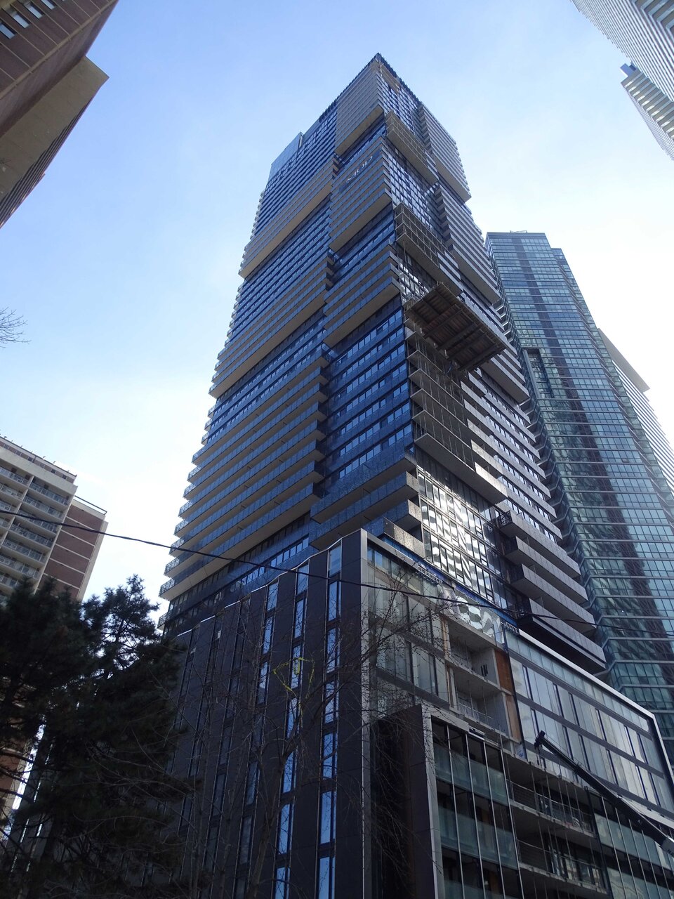
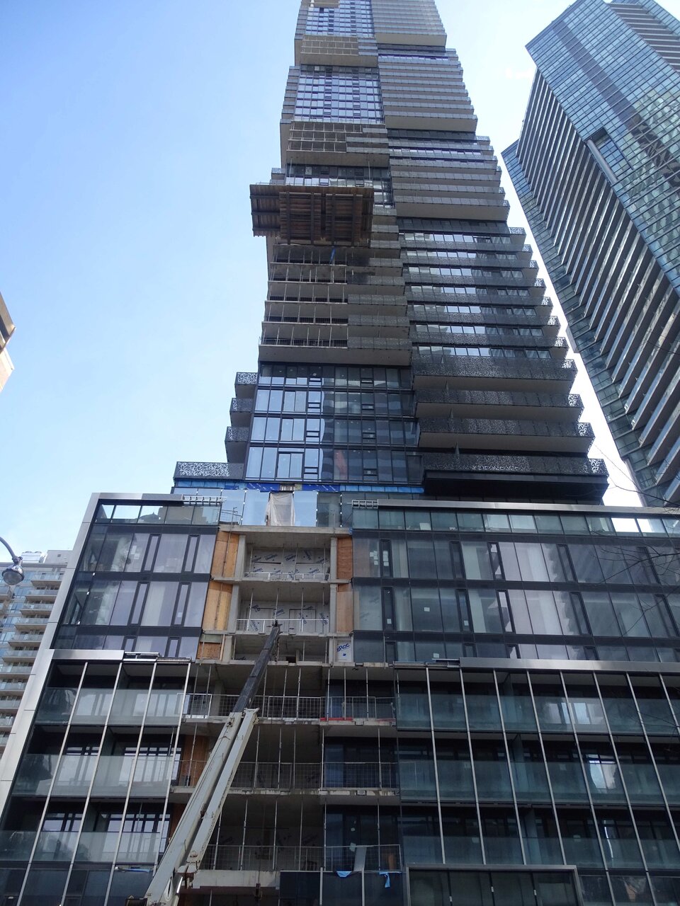
I was by here today, March 25th, 2024 and took a few pics:
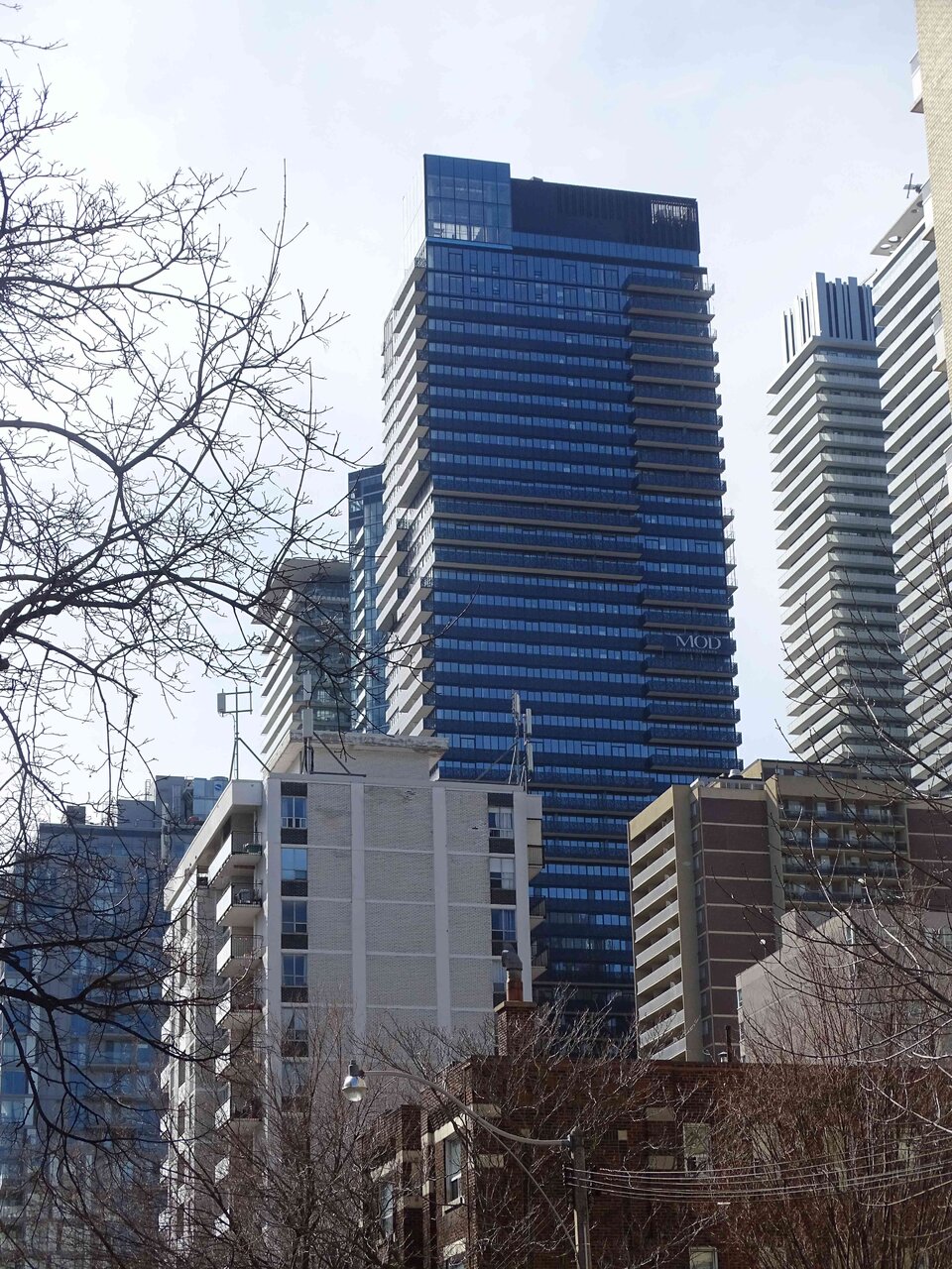
DSC03252.jpg


DSC03254.jpg


DSC03261.jpg


DSC03262.jpg


DSC03263.jpg
 
how many times can they build the same building in a 4 block radius??? what passes for architecture here is a joke. and the fact that people eat them up and get excited over it is tragic comedy.
 
This one would have been decent if they'd used warm and bright colours. The way it's done it comes across as so gloomy.
 
This one would have been decent if they'd used warm and bright colours. The way it's done it comes across as so gloomy.

I get that black isn't everyone's thing...........

But gloomy?

I wouldn't have said so............I might say formal, or even a bit cool. (not in the trendy way, but in the not warm way)

***

Edit to add:

I'm not particularly taken w/this at street level, but that's how I feel about pretty much everything ..........mostly 'Casas I, II and III' along this stretch of Charles.

But I'm not sure black on the tower is the problem.............
 
Last edited:
I get that black isn't everyone's thing...........

But gloomy?

I wouldn't have said so............I might say formal, or even a bit cool. (not in the trendy way, but in the not warm way)

***

Edit to add:

I'm not particularly taken w/this at street level, but that's how I feel about pretty much everything..........most 'Casas I, II and III' along this stretch of Charles.

But I'm not sure black on the tower is the problem.............
Agreed. I think it looks great in person. Nicely finished and well executed.
 
It turned out more ''subtle' than I expected from the renders, which is a good thing! This was achieved by the balcony rail color matching the facade (as opposed to silver or grey balconies), and use of white paint under the balcony.

I was expecting the balconies would get more obnoxious treatment like at YC condos.
 
I get that black isn't everyone's thing...........

But gloomy?

I wouldn't have said so............I might say formal, or even a bit cool. (not in the trendy way, but in the not warm way)

***

Edit to add:

I'm not particularly taken w/this at street level, but that's how I feel about pretty much everything ..........mostly 'Casas I, II and III' along this stretch of Charles.

But I'm not sure black on the tower is the problem.............
Black can definitely look formal, sexy, classy, etc. But here I think it's just dark.

It's fine on a bright day, but buildings in these dark colours look grim during the gloomy winter months when we need all the colour and warmth we can get.
 

Back
Top