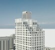
If these latest renderings are anything to go by, this is one of the most dreadful overwrought and underwhelming pieces of crap this city has seen in recent years.
Full of pointless tweaks, subtractions, pullbacks and add-ons that mean nothing, add nothing and go nowhere.
The cave-like corner which looks like a drive court, the curved corners too short to either add interest or space on the street, the long, pointless horizontal dividing bands that only act as an inept drag on the tower's height, a sampling of piddling setbacks, the grotesque amount of awfully white spandrel - patchy and clumsy, the graceless wan brick, the jumbled non-relation of all the parts. This thing is an utter embarrassment. There's also the issue of the all-hallway, hideous apartment layouts, which are so poorly and perversely laid out it reads like a kind of sick joke.
I'd expect better from an amateur at home with Sketchup.
(And don't get me started on that mechanical rooftop bit)
.

This should not go ahead. It really needs to go back to the drawing board.
It amazes me that this thing has been through - what?- five iterations, and each one seems to be more lousy than the last. Although the one just before this one wasn't anything special, it had a much more sure sense of composition and design. Given the building's prominence for this neighbourhood, better is demanded.
