rdaner
Senior Member
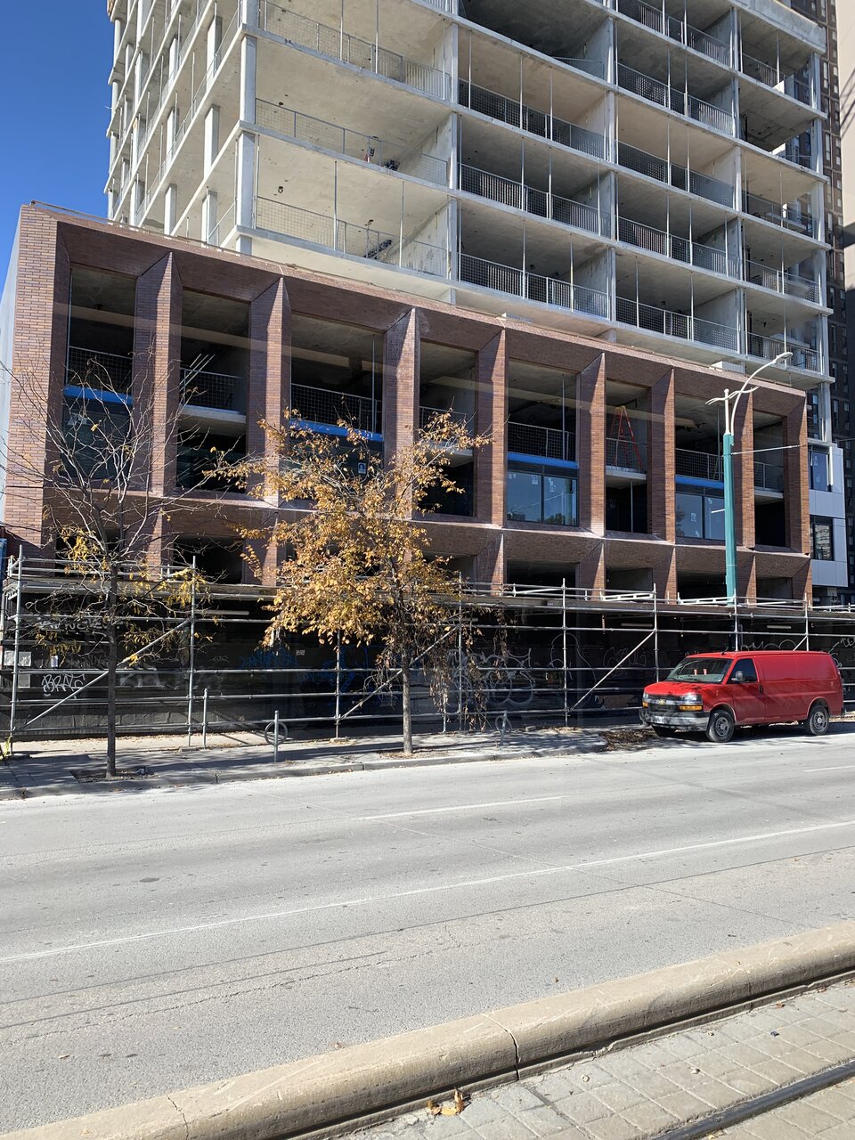
Taken 1 November.

Just because its address number is the Mark of the Beast does not make this building a monstrosity.As much as I hate to say it, that looks remarkably good...
...I mean, it certainly doesn't give off that Iron Maiden vibe.
What is Salford? I thought the company who owns this building is Cromwell right? What is a N13 notice and were you not given priority access to rent again with the same rent when the renovations were done? There were renovations in this building in the lobby and laundry room to but the tenants weren't asked to leaveI lived in 11 Walmer Rd -- which is owned by the same company -- for 15 years. Our balcony renos started in May of 2018 and we didn't get access to our balcony back until June of 2019. Got to enjoy it for about 3 months before we received our N13 notice saying interior renos (which they told us would be the hallway, lobby, and laundry) would take 3 years and we had to vacate.
Salford is a horrible, horrible company. Throughout the entire process of our 'renoviction' they were constantly rude to us whenever we interacted with them, reminding us they had the law on their side and we shouldn't bother trying to fight it. I fear for the residents of 666 Spadina.
Architecturally this is almost okay.
The problem is the combination of black, white and brick tile in the cladding: too many materials, and the transitions between them are poorly detailed. It’s really striking IRL.
Clearly the architects did not spend a lot of time, if any, looking at the cladding three-dimensionally.
The building looks like it’s glitching