rdaner
Senior Member
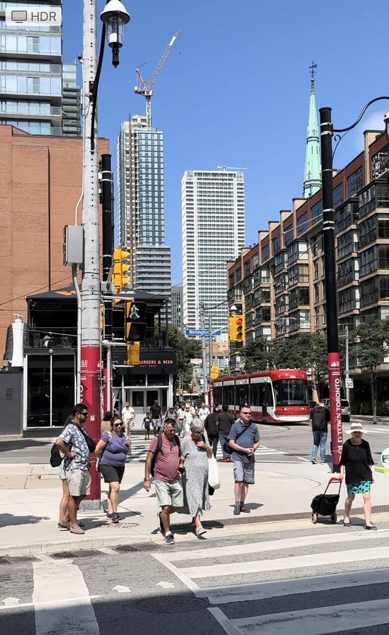
Just a little image for all of those who can’t understand why the architects chose the light green on 88 Queen. If you still don’t get it look at the GREEN spire then look back to the GREEN on the project. 

Spire 10; building 5.Just a little image for all of those who can’t understand why the architects chose the light green on 88 Queen. If you still don’t get it look at the GREEN spire then look back to the GREEN on the project.View attachment 592989
Maybe it's supposed to be reverse oxidation. In a few decades the spandrels will turn brown, matching the podium cladding.The former was the result of oxidation though. The latter...questionable developer decisions. >.<
No doubt they think so, but is it art?I see public art!
Gonna disagree. I think this is much better than most new builds. Modernist condos look best when the exterior elements follow a "grid" of sorts like this rather than having random balconies popping out everywhere. The white/light green combo is also refreshing.Unfortunately, this is VERY boring building that really fails to live up to expectations for such a large and prominent site. Pity!