I'm not disappointed at all. I expected it to look like shit ever since I saw the letters P + S and IBI in the thread title. We've been saying this from day one.

You've been predicting it to look like shit at every stage. The base and precast component look fine. The tower glass is a definitely disappointing.
 
So, I seriously had to log in just to type this (and I'm really sorry to all the forumers on here): WTF....grey spandrel again??? How is it that Toronto continues to have so many developments with grey when black (for the most part) looks significantly better? In the last week or so, I've become disappointed in two buildings - this and the Tridel-based 65 storey York Street tower! For this tower, they could've absolutely used the black that they have used on the lower floors...seriously, which city has so many issues with such obvious and simple things? Same goes with Tridel's tower. The one thing I've learned about Toronto (since moving here five years ago from Calgary) is that despite small improvements, overall, in my lifetime, Toronto will have way too many missed opportunities (urban planning and architecture wise), a generally shabby public realm and a failed transit file! Ugghh!! (I'm pissed because I care about Toronto and it hurts me to see the staggering level of indifference and poor planning so many aspects of this city exhibit!) Anyway, rant over (I'm sorry for posting what most here already know, but I just couldn't help it)! By the way, when I first moved to Toronto, I lived in Liberty Village so can you imagine my frustration with the cluster-**** there?
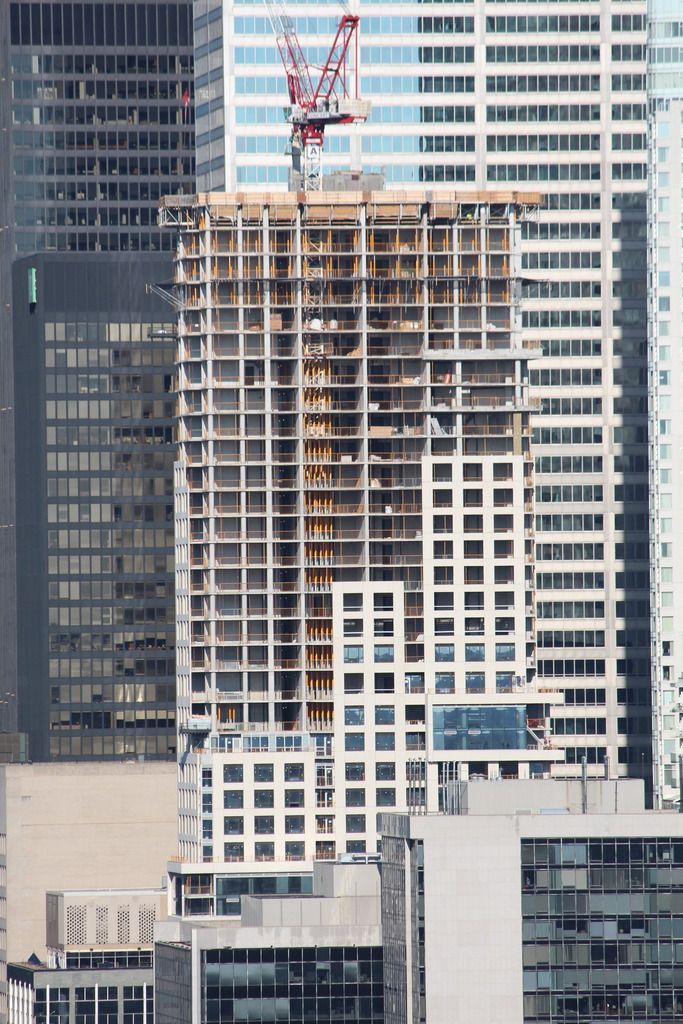
 
^ I totally agree with all of the preceding objections to the grey spandrel and mullions. A real let down...

July 19,2016:

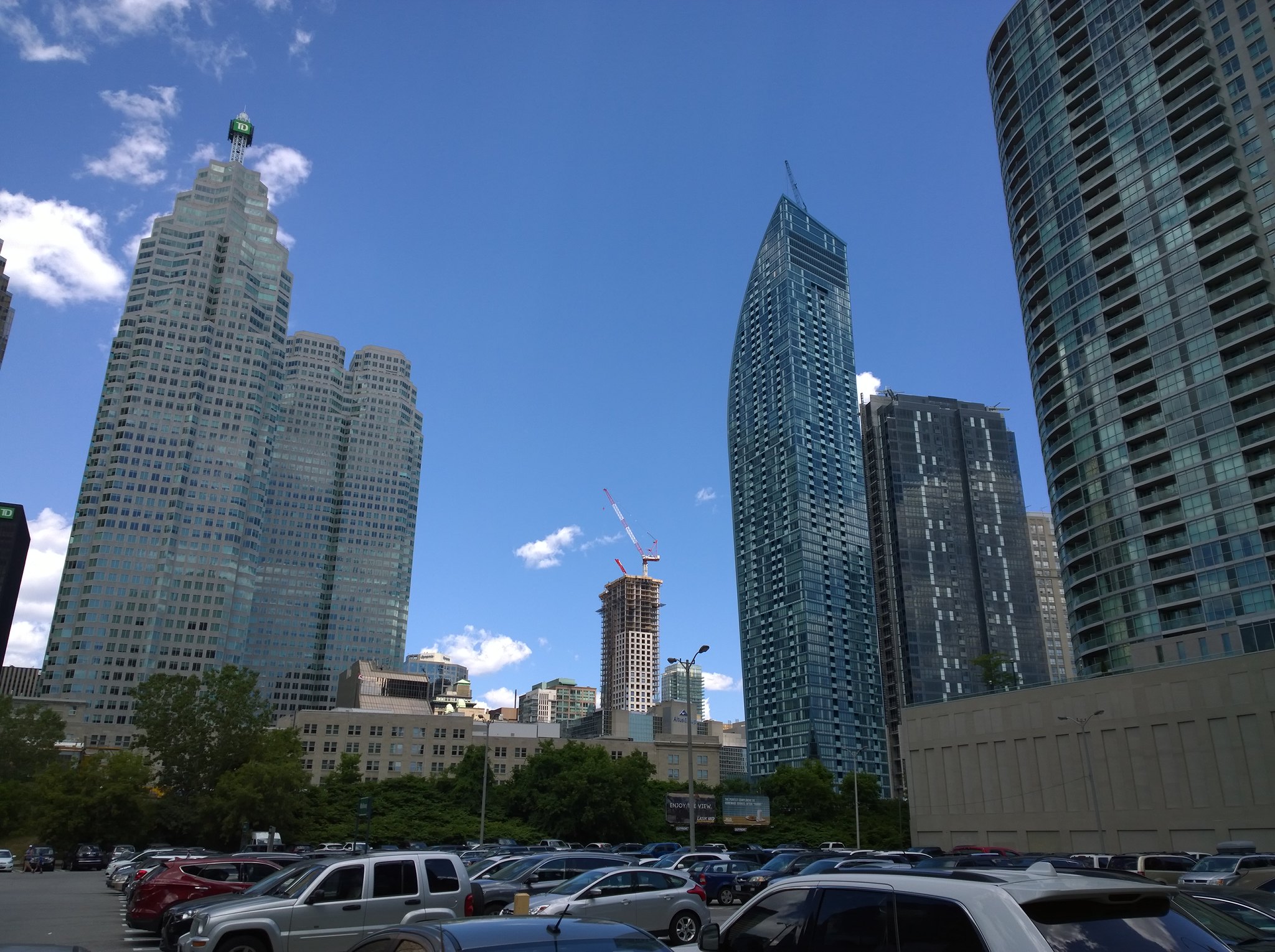
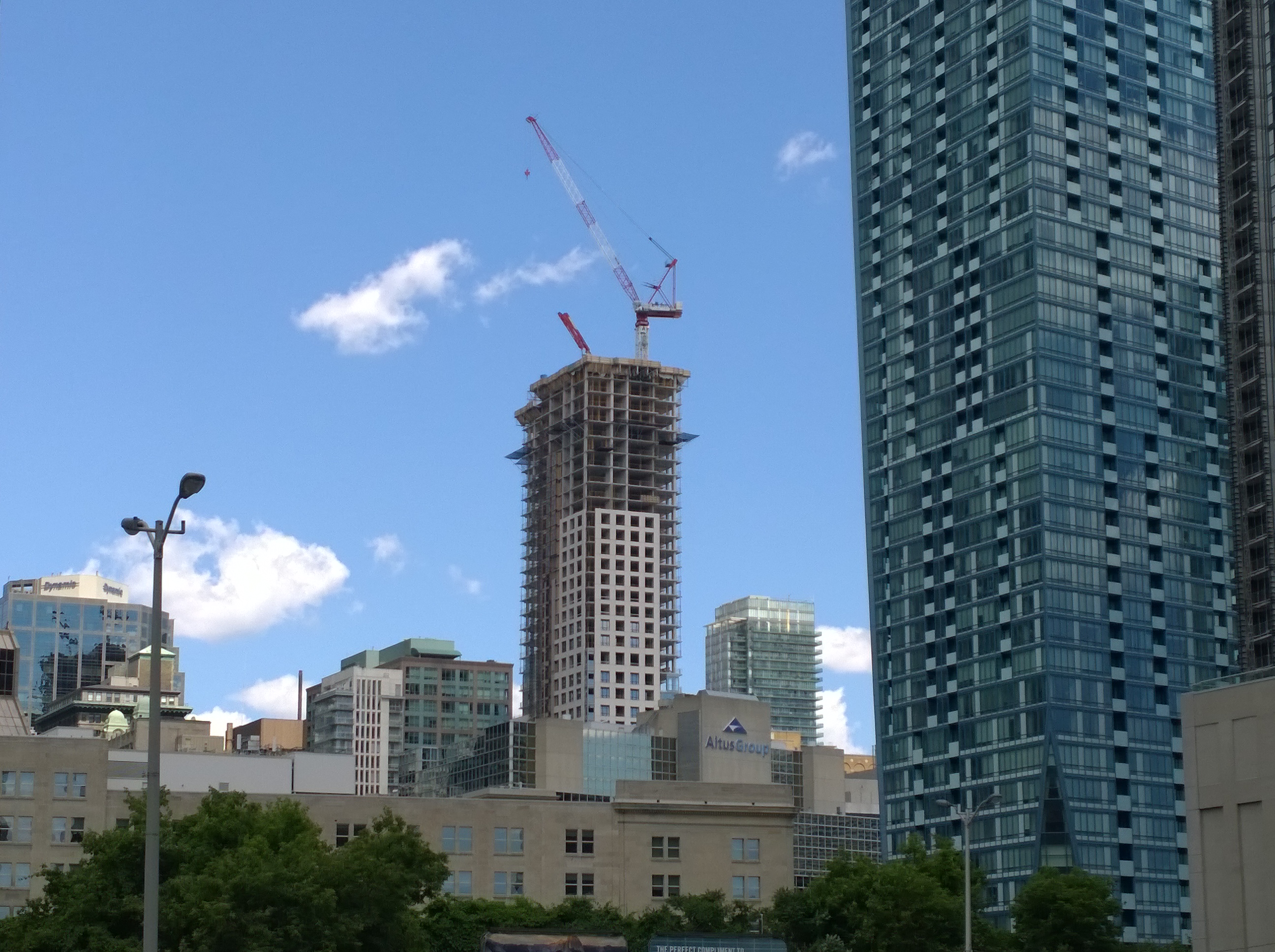
The tower has ascended to 40 floors. 18 more to go.


You've been predicting it to look like shit at every stage. The base and precast component look fine. The tower glass is a definitely disappointing.

The base is not fine to everyone. I think most would generally agree the quality is a little better than the tower.
 
So, I seriously had to log in just to type this (and I'm really sorry to all the forumers on here): WTF....grey spandrel again??? How is it that Toronto continues to have so many developments with grey when black (for the most part) looks significantly better? In the last week or so, I've become disappointed in two buildings - this and the Tridel-based 65 storey York Street tower! For this tower, they could've absolutely used the black that they have used on the lower floors...seriously, which city has so many issues with such obvious and simple things? Same goes with Tridel's tower. The one thing I've learned about Toronto (since moving here five years ago from Calgary) is that despite small improvements, overall, in my lifetime, Toronto will have way too many missed opportunities (urban planning and architecture wise), a generally shabby public realm and a failed transit file! Ugghh!! (I'm pissed because I care about Toronto and it hurts me to see the staggering level of indifference and poor planning so many aspects of this city exhibit!) Anyway, rant over (I'm sorry for posting what most here already know, but I just couldn't help it)! By the way, when I first moved to Toronto, I lived in Liberty Village so can you imagine my frustration with the cluster-**** there?

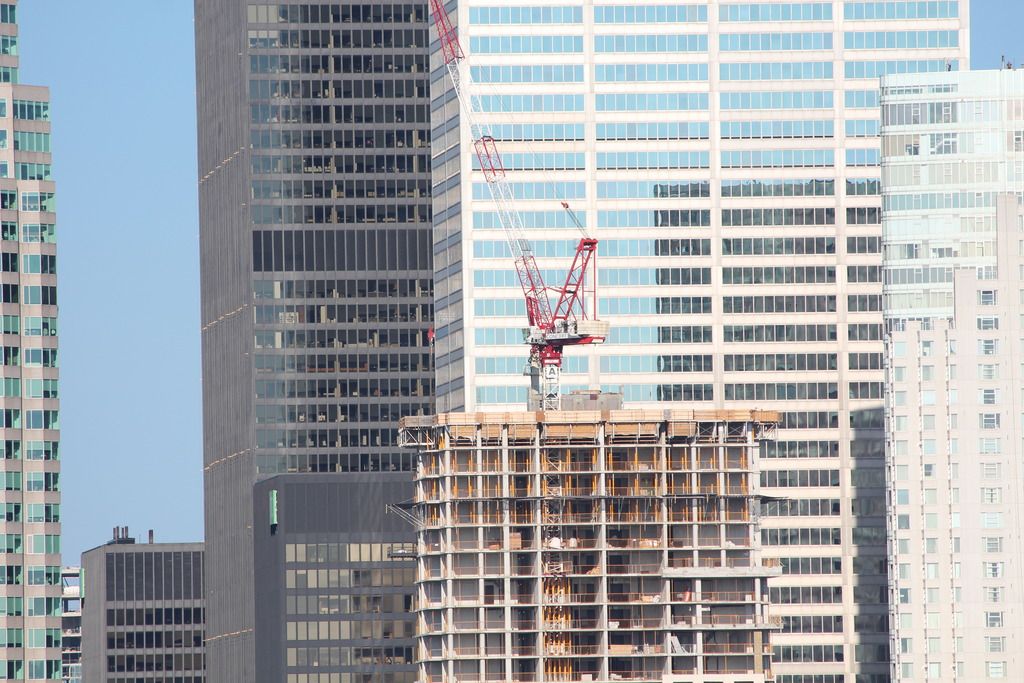
Black spandrel is not a solution either. It doesn't work well with every vision glass used and too much of anything usually leads to whining. Grey spandrel isn't the problem. It's the overuse of cheap looking window wall used in most of the booming markets in Canada.

We got a long way to go and I doubt we'll ever meet urbantoronto's expectations however, public realm improvements have been pretty dramatic in the last 5 years around the core. I wouldn't judge urban planning in Toronto on Liberty Village either.
 
We should just be happy it's grey and not another blue tower. I think it won't look AS bad once completed.
 
We have grey, virtually colourless towers that reflect as bluish or green at different angles and lighting but, we don't really have an Istanbul blue skyscraper in Toronto.
 
I don't agree, overall I would say feedback regarding the base has been positive.

I'm not surprised. The white precast and dark mullion caps are a classic look. Architecturally, it is a mess of convoluted lines and conflicting elements.
 
27886078473_1ed9a46c06_k.jpg


28469770246_f2b31c54a4_k.jpg


28423799701_502030da6b_o.jpg
 

Back
Top