You are using an out of date browser. It may not display this or other websites correctly.
You should upgrade or use an alternative browser.
You should upgrade or use an alternative browser.
- Thread starter yyzer
- Start date
scamander24
Active Member
Marcanadian
Moderator
Thursday:
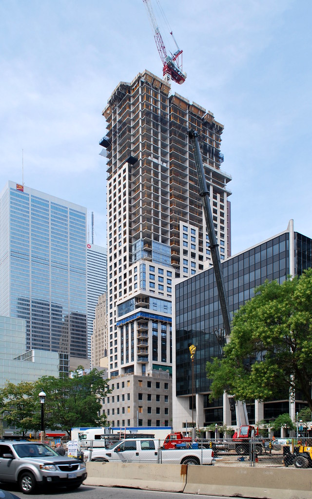 88 Scott by Marcus Mitanis, on Flickr
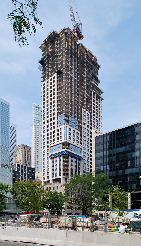 88 Scott by Marcus Mitanis, on Flickr
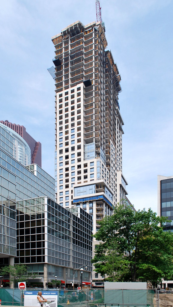 88 Scott by Marcus Mitanis, on Flickr
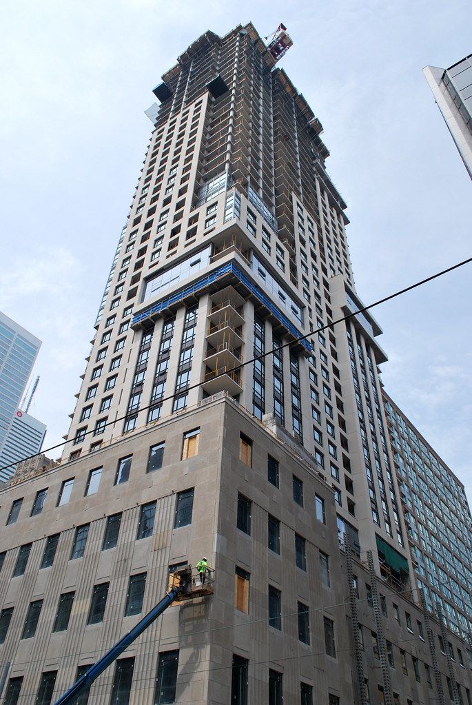 88 Scott by Marcus Mitanis, on Flickr
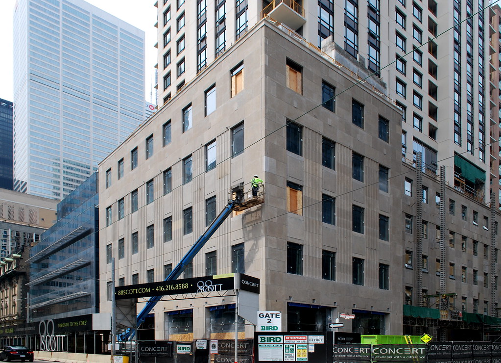 88 Scott by Marcus Mitanis, on Flickr
 88 Scott by Marcus Mitanis, on Flickr
 88 Scott by Marcus Mitanis, on Flickr
 88 Scott by Marcus Mitanis, on Flickr
 88 Scott by Marcus Mitanis, on Flickr
 88 Scott by Marcus Mitanis, on Flickr
ptbotrmpfn
Senior Member
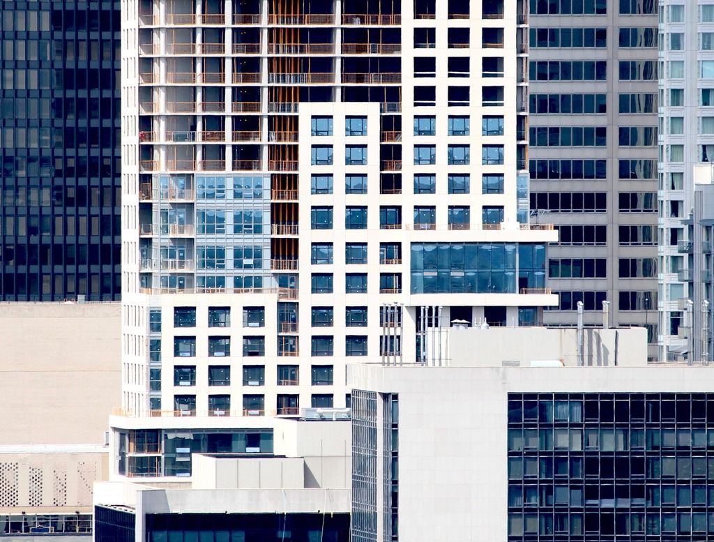
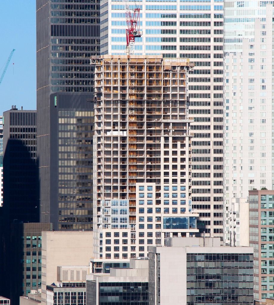
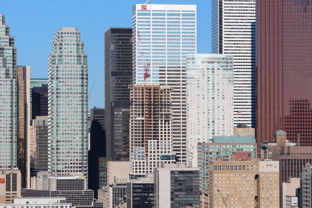
Marcanadian, Thanks for those pictures. The first one I find to be a very flattering capture. The newest sections all together and the lighting and angle taken, certainly change my opinion a bit.
skycandy
Senior Member
Youranthony1
Active Member
Great photos. The tower glass might end up looking okay once complete.
Ryan_T
Senior Member
The reflective quality really helps.
ssiguy2
Senior Member
I LOVE the podium!
Razz
Senior Member
CITY_LOVER
Active Member
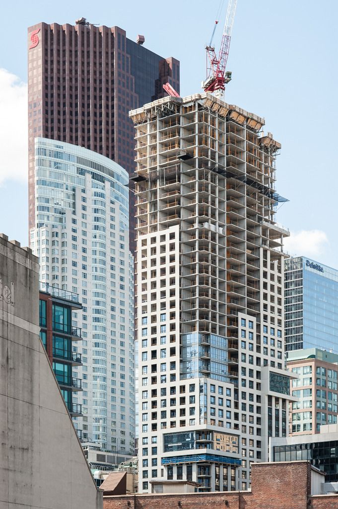
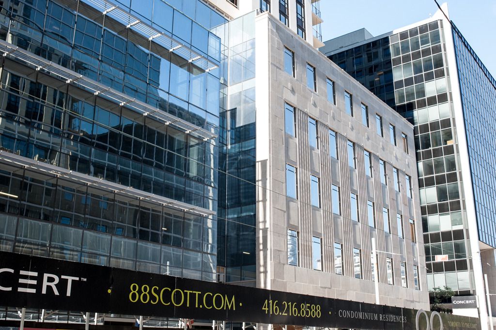
It's too bad that they went with grey spandrel outside of the yellow precast sections of the building instead of going with the reflective glass that is part of the two sections of the building that are sticking out (not sure what word describes that component of the building).
Ryan_T
Senior Member
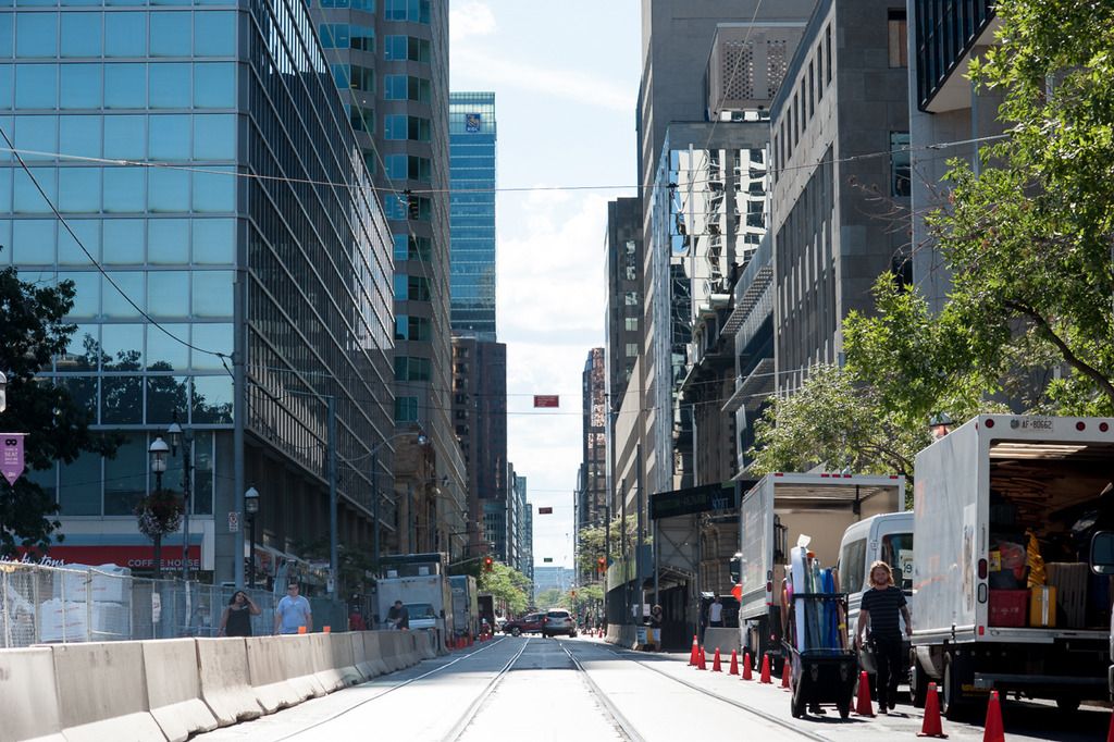
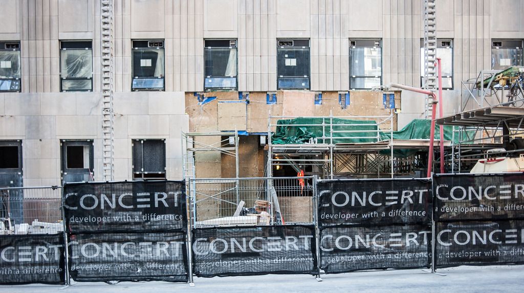
What are those angled pre-fab for? The sidewalk?
Ryan_T
Senior Member
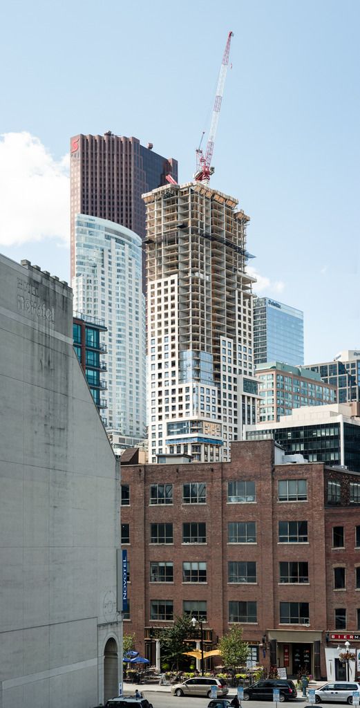
Last edited:
maestro
Senior Member
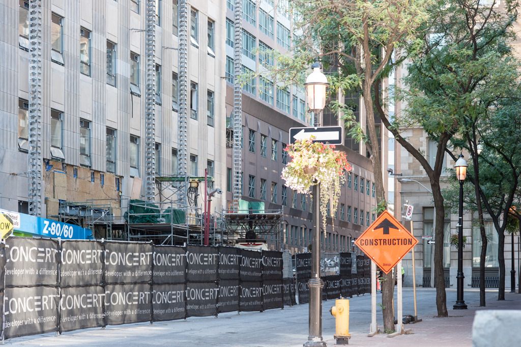
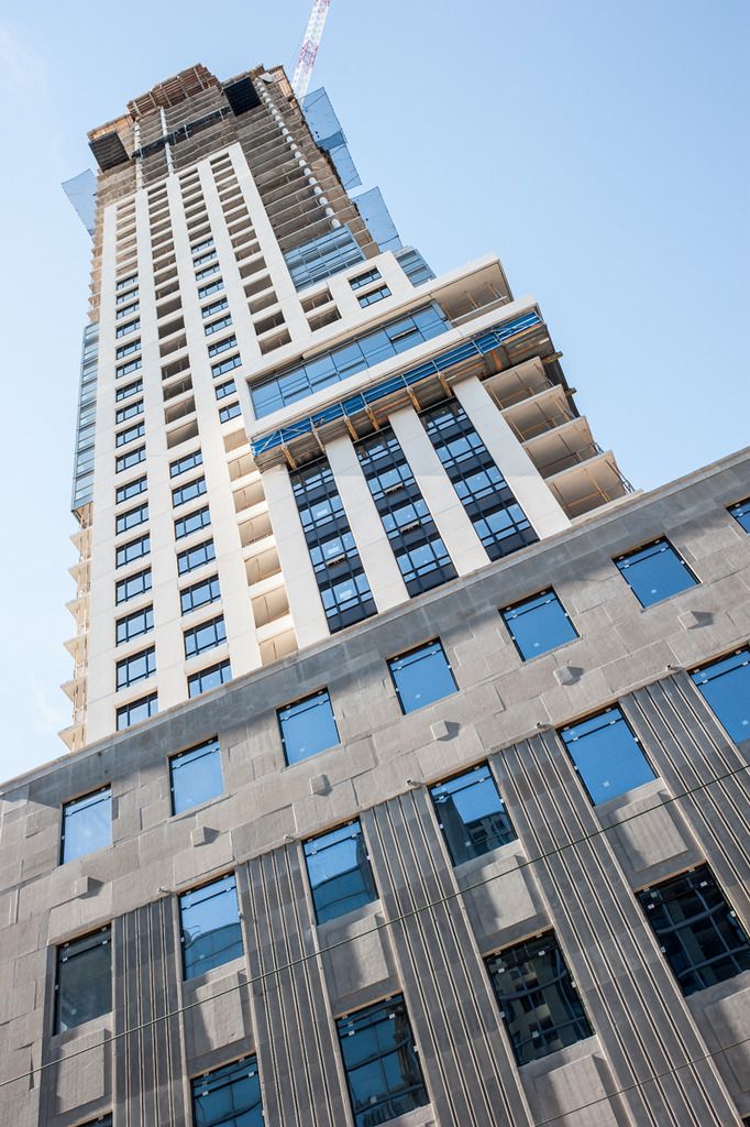
Please tell me the stone panels are still to be tightened in their place because, right now, it looks like crap. The glass on the indent would look so much better if it was setback behind the heritage facade. A dozen little things and a couple big things has the design here relegated to the ho hum category.
modernizt
Senior Member
The stone veneer cladding on the heritage component is indeed looking pretty shoddy. If I was from Concert, I would not be satisfied with that work.
Ramako
Moderator
The stone veneer cladding on the heritage component is indeed looking pretty shoddy. If I was from Concert, I would not be satisfied with that work.
If you're hiring Page+Steele to design your building, you probably don't have the highest standards in the first place.
