TheSix
Active Member
Anyone else notice that Concert pulled their sloppy logo application from the crown? Sorry if this was already mentioned in the thread.
Yea, it was mentioned a few posts backAnyone else notice that Concert pulled their sloppy logo application from the crown? Sorry if this was already mentioned in the thread.
First time posting. I hope I don't get lambasted...
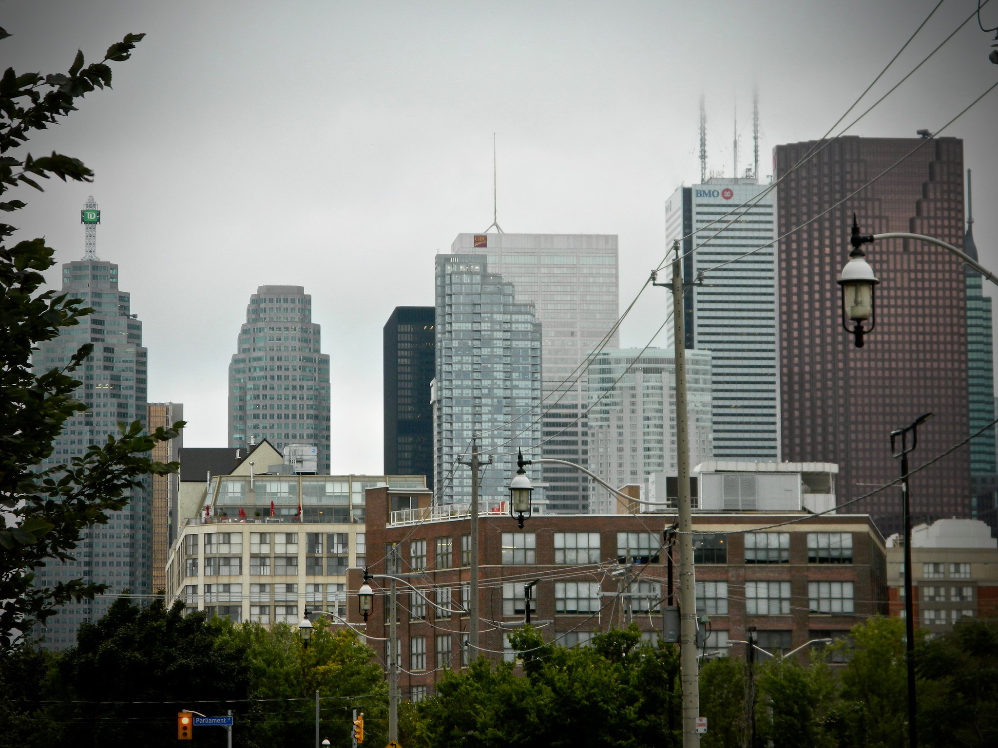
This is a great pic of Toronto's new downtown density - I really want to visit the city soon.
That shot is of downtown's arguably best neighborhood, so I'd strongly recommend you check it out.First time posting. I hope I don't get lambasted...
This is a great pic of Toronto's new downtown density - I really want to visit the city soon.
Great view! It is a shame about the crown lighting, a missed opportunity (where as Tridel finally got it right with 10 York).Taken Aug 23
View attachment 154478
First time posting. I hope I don't get lambasted...
This is a great pic of Toronto's new downtown density - I really want to visit the city soon.
Great view! It is a shame about the crown lighting, a missed opportunity (where as Tridel finally got it right with 10 York).
I would say that it is still 'construction signage' and assume it will go once the building is occupied.
