The Lorne Building is definitely a gem and definitely worth preserving. The rest of the project is great too but I'd also like even more attention brought to the structural elements.
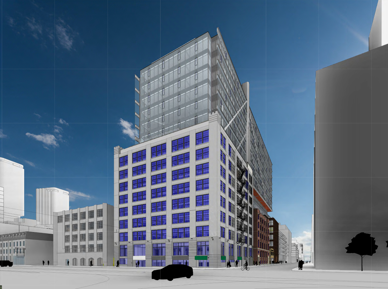
 
I support every part of this latest revision... except this part:
Screen Shot 2020-08-31 at 10.36.30 PM.png
 
There is still something not quite right about the tower - and I am not sure if this iteration is the right direction. Granted, it is sleeker - but it also felt less "essential" and lacking in visual heft to make a statement.

AoD
 
I wonder if it would help people's conception of what's going here to just eliminate the two buildings underneath? Bad illustration but it kinda helps illustrate the herculean structural gymnastics at work:

Pages from viewSupportingDoc (8) 1.jpg


It also seems they've redesigned the podium on the west side. It's a far more detailed and complicated form. No indication of materiality yet (unless I missed it in the notes) but this could be very special. Very much worth downloading and zooming in.

viewSupportingDoc (4).jpg
 
Agreed, the westernmost part of the podium looks really promising. Some interesting curves on the facade in there when you zoom in.

Other cool tidbits from the latest document drop:

There's actually a second set of columns for the mast structure, sharing the same bases but canted inwards. The pedestrian walkway between the buildings is going to be a pretty dramatic space with these columns going up for a full eight storeys above.
Screen Shot 2020-09-02 at 12.00.46 AM.png


The landscaping plan proposes a whole lot of pavers in a diagonal pattern, with diagonal bench seating in the east-west laneways.
Screen Shot 2020-09-02 at 12.07.16 AM.png
 

Back
Top