You are using an out of date browser. It may not display this or other websites correctly.
You should upgrade or use an alternative browser.
You should upgrade or use an alternative browser.
Rascacielo
Senior Member
Today
UrbanOzz
Active Member
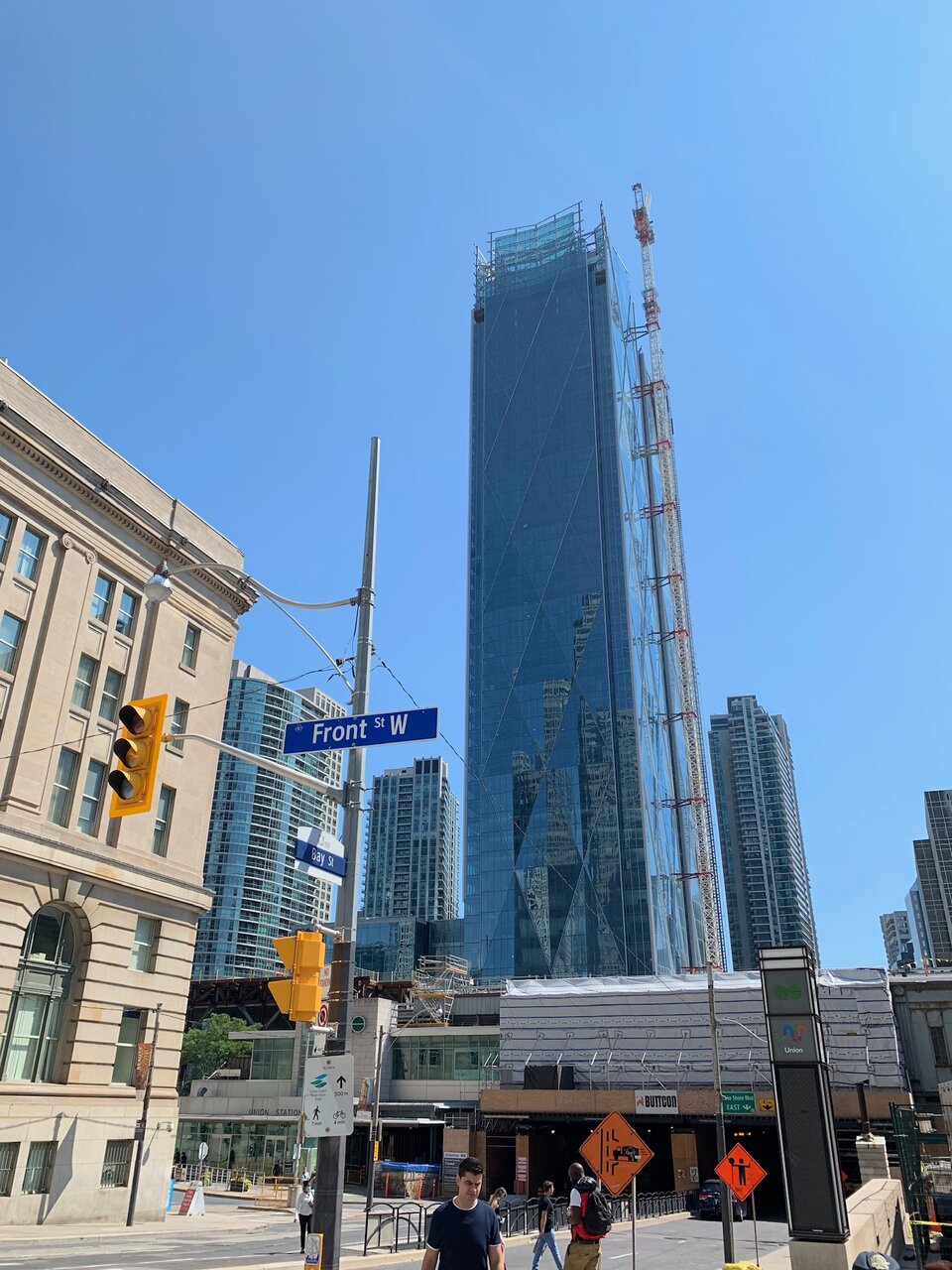
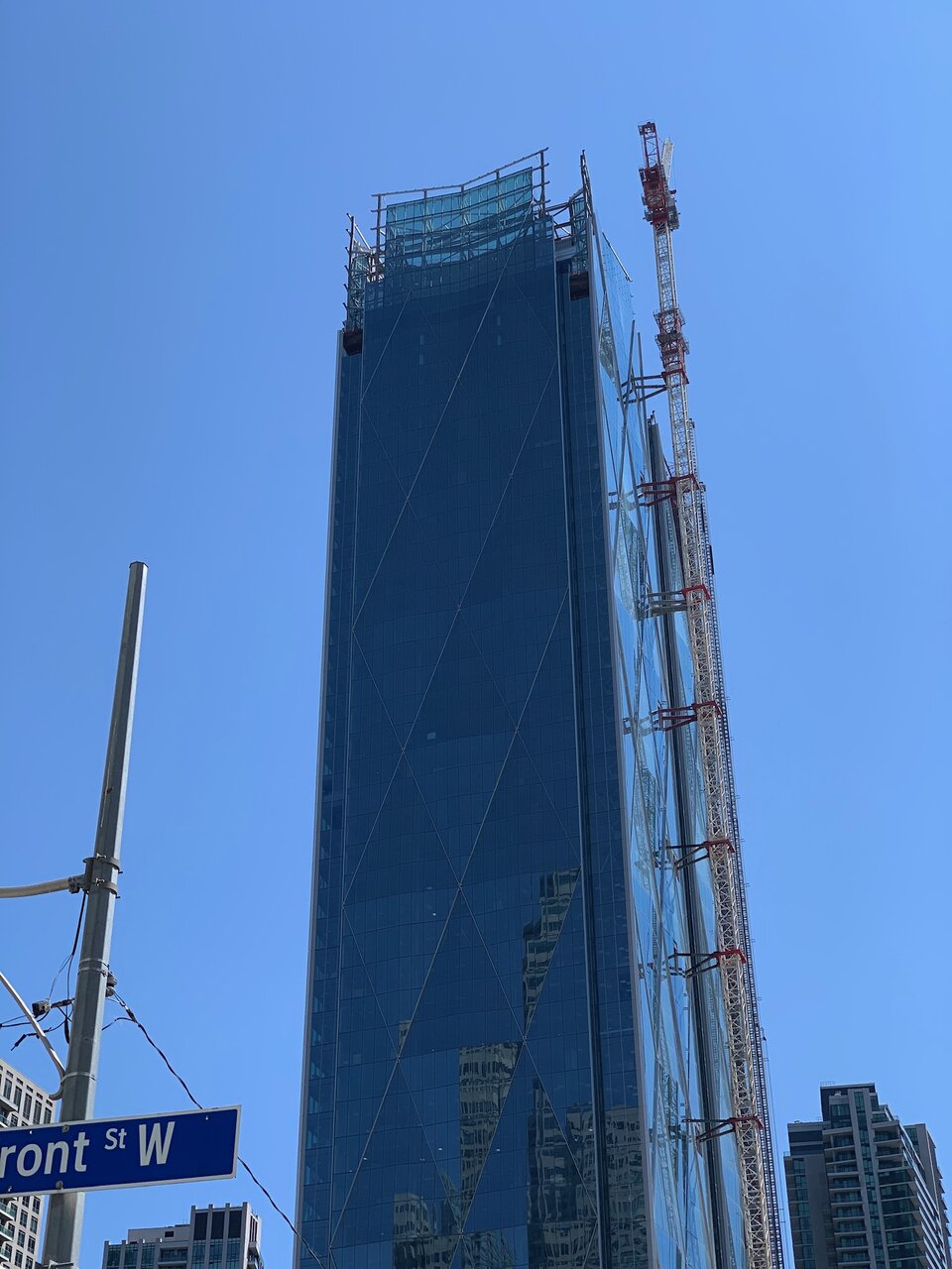
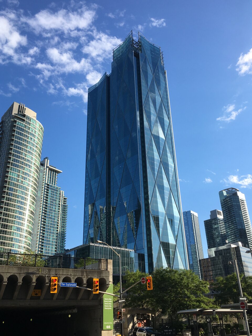
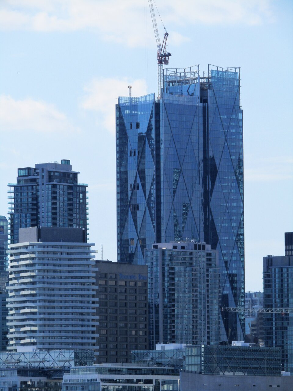
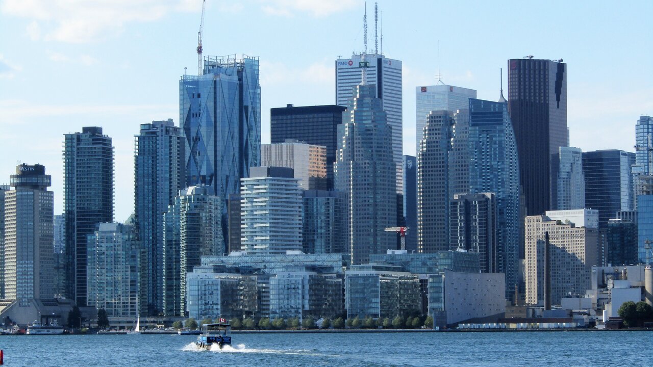
Call me crazy but i'm not a fan of this thing at all. It's way too fat. They need to slice it down the middle. Because of the width, it looks stubby and when you're driving in from the east, it just looks like a massive wall of glass and i'm terrified to think what it'll look like once tower #2 looks like if it's identical to this one. i appreciate the textures on it but that's the extent of it.
smably
Senior Member
Offices need big floor plates. It would not have worked as four towers. Whether the massing could have been broken up better is an open question, but it was never going to be more than two towers.
Riseth
Senior Member
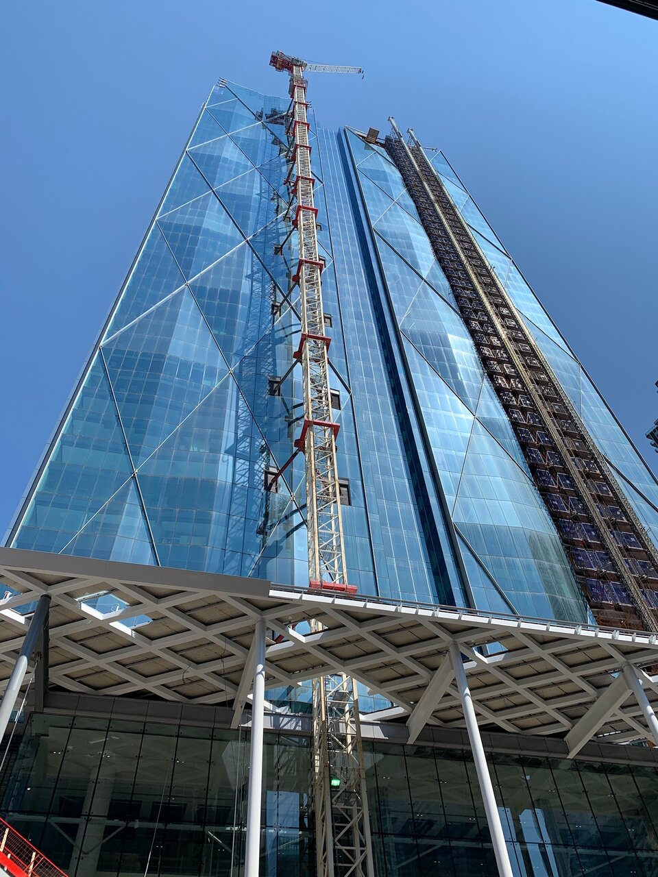
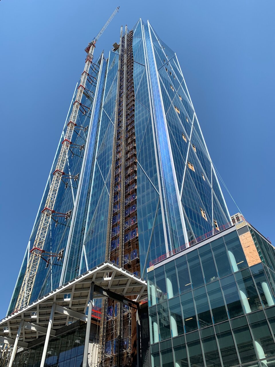
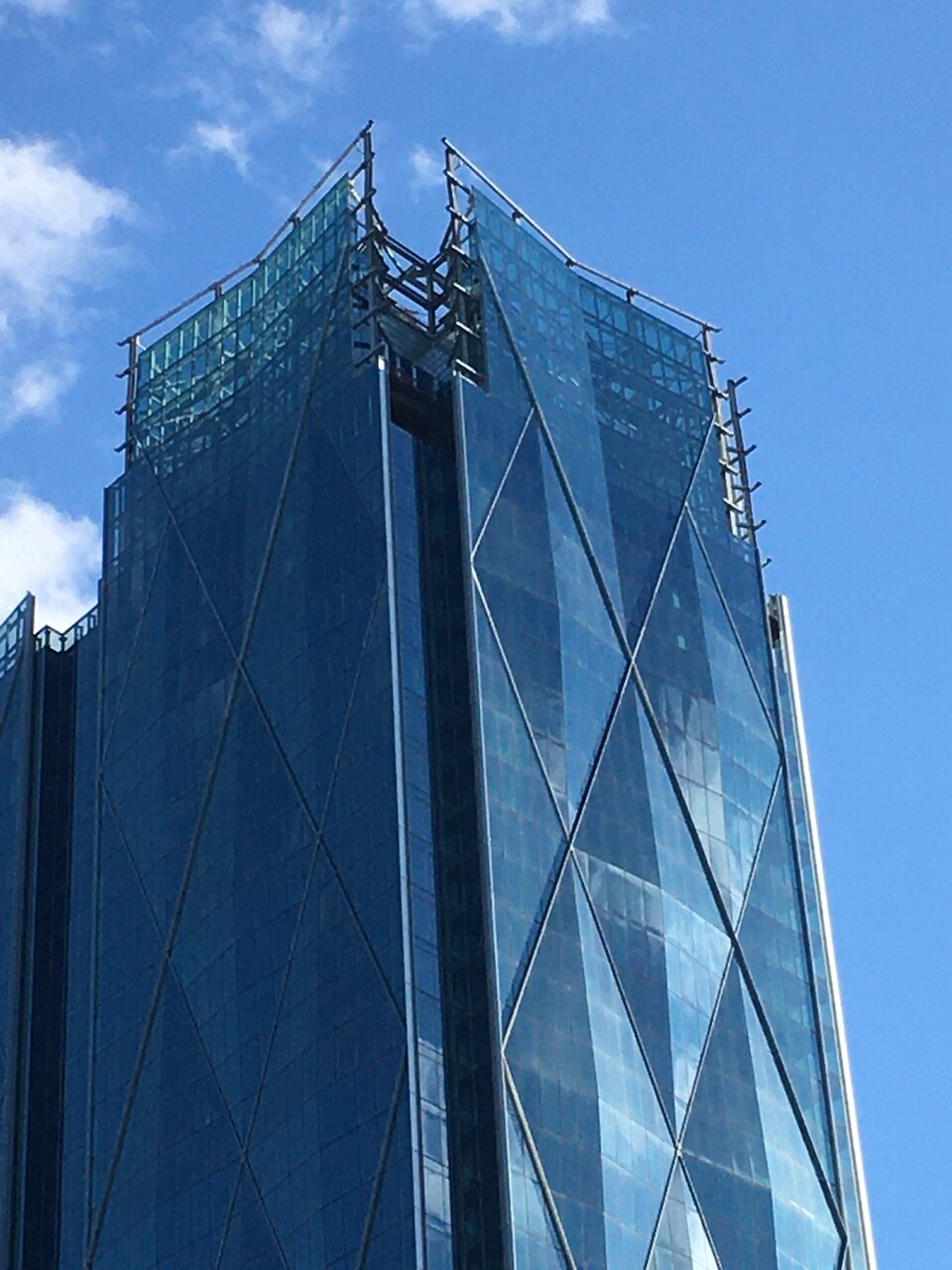
If it had lighter glass down the middle it would help to mitigate that effect. It's still a handsome tower and the diamond texture is stunning, especially on sunny days.Call me crazy but i'm not a fan of this thing at all. It's way too fat. They need to slice it down the middle. Because of the width, it looks stubby and when you're driving in from the east, it just looks like a massive wall of glass and i'm terrified to think what it'll look like once tower #2 looks like if it's identical to this one. i appreciate the textures on it but that's the extent of it.
UrbanOzz
Active Member
Offices need big floor plates. It would not have worked as four towers. Whether the massing could have been broken up better is an open question, but it was never going to be more than two towers.
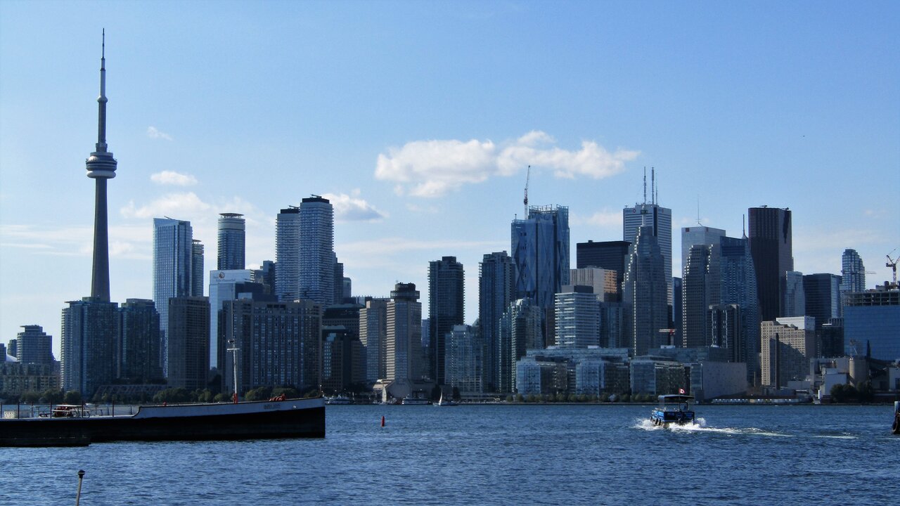
for sure I get that. I'd be happier with 2 thinner towers. I get they need larger floor plates but this thing is way fatter (at least optically) compared to towers around it. Even in the skyline shots it looks way fatter than FCP and it's amplified driving in from the east.
old boy
Senior Member
There seem to be a lot of twin towers in Toronto. This project takes the cake for now.for sure I get that. I'd be happier with 2 thinner towers. I get they need larger floor plates but this thing is way fatter (at least optically) compared to towers around it. Even in the skyline shots it looks way fatter than FCP and it's amplified driving in from the east.
daptive
Senior Member
There’s so many twin towers! South core alone has ICE, Harbour Plaza, Sugar Wharf, and King West has Theatre Plaza, King Blue, and Nobu.There seem to be a lot of twin towers in Toronto. This project takes the cake for now.
Rascacielo
Senior Member
Today
kotsy
Senior Member
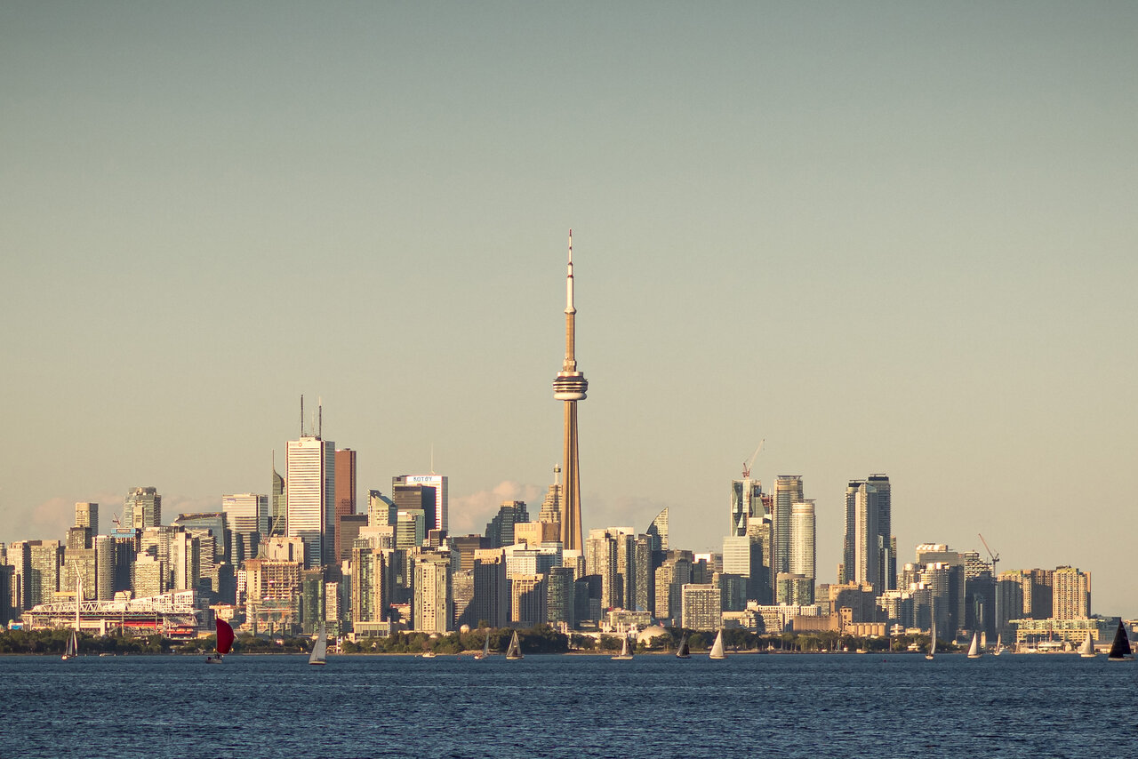
Zoomed in from Whimbrel Point in Etobicoke.
ushahid
Senior Member
Kotsy is the lead tenant of CC. 
innsertnamehere
Superstar
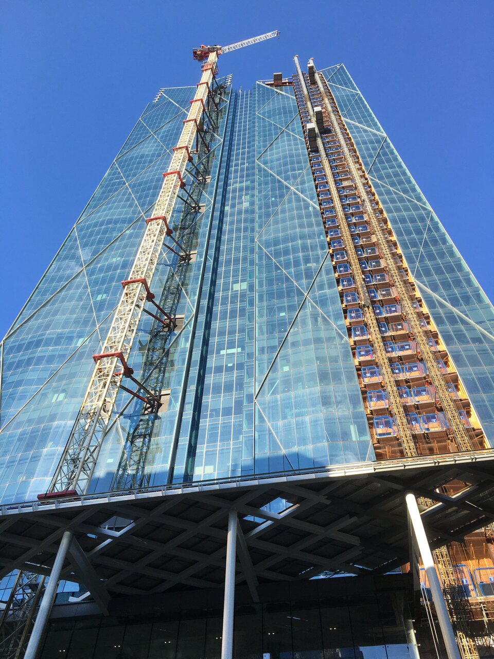
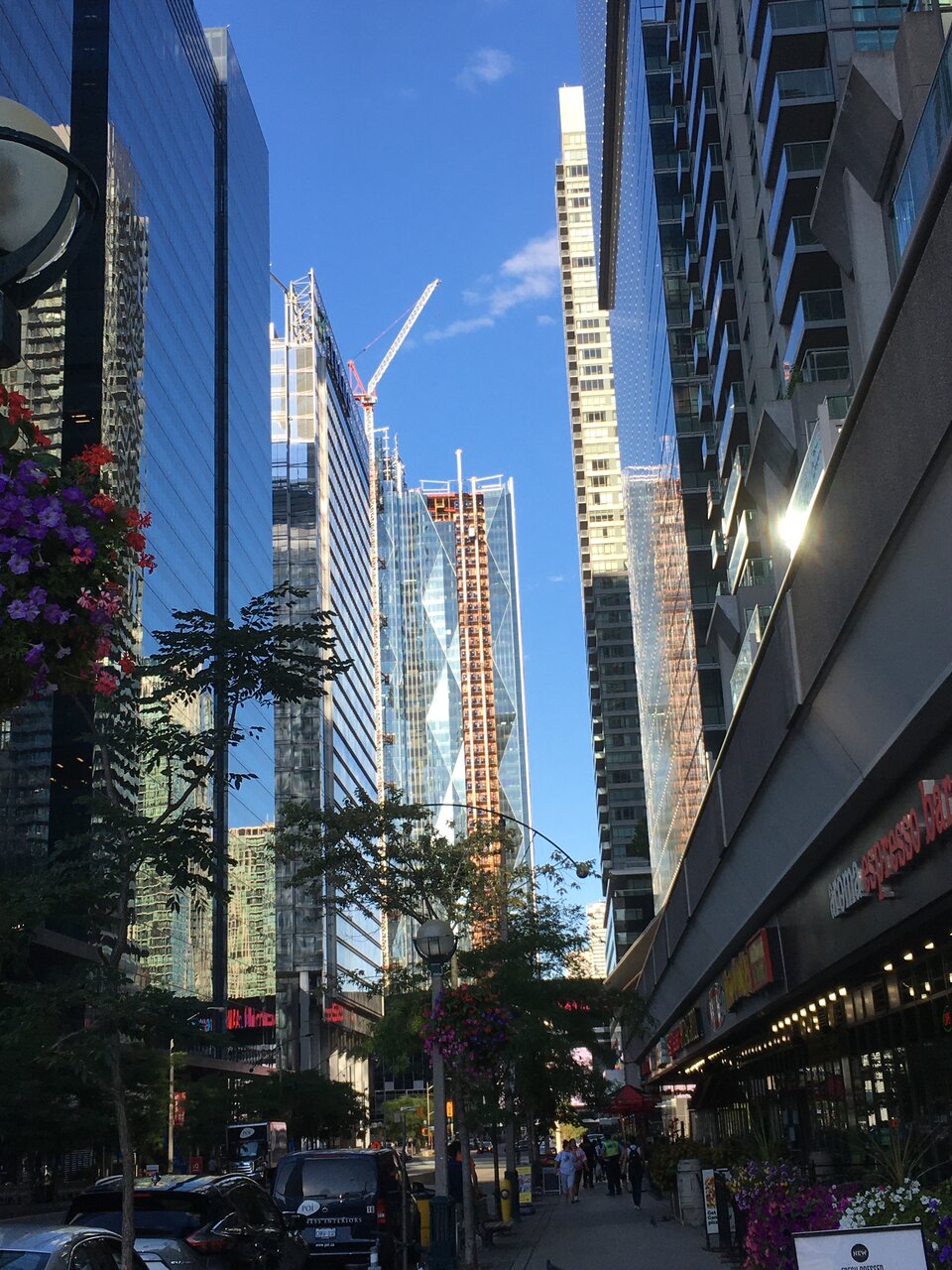
Shouldn't be long now until the crane is taken down.
someMidTowner
¯\_(ツ)_/¯
Benito
Senior Member
Today.
