steveve
Senior Member
Yesterday:
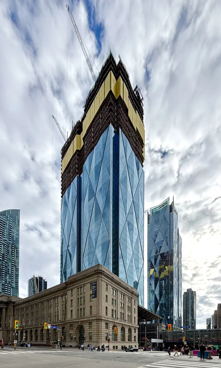



Sugar Wharf and Canada House really show their balcony designs from distance,
It just looks messy and unsophisticated IMO.I'm not a fan of either. They're supposed to be "clever" but they clash with a bold skyline.
I'm not a fan of either. They're supposed to be "clever" but they clash with a bold skyline.
Former looks ugly as sin at the end of the day, IMO. While the latter captivates and tantalizes all in good ways. Kinda like night and day, really.My problem with Sugar Wharf isn’t even that they’re bold or clash (which I think can be a great thing ie Scotia Plaza), my problem is that they’re disingenuous and merely illusions.
CIBC Square is a great anti-example of this. Its diamonds aren’t just patterns printed in the glass but dimensional shapes that are affected by light!