isaidso
Senior Member
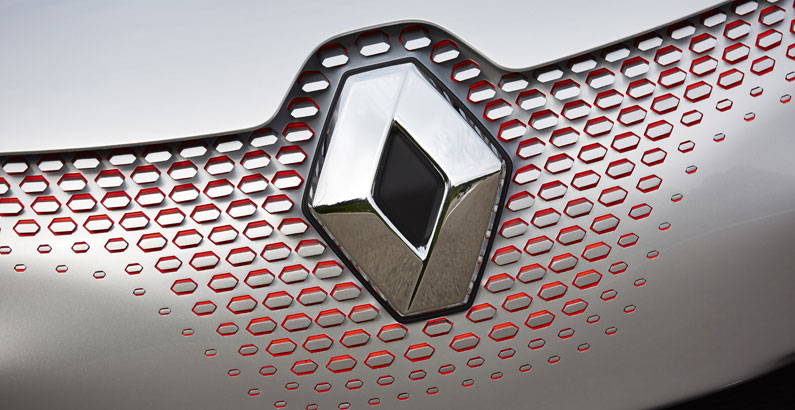
One could argue that Renault should have come up with their own logo in 1972 instead of using something so similar to CIBC's old 1966 logo. The 1966 CIBC logo was a open ended hollow diamond.

 1000logos.net
 www.renaultgroup.com
CIBC Logo and symbol, meaning, history, PNG
CIBC Logo PNG CIBC is a short name of the Canadian Imperial Bank of Commerce, which was established in 1961 in Toronto. Today the bank is considered to be one of the largest and most reputable in its country and provides such services as banking and financial consulting not only in Canada but...
120 years of brand identity - Renault Group
Back to 120 years of logos and brand identity that have changed our company with its times.
Last edited:
 CIBC's new logo reminds me of something
