Nope, you're not alone. I also appreciate the unique look and cladding of this building. I also love the fact that it's not a mass of ugly, grey spandrel.

Too many people on this site, seem to be happy to have one grey box, after another and anyone who tries something different, is harshly criticized but build another grey box and everyone will justify their praise. Sadly, non-conformity and creativity are just not appreciated by many on here. Just watch the reaction when a developer builds a building with vibrant colour. You would think the sky was falling down.

Grey, beige, black and white, are the only acceptable colours and god forbid, the building contains any decoration at all. Art is a no-no. Another grey, spandrel box by aA, on the other hand, is A OK.
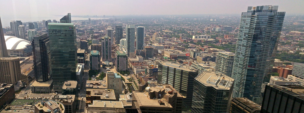
 
No you have it wrong. I criticize the "art" of the dressing not the material nor its colour--although yes some materials and shades of colour are worse than others. Here, everything is all "wrong." It's a hulking suburban big box store idea of a building (like saying an Ikea store is cool because it's blue.) Terracotta cladding could look cool, but you gotta get the design right from the start. This development is like buying a yellow Toyota Corolla--oh sure it's got colour but it's still a lemon.

There is no "art" here. Try Picasso on Richmond for starters....

This is Adelaide Street West's "McMansion" moment. Gaudy, tacky, clumsy and inappropriate for its context.
 
Last edited:
I guess I'm alone in actually liking this building... I find the podium to be a refreshing colour and type of material, albeit a little poorly executed.

I personally think this tower saved this block. While the cladding on Pinnacle is of superior quality, the overall form is bland. Festival Tower does nothing for me either, with its anemic window wall glazing. Even though the materials are not top-quality, Cinema has some character, which seems to be a dirty word on UT. Each to their own though I guess.
 
That's because too many people on this site are fine with more and more grey boxes. Anything out of the ordinary is just too off putting for them. Decoration and colour must only be restricted to art galleries. Eccentricity, exuberance, whimsy and especially charm, are dirty words. lol Didn't you learn that in architecture class?
 
^^ Funny you should say that given the overwhelming popularity of L Tower. UTers want character, out-of-the-ordinary, decoration, colour, eccentricity, whimsy and especially charm done right.
 
That's because too many people on this site are fine with more and more grey boxes. Anything out of the ordinary is just too off putting for them. Decoration and colour must only be restricted to art galleries. Eccentricity, exuberance, whimsy and especially charm, are dirty words. lol Didn't you learn that in architecture class?

You really couldn't be more off the mark with this analysis. The buildings that are often derided here are the beige/seafoam/grey spandrel and window wall nightmares that clutter our skyline (think Kirkor, Page + Steele, G+C, et al).

If you paid attention you'd notice that unique design, colour and high quality finishes are commonly praised. Look at Teeple and their funky shapes and use of colour, playful balcony designs by aA, RAW's use of colour and shifting forms, and designs by D+S, Hariri Pontarini, or Quadrangle's more playful work. Cinema is a generic as the rest of the schlock, but it fools the lazy viewer with its easy-sell curves* and attempt at infusing colour.

*credit to Urban Shocker for the "easy-sell curves" term.
 
One of those odd exceptions where a building looks more beautiful up close than from a distance. At the street level I respect the curve of the tower, scaling and attention to detail. From afar it looks rather lifeless.
 
One of those odd exceptions where a building looks more beautiful up close than from a distance. At the street level I respect the curve of the tower, scaling and attention to detail. From afar it looks rather lifeless.

Huh? You mean like the discolouration on the podium cladding?

pTz7s.jpg
 
If that discoloration stays I will be angry, and fill give this project a failing mark, but I still credit that to the fact that the condo is still under construction. If that is fixed, it really isn't that bad, and is actually a very nice way to clad a parking garage.
 
Yep they cleaned it ! It looks quite nice. I'm actually looking forward to the restraint !
 
Work on a couple entrances.

Pics taken July 11, 2013

JAm5QxU.jpg


C0hFeRW.jpg
 

Back
Top