DarkSideDenizen
Senior Member
Wtf? T.O. Just got "Powned"..
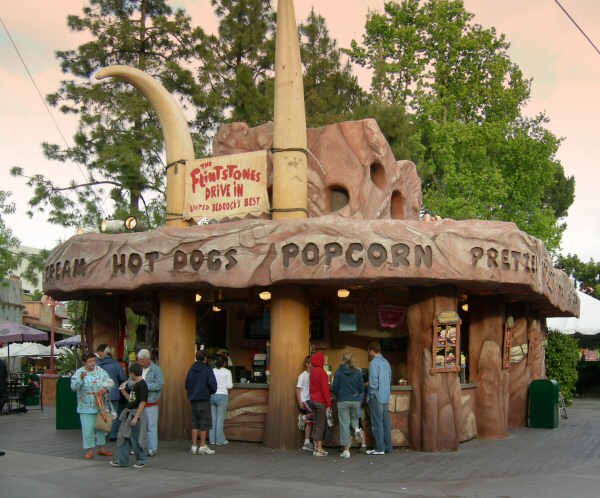
WOW. That looks like an entrance to a roller coaster ride. What's worse, it looks like it's made out of styrofoam!Original renders:
Actual:

WOW. That looks like an entrance to a roller coaster ride. What's worse, it looks like it's made out of styrofoam!
I would seriously hate coming home to a cave like entrance like that. What a shame.
CINEMA TOWER’S INNOVATIVE PUBLIC ARTWORK
Posted on October 5th, 2011
Like many cities across North America, Toronto has a Percent for Public Art program. This means that every new development must devote one percent of construction costs towards an artwork that may be enjoyed by the public.

You know who lives on the other side of that entrance?