Yup, truly awful redesign. Now if only the effects of the downturn could be focused on particular projects while leaving those around unscathed, this one would be square in the sights of my bad economy gun.
42
42
Yup, truly awful redesign. Now if only the effects of the downturn could be focused on particular projects while leaving those around unscathed, this one would be square in the sights of my bad economy gun.
42
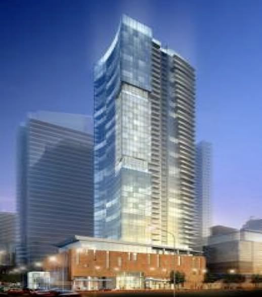


Yes of course, the second picture is just stretched ... I'm not sure where all the hate for this project is coming from.
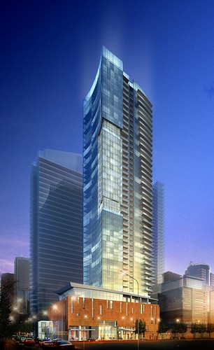
For one, while yes it does exhibit box light qualities it does have a few unique features that will make it stand out (slightly) ... yes it won't be an eye turner. Secondly I'm really like the base - it works well with the area and would be unique in Toronto particularly if that color shown in the rendering is actually used.
So while yes this isn't amazing or revolutionary it can still turn out very nice.
Why all the hate?
are we sure it's not just a stretched image in that pdf?
It's just an odd mish-mash that doesn't really work.
It is stretched. I thought it was funny that people were judging the render based on that image, when just the page before we had a nice quality image.
How sure are you that people were *only* judging the render?
Is it me, or does this tower look alot chunkier than the proposal?
Comments like that
I was referring to the proposal in the pdf link I attached, with the curved base and tower; NOT the attached image.
From what I could see in the pdf, the base varied from 6s to 12s, then the tower to 44s.
I did not see any staggering of levels in the new version.
Odd == different == beautiful
But that's all relative
I agree that the podium and tower lack some cohesion - but I actually like that in this case. Either way - if you judge the separate elements on their own it can still may for a very very nice tower ...