Red Mars
Senior Member
Aug 11, 2022
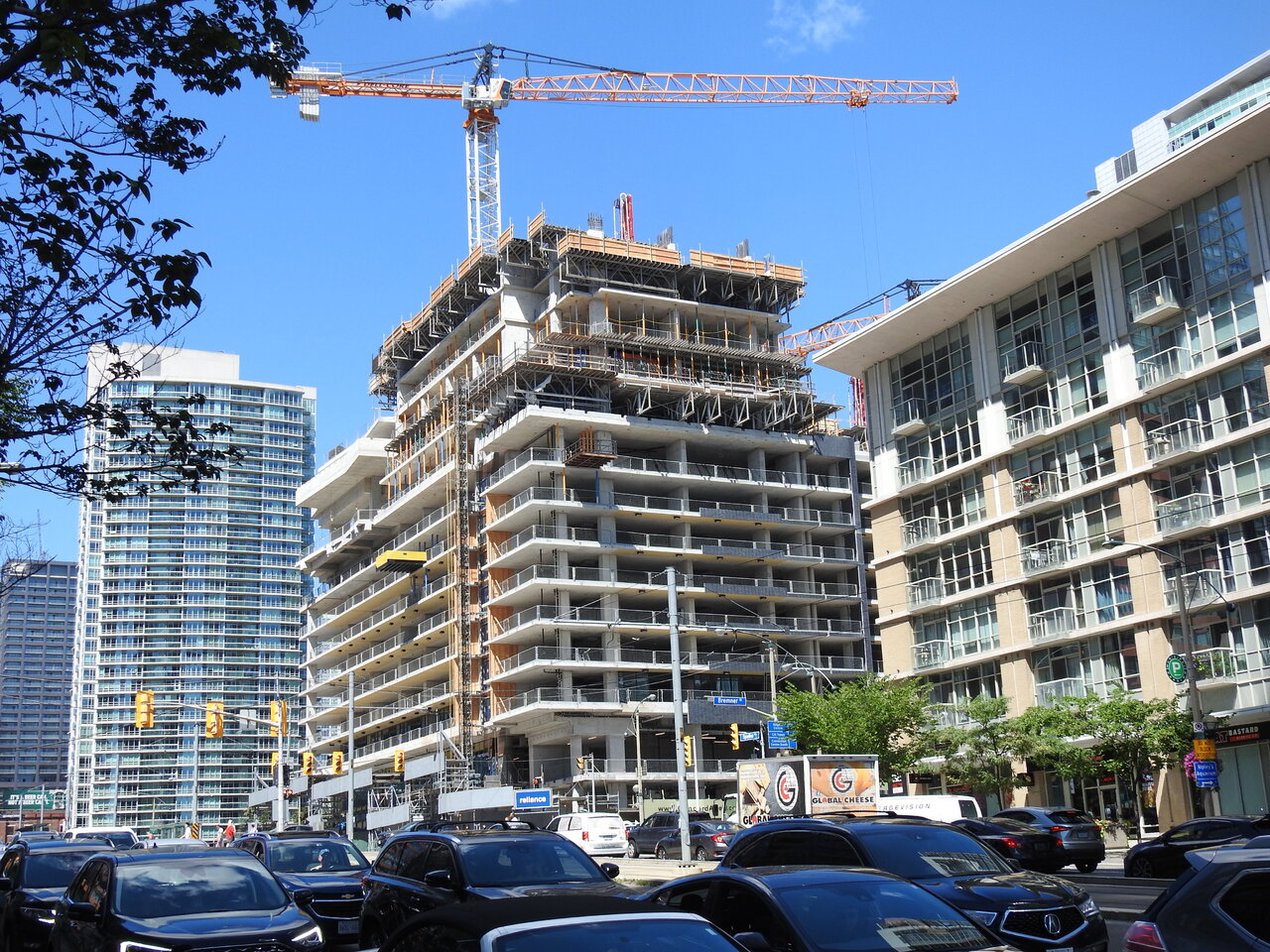
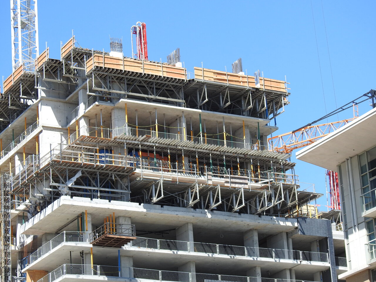
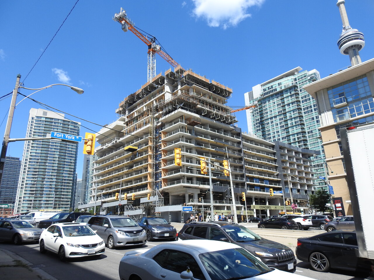
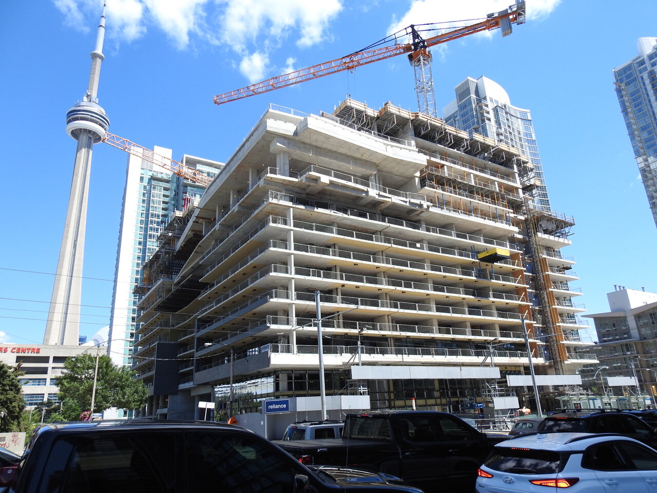
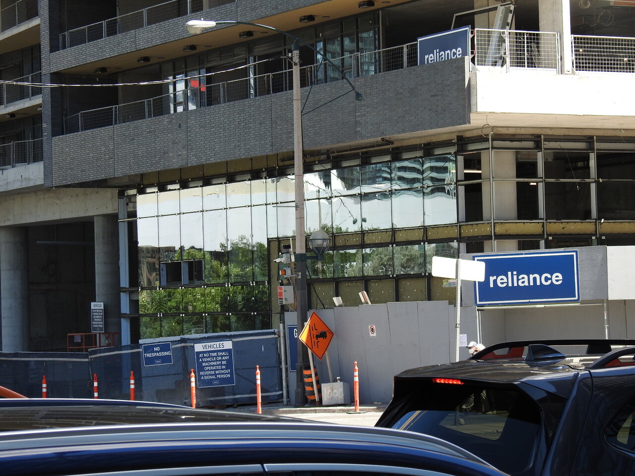
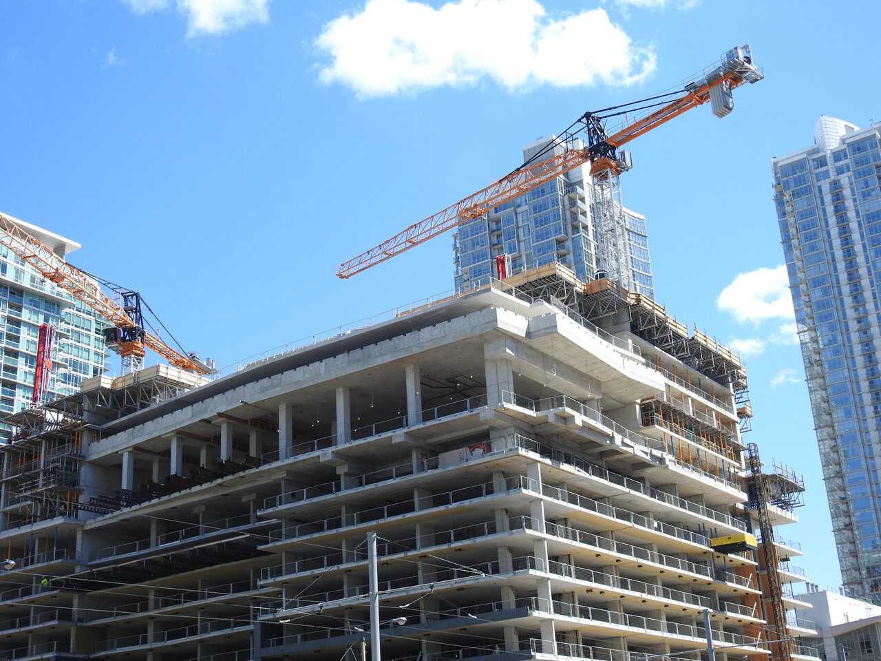
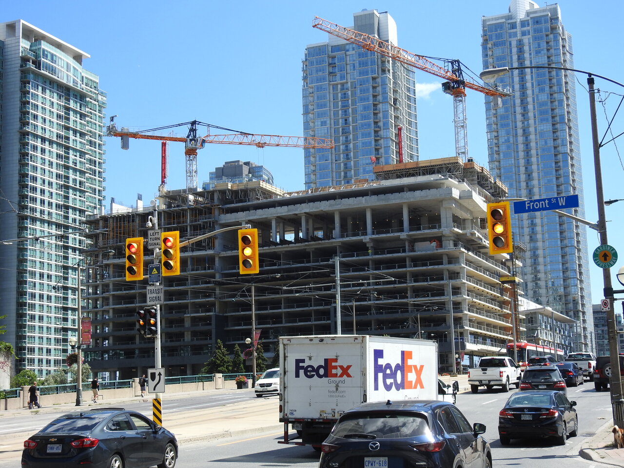
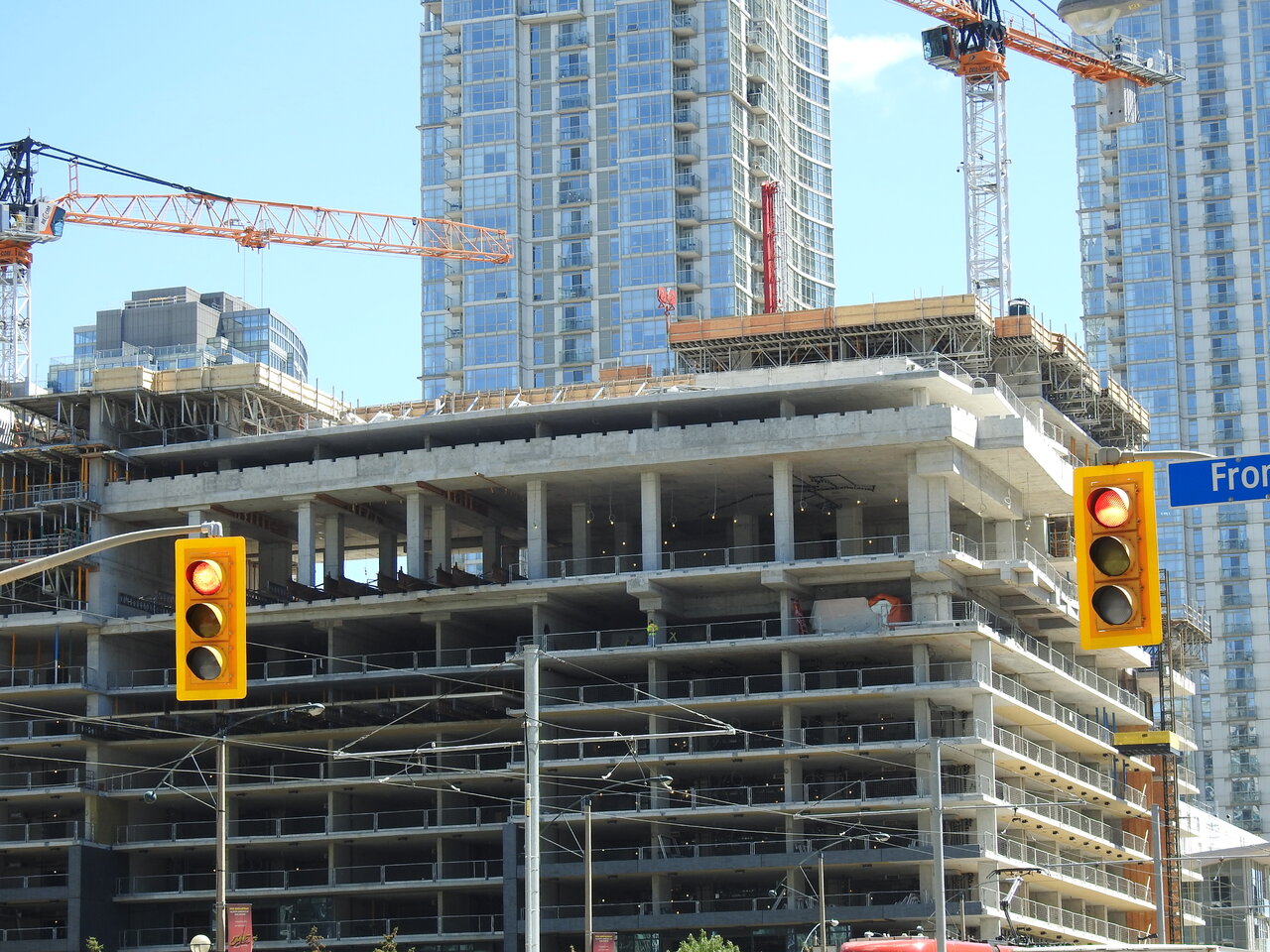
Which part? The only major thing that is apparent right now is its big hefty podium.I know everyone never gave the project a chance because it was Concord, but so far I'm liking it.
Which part? The only major thing that is apparent right now is its big hefty podium.
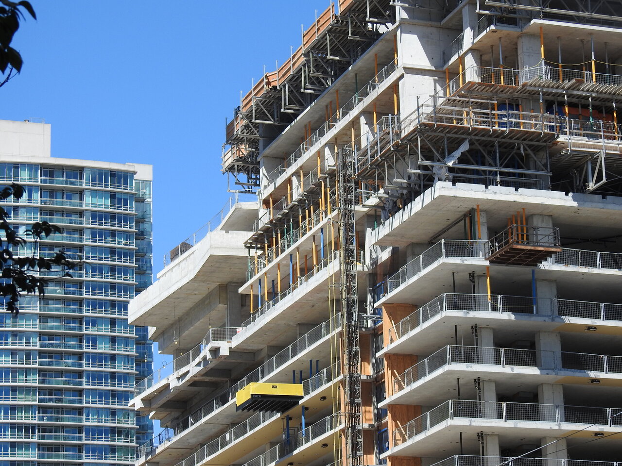
It’s all just paint on the concrete slab, with a black trim to finish off the edges. I like the pop of colour the yellow adds, but yea - it’s so off from being wood tone.Ugh, that yellow paint they used for the balcony soffits look horrible. Doesn’t even look anything close to a wood tone.
Is the wood-textured panel made of aluminum or something similar to Hardyboard? Or even worse, is it merely paint on concrete that has a casted texture? (Which looks to be case in some of the photos)
On the positive side, from a distance the yellow paint will bringing a little bit of warmth to the mostly grey exterior.
Lol prepare to be disappointed very shortly. It's Concord, they never pleasantly surprise with anything.It's the dark brick cladding I like. I just can't stand all the blue/green glass rectangles all over this city.
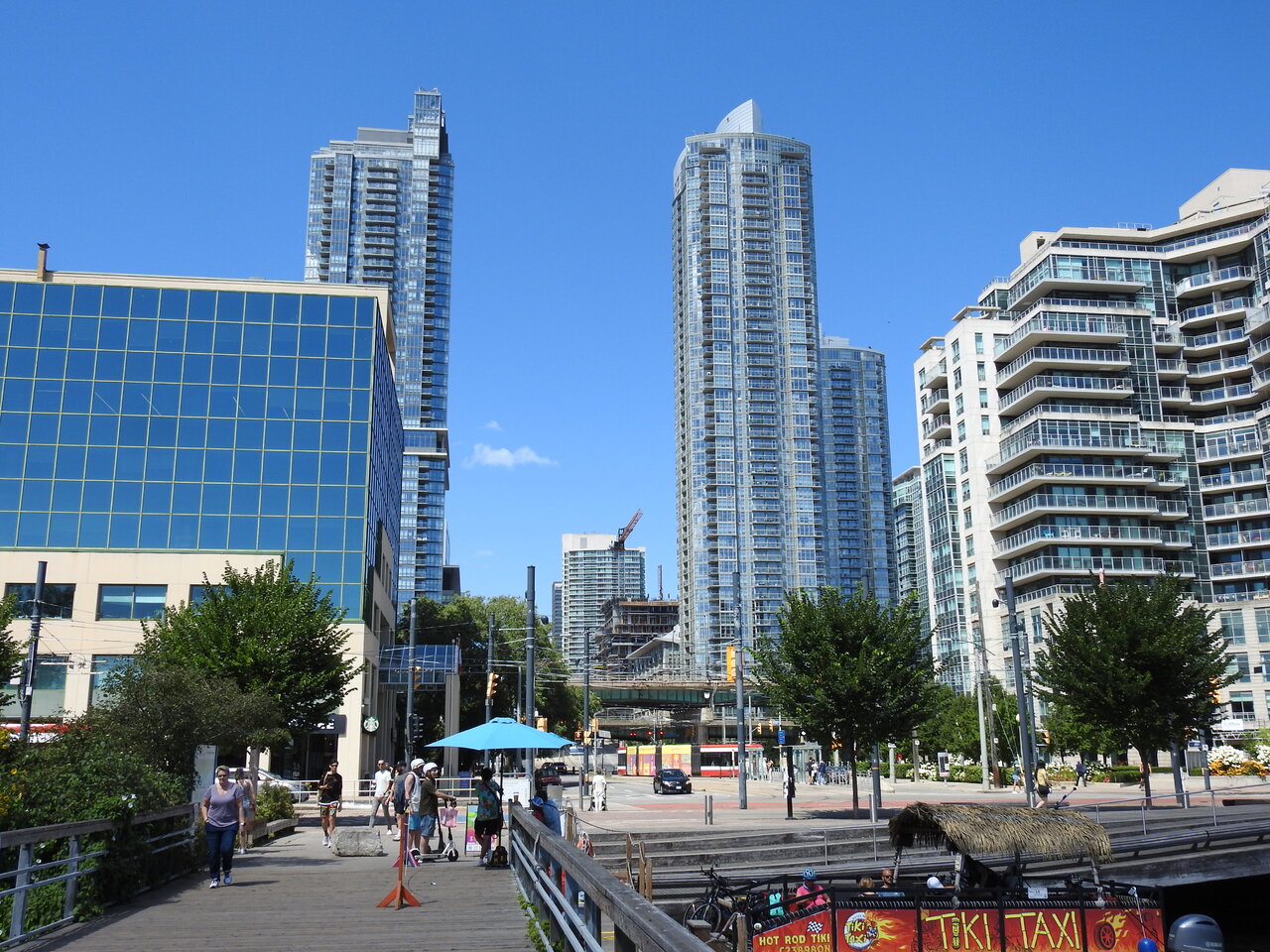
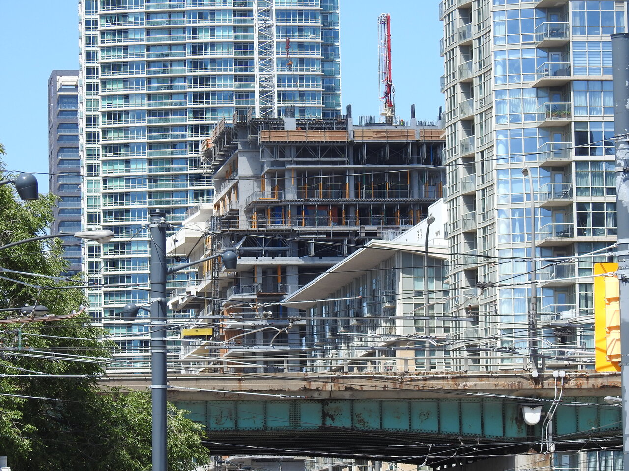
This is an interesting vantage point. The view may even improve once this 'signature' building rises above the monolithic sameness of its immediate surroundings. One can always hope.