August 24, 2022

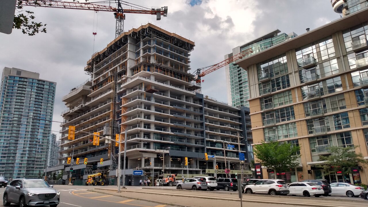
IMG_20220824_172038658_HDR.jpg


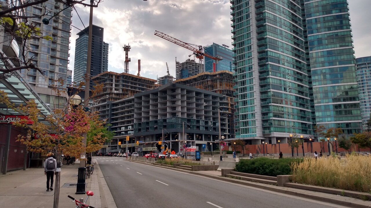
IMG_20220824_172729547_HDR.jpg
 
So far this thing is looking great and proving most people wrong.
This is the podium levels though, where more expenditures for materials are usually allocated. I mean talk about judging a book by its cover...
 
This is the podium levels though, where more expenditures for materials are usually allocated. I mean talk about judging a book by its cover...

Still looking good so far...just saying....

If we're going to throw the phrase "judging a book by its cover" around, at least I waited for it to be somewhat built as opposed to people judging it by its developer's name or simple renderings.
 
Last edited:
Err...there's still a lot to be built though. I'm holding judgement until I see what they they'll do with the towers.

...besides, it's okay to like what you so far. But that doesn't prove others where wrong or anything. /shrug
 
I mean, it's not bad so far. Not bad means it could also be better.
 
I can't believe I'm agreeing with @C-mac here, but I would like to hear from any detractors: what so far have you seen that's 'bad'? This is all pretty calm and well detailed.
I think a big part of the issue is that CityPlace is such a homogenous collection of window wall-clad towers and this is just 74 more storeys of the same. It feels like a wasted opportunity for what should've been the "signature" piece to the whole area. It's not necessarily bad, but it sure ain't a landmark.

Also personally, I'm so tired of charcoal brick. At this scale the podium is very dark and overwhelming.
 
Watching this rise enables us to gauge with increasing accuracy where on the ugly-scale this is going to end up--1 being something like Aura, and 10 being along the line of the Ryugyong Hotel in N Korea before the glass was added..
 

Back
Top