innsertnamehere
Superstar
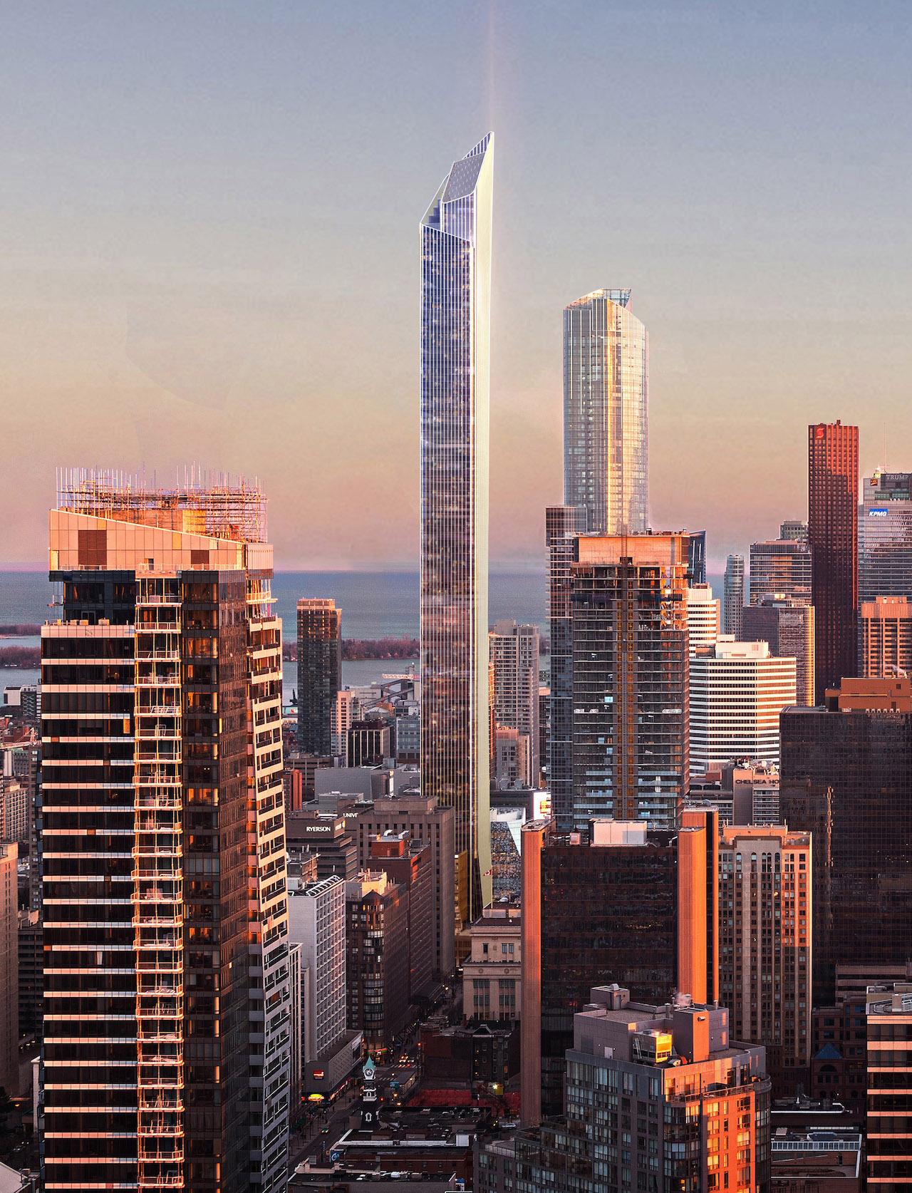
updated rendering:;
/cloudfront-us-east-1.images.arcpublishing.com/tgam/AWZFGJKUKJG3XNTRT7BRBBIPYY.JPG)
/cloudfront-us-east-1.images.arcpublishing.com/tgam/AWZFGJKUKJG3XNTRT7BRBBIPYY.JPG)
/cloudfront-us-east-1.images.arcpublishing.com/tgam/AWZFGJKUKJG3XNTRT7BRBBIPYY.JPG)
/cloudfront-us-east-1.images.arcpublishing.com/tgam/AWZFGJKUKJG3XNTRT7BRBBIPYY.JPG)
Oh my god if this is what the renderings look like then when it's all said and done Aura is going to be the crown jewel of the two. This is an absolute disgrace, we somehow went from this (below) to that (^):Ugh, it will blend right in with Aura.
/cloudfront-us-east-1.images.arcpublishing.com/tgam/AWZFGJKUKJG3XNTRT7BRBBIPYY.JPG)
Source: https://www.theglobeandmail.com/res...shing.com/tgam/AWZFGJKUKJG3XNTRT7BRBBIPYY.JPG

Oh my god if this is what the renderings look like then when it's all said and done Aura is going to be the crown jewel of the two. This is an absolute disgrace, we somehow went from this to that:

Aaaaaaaaaand here we are!Don't worry, Concord will surprise us with the best aesthetically designed tower in North America based on their atrocious work at City Place
This is definitely over 305 meters... only positive about this...thats ugly, mechanical levels at the top are loaded with Spandrel. it appears to be taller than 300m now or is it just renders?
Wow did you have a sneak peak at the renders or something because this is on point.If you want to see the new renders before they are released, I have a quick solution. Open your trash can. Mentally enlarge the contents you see inside to 299 meters. Voila!