mburrrrr
Senior Member
As good as it gets.


The sidewalk is clear again.

The sidewalk is clear again.
As good as it gets.
View attachment 286892
View attachment 286893
The sidewalk is clear again.
View attachment 286894
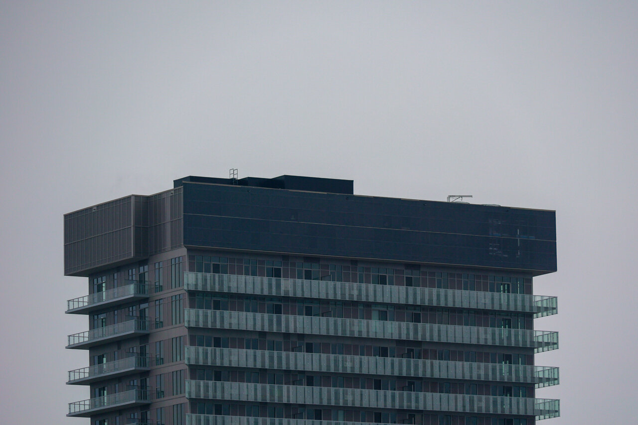
Ew... What is that on the right side of the crown? Looks kinda scratched upAs good as it gets.
View attachment 286892
View attachment 286893
The sidewalk is clear again.
View attachment 286894

If the tower use this colour scheme instead it would be an improvement, IMO.Why did they choose beige panels?
This project has really brought UT together. I'm not sure there's ever been one as universally agreed upon/despised.
And for the record the black cap looks ridiculous.

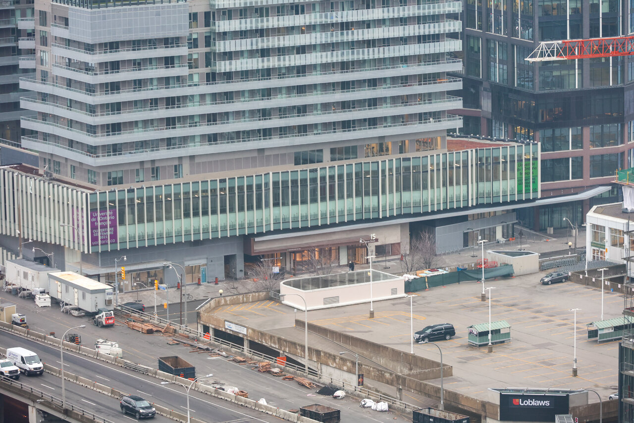
It's been noted previously in this thread that the developer and architect ( grudgingly, I suspect) were going to concentrate resources on the lower portions of the project - the warning signs have been there since the beginning.It’s a shame the residential towers are just so *terrible*. The office component and first 3 storeys of the residential component are actually quite well done, and this has an excellent public realm. It’s almost baffling how those components were done so well then they just completely f*cked the towers so badly. Like... how?
IMO, if you could only do one - focusing on the public realm and lower floors is better for the city than creating a great-looking tower. Obviously we would all have preferred both.
There's no reason you can't have both.IMO, if you could only do one - focusing on the public realm and lower floors is better for the city than creating a great-looking tower. Obviously we would all have preferred both.
You are on point. This trash never should have been built anywhere near the waterfront. Also a greater use of stone/brick in this area like the office component would have done wonders. Just way too much glass around here.that's not an excuse. They could have made a far better tower with similar resources if they just gave a shit. They could have picked non-beige spandrel panels. They could have made the balconies fully wrap-around. They could have made the balcony design stronger/more opaque to better hide the spandrel. They could have made the crown blend in better with the balcony design.
Don't get me wrong, I'm a little bit mad that they didn't try to put more money into making a high-quality tower. But I'm WAY MORE mad that they couldn't even do the bare minimum to make their tower not look like complete shit. They could have been basically as cheap as they were and the tower could have been a C. Instead, it's an F.
For that, everyone involved ought to be ashamed of themselves.
It's a symptom of the huge growth and demand for housing in Toronto. Developers want to make money and it's cheaper for them to build these bland glass condos. They can do whatever they want and get away with it since it's their land and it sells. Throw in the enormous demand for housing in this city and you end up with trash like this all over the place.I know some of you seem to think the black is an improvement, but at least the old crown had the slightest bit of variation. This is merely a black stripe that in no way ties into the rest of the building.
As already mentioned if this doesnt have the Rudy Guiliani effect down the road I will be unbelievably surprised. Even if it is the slightest of improvements now, it will not be in a couple years.
Good god this thing is absolutely awful
(And yes I agree the public realm of this complex is good, even very good, which actually makes this even more of a shame)
It's a symptom of the huge growth and demand for housing in Toronto. Developers want to make money and it's cheaper for them to build these bland glass condos. They can do whatever they want and get away with it since it's their land and it sells. Throw in the enormous demand for housing in this city and you end up with trash like this all over the place.
Just a reminder that Pina Petricone pretty much put Daniels on blast during this talk for demanding an incredibly cheap building, despite the designers best efforts. Nobody should be surprised by how these turned out.
If financial sense is to maximise profit, then this thing was likely more about choice as opposed to "have to".Despite architect's best efforts, they were pretty much ordered to value-engineer the residential towers so that good architecture of the rest of the site would balance out with crappy architecture of the towers. Unfortunately the towers had to be this crappy in order for the whole project to make financial sense. It's the case of a sad financial truth. Makes me wonder if the Loblaws redevelopment at Lake Shore and Bathurst suffered the same fate.