AlvinofDiaspar
Moderator
The design of the towers makes me rather nervous.
AoD
AoD
Again what Daniels told us in January was rental in the eastern tower, not student residences. George Brown has just built a student residence in the West Don Lands that will be used for the Pan Am Games and then be transferred to GBC.
The design of the towers makes me rather nervous.
The more I see of this, the more disappointed I am. These buildings look so ordinary. I expect something on the waterfront to look different that the buildings going up in Scarborough but besides the animation at street level, it looks totally unremarkable and without distinction. I do appreciate the fact that it will be arts oriented but shouldn't an arts oriented building on our downtown waterfront show a bit more creativity? This design is just not good enough for this prominent location.
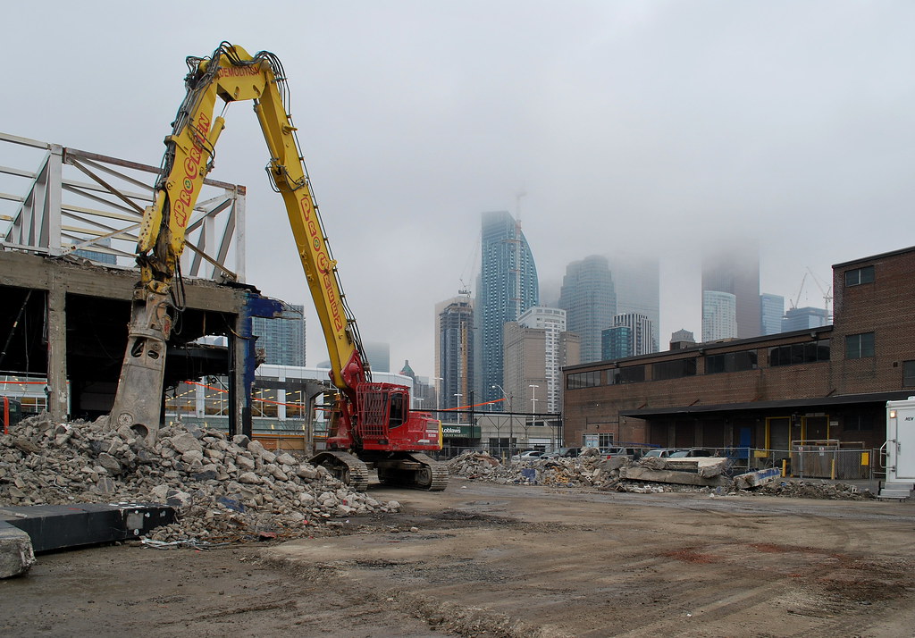
 Guvernment Demolition by Marcanadian, on Flickr
 Guvernment Demolition by Marcanadian, on Flickr
 Guvernment Demolition by Marcanadian, on Flickr
 Guvernment Demolition by Marcanadian, on Flickr
 Guvernment Demolition by Marcanadian, on Flickr
 Guvernment Demolition by Marcanadian, on Flickr
 Guvernment Demolition by Marcanadian, on Flickr
 Guvernment Demolition by Marcanadian, on Flickr
 Guvernment Demolition by Marcanadian, on Flickr


Somebody else is going to get the tab for them shiny new steel toe boots.
This is kinda like Monde: keep the podium, chop off the whole glass tower and I would have been happy.