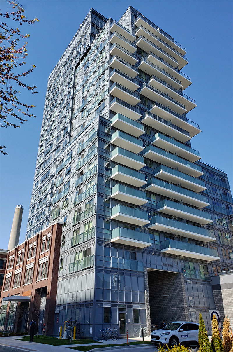
This building is so bad that Shiu Pong have to show an image of it's rear south facing side with glazed balconies, on its website:


designhaus.jpg
 
I still can’t get over how bad this building is. This was a huge missed opportunity to do something great, or at the very least something passable. Kirkor should at least be more sympathetic to the retained facade — the windows are not even correct to the era of that building (mullion pattern and colour) and the storefronts are in the same awful window wall design as the tower portion (the glass panels should be much larger and minimal mullions) which better suits the retail aspect. Looks like Kirkor was trying to (unfortunately) tie it to the rest of the building which is already a bad cheap mess.

What Kirkor and G+C is doing to our city is a crime, and they have no shame!
 
I'm a little scared that I'm going to start appreciating this ridiculous monstrosity for it being the iconic example of Toronto's spandrel borg cube on top of a beyond belief it's so hilariously bad facade preservation architectural moment. Like can there be a better example? Plus the irony and gall of the again beyond belief absurd name. A true symbol of this moment. This one's for the history books. In 40 years some sick architecture freaks like us may be talking in this thread about how they "kinda like it in its starkness and honesty" and that it's important to preserve it to tell the story of this moment in our history. Maybe it will be me. Maybe that's already me. Oh no.
 
Last edited:
I'm a little scared that I'm going to start appreciating this ridiculous monstrosity for it being the iconic example of Toronto's spandrel borg cube on top of a beyond belief it's so hilariously bad facade preservation architectural moment. Like can there be a better example? Plus the irony and gall of the again beyond belief absurd name. A true symbol of this moment. This one's for the history books. In 40 years some sick architecture freaks like us may be talking in this thread about how they "kinda like it in its starkness and honesty" and that it's important to preserve it to tell the story of this moment in our history. Maybe it will be me. Maybe that's already me. Oh no.
So, verging into so bad it's good territory for you? Those are choppy waters!

I've listened to a British movie review podcast for years, Kermode & Mayo to be precise, and they've had a weekly segment resolutely called "So bad it's bad" so that listeners understand that there really are no redeeming features, the segment is not a reverse-psychology you-won't-believe-how-bad-this-is-you'll-laugh-your-ass-off you-gotta-see-it thing, they're sincerely saying nope-not-even-good-enough-bad-to-be-good.

So, this building is that: not so bad that it's good, but so bad that it's just bad. Hold firm @concrete_and_light!

42
 
I'm a little scared that I'm going to start appreciating this ridiculous monstrosity for it being the iconic example of Toronto's spandrel borg cube on top of a beyond belief it's so hilariously bad facade preservation architectural moment. Like can there be a better example? Plus the irony and gall of the again beyond belief absurd name. A true symbol of this moment. This one's for the history books. In 40 years some sick architecture freaks like us may be talking in this thread about how they "kinda like it in its starkness and honesty" and that it's important to preserve it to tell the story of this moment in our history. Maybe it will be me. Maybe that's already me. Oh no.

Yes, it's going to get talked about like a less architecturally interesting, less creative and worse executed Nightmare on Elm Street or Holiday Inn on King. Period cheap smut.

AoD
 

Back
Top