A few from today:

image.jpeg
image.jpeg
image.jpeg


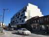
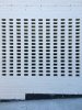
It really would be great if Toronto developers/architects realized that long, straight, unarticulated blank walls of glass kinda suck from both a design and public realm perspective.

image.jpeg
image.jpeg
image.jpeg


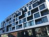
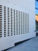
Really awesome detail in the brick here: this slatting arrangement is hiding an exhaust vent. Love it.

image.jpeg
image.jpeg
image.jpeg
 

Attachments

  • image.jpeg
    image.jpeg
    2.4 MB · Views: 603
  • image.jpeg
    image.jpeg
    2.2 MB · Views: 560
  • image.jpeg
    image.jpeg
    1.4 MB · Views: 522
  • image.jpeg
    image.jpeg
    1.5 MB · Views: 510
  • image.jpeg
    image.jpeg
    1.6 MB · Views: 504
  • image.jpeg
    image.jpeg
    1.6 MB · Views: 499
  • image.jpeg
    image.jpeg
    1.5 MB · Views: 477
  • image.jpeg
    image.jpeg
    1.5 MB · Views: 504
  • image.jpeg
    image.jpeg
    1.7 MB · Views: 488
Wow. This is very well done. I looks, dare I say, almost German, like something you'd find in Munich. (I was there a couple of years ago.) But, yes, these ground floor expanses of glass are awful.
 
We do midrises better than towers in this city. There's another midrise on Eglinton close to the future Forest Hill station which looks like this one and looks very good and striking.
 
I agree many of the better projects are mid-rises. I would really like to see more buildings of this scale built along the main corridors, particularly outside the downtown.
 
One of the things that we've come to realize by putting together the Growth To Watch For series this year (this being the first time that we've put everything on routes through the city) that there's actually quite a lot of mid-rise development proposed or in sales in Toronto.

DUKE just happens to be one of the very best looking of them! (But yes, the ground floor commercial needs articulation too.)

42
 
Yes, a very slick looking project. Love the black trimmed windows. Would like to see more of this in the city. The interiors aren't bad either.
 
Fantastic looking project, although I agree with the other opinions here that the all glass retail portion is badly designed.
 
At street level, where it really counts, this building is terrible. I hate that wall of glass! The sad thing is, so many developers are doing it all over the city. I wish they would have used a few brick columns to separate the retail units and provide some contrast or something!
 
I love this project as well. Stylish, Chic, in scale with the neighbourhood'. I like the glass retail 'wall' which appears to have some good height also. LUVIT!
 
I love this project as well. Stylish, Chic, in scale with the neighbourhood'. I like the glass retail 'wall' which appears to have some good height also. LUVIT!

So far you're the only person here who likes the glass wall.
 
IMO, the massing looks great, but this building will look very dated very quickly. The black and white colour scheme, personally makes me puke. I am at least actually grateful they widened the sidewalk.

As for the "one unit ground floor retail" how is it that you know this? And what is it? People have already moved in to this building.
 

Back
Top