Can we add; bringing back the full Dundas glass arcade treatment; most original water features (one would have to be modified as elevators were added); and why not most of the original flooring while we're at it; it may been worn a bit, but wasn't particularly dated.

****

Put another way, these at the things I would be ok w/changing from the original Eaton Centre design:

- The cladding on the former Eatons/Sears etc, including introduction of extensive windows.
- The Yonge Street facade (south of the former Eatons) which has never worked in any incarnation.
- Redesigning retail to engage Yonge
- Clearer/less opaque glass for the main arcade/skylight
- Redesigning the relationship to Trinity Square and James Street to create engaging retail, patios and architecture.
- Reducing or eliminating parking over the Yonge Street frontage; and off Dundas (adding, as appropriate, retail/office/institutional

*****

In respect of additional retail created over the years. The lower hallway to Canadian Tire is a fail; either close it, or relocate it to the south of the elevator core where retail can line the corridor on both sides.

Consider removing Canadian Tire/Best Buy etc. (let them find other good downtown space) and shift the Cineplex back to that space in the Eaton Centre. The space over at 10 Dundas East is simply too cumbersome and awkard being up 4 levels and 5 when you factor in the two level nature of the cinema.

It would be better the complex located mostly on levels 1/2 below and just a grand entrance and perhaps single auditorium on the ground level to create a sense of an 'event' space.
Great ideas!

-I would love to see a deep, thorough re-working of the Dundas Street entrance. Bring it back the glassy, airy feeling - but perhaps greenhouse it up a notch, perhaps expand it...up? - making it a good spot to collect yourself between the mall's busyness and the street's cacophony. Right now it's clumsy and oddly pinched for all its space. There's no sense of arrival, nor good direction.

-The Yonge street wall south of Nordstrom's could definitely use a rework. I might be one of the few people who actually liked the metallic-constructivist original. The pseudo olde-towne po-mo front that replaced it has always lacked pep or intrigue. It utterly fails to be homey or convincing. That's partly it's shallowness - lack of movement from the facade back into the mall left it looking like a thin false front. It's partly the cheapness of the materials too. Oddly, it seems to have gained a coat of unbecoming dinge during its short life. I think that almost all of that run should be enthusiastically reworked and LED'd to within an inch of glory.

-The rooftop parking level (or upper levels) should be reworked to be public spaces and/or retail. If there's any mall in the world that does *not* need parking, it's The Eaton Centre. The blank rooftop parking lot is a golden opportunity for all sorts of things - from patio restaurants, green space, a market-type set up to outdoor entertainment. I bet you could pop a skating rink up there in the winter without a problem.

-I'm really glad you brought up that indeterminable corridor from to Canadian Tire and back. I wonder how much of the original multiplex spaces remain behind those walls? Anyway, there's a golden opportunity there to - as you mentioned - create a grand entrance - (in keeping with a reworked Dundas Atrium?) - and for them to dig in and put in some massive, excellent cinemas and event space as would befit the Centre itself. It would also spare us the drear ride up the escalators at Cineplex Dundas Square. The more cinemas, the merrier.
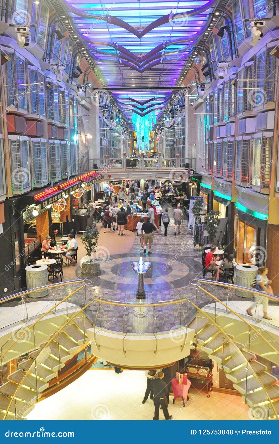
 

Looks like the inside of a cruise ship.

liberty-seas-cruise-ship-central-promenade-deck-inside-interrior-liberty-seas-cruise-ship-promenade-125753048.jpg

 
I'd love to see some of the Pop-nautical references brought back - especially the profuse greenery and trees, and the original style railings. The original closeness of the railing's bars/metalwork guaranteed perceptible comfort when standing near or leaning on them - unlike the new metal-topped glass ones, which do nothing to prevent feelings of vertigo from arising.
The removal of plants and fountains from malls is something I’ve alway hated.
 
The removal of plants and fountains from malls is something I’ve alway hated.
They cost money! Imagine, paying to have a gardener come in once, maybe even twice a week to the Eaton Centre! How would they be able to extract maximum profit from every last square inch if they had to pay someone for a service that contributes absolutely nothing to their bottom line?

CF knows this is “The Eaton Centre” and will value-re-engineer the ever-loving crap out of it so long as they keep luring in tourist bucks.

Which again, is why I’m surprised the east-side parking hasn’t yet been eliminated for retail space.
 
The office tower at Yonge & Dundas is looking awful - hopefully those missing panels are replaced quickly. I remember it looking like this less than 5 years ago, until they eventually fixed it, but was that just temporary?

IMG_1243.JPG
 
CF knows this is “The Eaton Centre” and will value-re-engineer the ever-loving crap out of it so long as they keep luring in tourist bucks.

Which again, is why I’m surprised the east-side parking hasn’t yet been eliminated for retail space.
The merchants have the parking spaces guaranteed in their contracts. It's one of the reasons that the at-one-point-planned 60-storey tower never got built above the south end of the mall: the CF Commercial couldn't give CF Residential any of the parking space.

42
 
I just went down a youtube rabbit hole and came across this compilation of commercials from the 1980s of the Eaton Centre.

Is it just me or did that mall have far more class and character than it does now?

It really did. Thanks to Cadillac Fairview, it has gradually endured death by a thousand cuts.
 
I just went down a youtube rabbit hole and came across this compilation of commercials from the 1980s of the Eaton Centre.

Is it just me or did that mall have far more class and character than it does now?


I miss Eatons. Maybe it's just the nostalgia, but it seemed more fun back then. As a kid, I always loved the toy floor. They always had great displays. I remember once they had created a display for the Teenage Mutant Ninja Turtles, which was the big thing at the time. It consisted of a large city block. They had foot soldiers popping out of manholes, the Ninja Turtles on fire escapes, etc. All under glass. My dad bought me a Leonardo action figure.

I also miss the upper level restaurant/cafeteria. It was not at all fancy, but there was something cozy about eating there.

I had the same experience growing up. My mom often took me there as a kid, and it always felt like an adventure. The cafeteria with the dark nautical theme was great. I miss the affordable Anglo comfort food you could get there (good luck trying to find any downtown now). I usually went for the roast beef with gravy. The toy section on the 7th level was indeed epic beyond words, as you mentioned. Multiple large action displays featuring all the latest products from the most awesome brands of the day, Transformers, Thundercats, G.I. Joe, and my personal favourite, Masters of the Universe, among many others. Nobody puts in efforts like that anymore. Sigh...
 

Back
Top