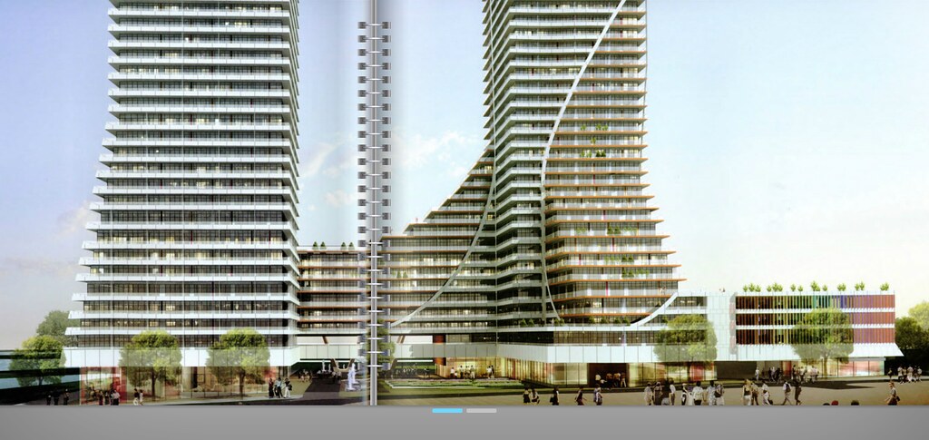
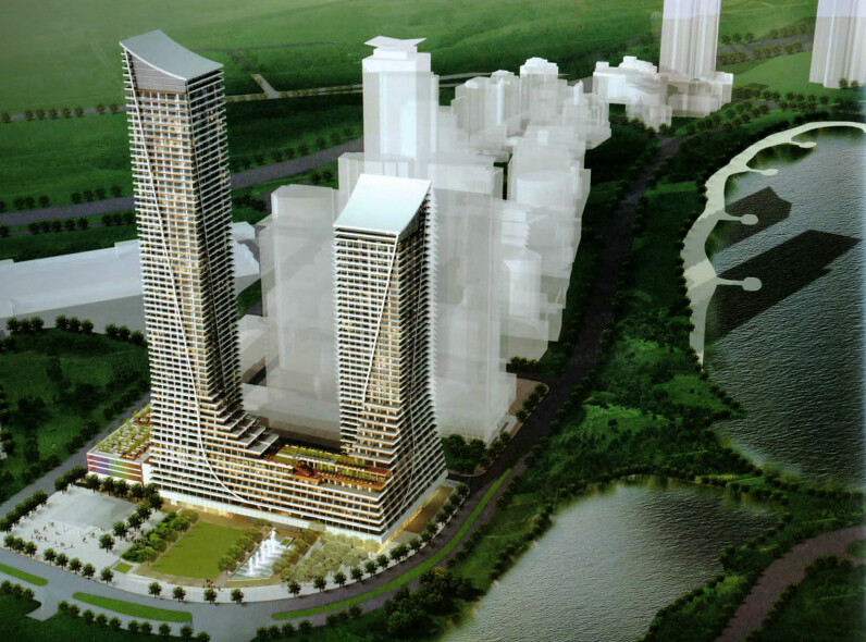
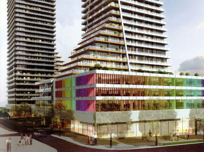
The ugliness seems to come from all the steps, swooshes and curves making the building look like it wants to be a more interesting structure than it actually is. It's like an architectural version of The Uncanny Valley effect.

That stuff is called "interesting features". Some architects like to make their buildings interesting.
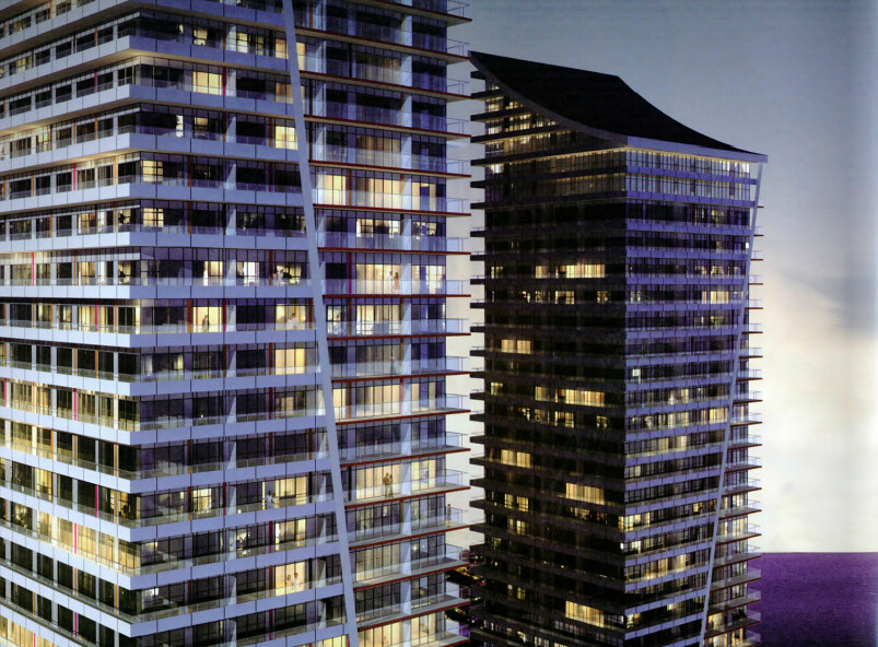
 
ah, Torontonians. constantly complain about their buildings being too boxy, but when the finally get a building that isn't boxy, they claim that it isn't boxy enough.
 
it looks good and clearly the base has been designed to resemble a cruise ship being that its by the water
 
^ Renderings extracted from that file, for everyone's convenience.

The design hasn't grown on me yet, but I think it fits in with Miami Beach-North quite well.


6944174976_efb185b205_b.jpg


7090244851_24fac2de0f_b.jpg


6944179928_53b2a8d03c_b.jpg


6944175760_7b6168b0ea_b.jpg
 
Another nice complex in the hood thats going to sell-out in no time...i love that green space, plaza square-fountain next to it.
 
Last edited:
I wish this area was more than just a residential area. At first, there was talk that it was going to be an entertainment, touristy area but all we ended up with is just another typical residential area. It doesn't offer much to people living out of the area, except for more passive park land and a few small stores. It's OK for what it is, I was just hoping it would have a few major attractions and provide another cool area to visit. A pleasure pier, would have been nice. I think that was talked about when this area first started to be redeveloped. Also a Harbourfront type of attraction was also being discussed at one time. It's too bad nothing like that got developed. A massive outdoor pool in the park, could have been nice.
 
Last edited:
If any of that colour makes it into the final product I'll be pleasantly surprised. I still think the MJMA plan was fundamentally superior though.
 
There are a lot of interesting creative flourishes to these towers like the elegantly sloped tops, the flowing diagonal lines along the tall facades of the towers, and the beautifully coloured podium. On the other hand, the terracing of the towers where they meet the podium looks bulky, and that's how this project may come across from certain perspectives because of its large footprint. There are colourful accents on the towers, but they may be slightly too subtle to make an impact. It would be nice to see the podium's colour applied in some way to the waterfront facade.

There seems to be a fair bit of architectural exuberance on the Etobicoke waterfront which is making it rather interesting. The area is a destination for its excellent parkland with long and interesting paths, the Martin Goodman Trail, the Humber Bay Arch Bridge, marinas, and opportunities for canoeing and kayaking. But achieving a greater presence for destination businesses would be positive to cement its destination status.
 
Last edited:
This area will be nothing other then a bedroom community ... oh well ...
 
This area will be nothing other then a bedroom community ... oh well ...

And is there anything fundamentally wrong with that?

Not very long ago, I wished that this area would becoming a booming destination community with lots of shops, restaurants, perhaps even nightclubs or whatnot; but the longer I work, the more I long coming home to a quiet area. I love the hustle and bustle of downtown and the 24/7 aspect of it, but I realize I love coming home to something quiet. If I need my dose of crazy, downtown is a 5 minute drive away.

I would love to see more restaurants, and perhaps a few more shops, but that's it.
 
There are a lot of interesting creative flourishes to these towers like the elegantly sloped tops, the flowing diagonal lines along the tall facades of the towers, and the beautifully coloured podium. On the other hand, the terracing of the towers where they meet the podium looks bulky, and that's how this project may come across from certain perspectives because of its large footprint. There are colourful accents on the towers, but they may be slightly too subtle to make an impact. It would be nice to see the podium's colour applied in some way to the waterfront facade.

I must agree- though the building has its moments, it feels like yet another miss for Zeidler. The awkward and abrupt tower-podium transition that snap the diagonal curves running down the tower, the awful 70s-esque base and the parking garage slapped onto the side of the building...this building needs a whole lot of love from a design panel before it's acceptable.

The good thing is that the building still contributes to the Miami-like feeling around the area.
 
I don't quite see how you could label that as abrupt, its one of the most gradual tower-podium transitions of any Toronto development.
 

Back
Top