robmausser
Senior Member
It's essentially the new design language being pushed by Metrolinx for Eglinton, Finch, and Hurontario. The boring white and black finishes, the font, the symbols, the diagrams and bilinguality. Personally, it's nice and minimalist, albeit a bit boring.
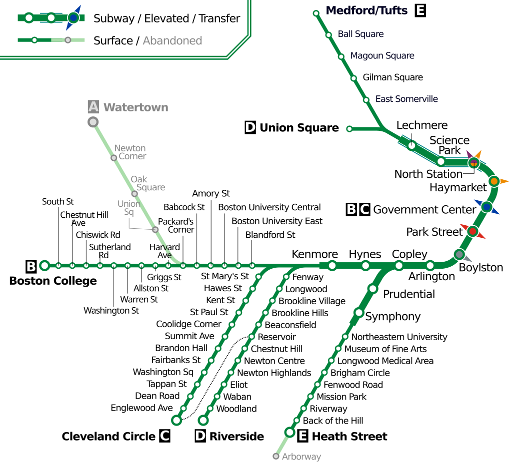
This should be the actual rapid transit map. Emphasis on rapid, because you know...
View attachment 244303
I think the map should still show the full Crosstown, but show it differently for the above ground portions.
Like change it to an outlined line to indicate its different, and remove the station stops but show it still continuing to Kennedy.
I mean the map shows a bus to the airport FFS.


