


TheTigerMaster
Superstar
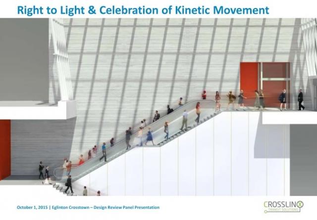
The station design principles prioritize an abundance of natural light, as well as spacious layouts that foster intuitive passenger circulation throughout each station.
I'm happy to see Crosslinx learned from TYSSE. The natural light in these stations will probably be the best feature.
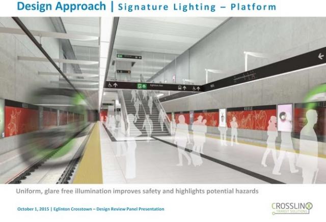
Inside, the stations are designed according to principles of "clarity and simplicity of architectural expression," with clean, minimalist spaces at platform level. Notes of orange colour are visible throughout the renderings (below), knitting together an identity for the upcoming LRT line.
I'm not so impressed with the platform design. ""clarity and simplicity of architectural expression," with clean, minimalist spaces at platform level", sounds exactly like the principles that lead to the designs of Line 2 and Line 4. Orange will apparently be used prominently throughout each station, which I take to mean that each station will share the same colour scheme. It sounds like riding on Line 5 will be a lot like the banal repetitiveness of the Bloor-Danforth and Shepard Line. I'm a little disappointed. I find the unique designs of Dufferin and Pape statios along with almost all the stations on Line 1 to be a welcome relief from the monotony of subway travel. But I'll wait until the final renders before passing judgement. Hopefully Crosslinx will learn from the mistakes of TTC station design by incorporating unique public art and colour into each station.