turini2
Active Member
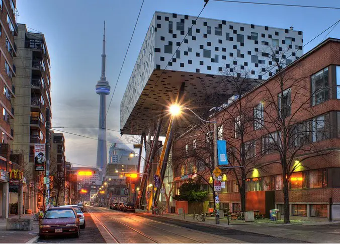
Annoyingly, a cantilevered building would solve the problem of the station building being in the way - but that would be very expensive and risky to build, reducing the amount of potential affordable housing. Probably would scare away a few developers from the project too.
At the very least, a modest cantilever could allow for a couple more units than would be possible on the small plot to the south.


At the very least, a modest cantilever could allow for a couple more units than would be possible on the small plot to the south.
Last edited: