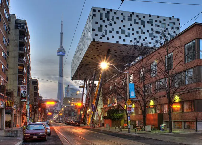
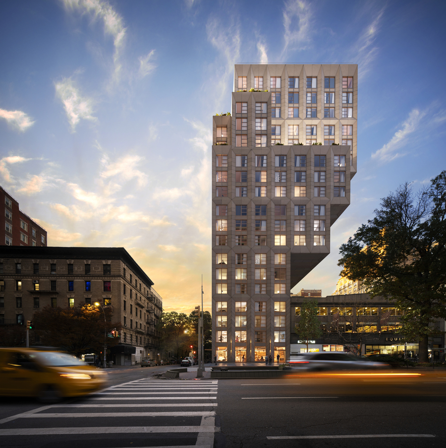
Annoyingly, a cantilevered building would solve the problem of the station building being in the way - but that would be very expensive and risky to build, reducing the amount of potential affordable housing. Probably would scare away a few developers from the project too.

At the very least, a modest cantilever could allow for a couple more units than would be possible on the small plot to the south.
oda1-1.jpg
manhatan-canti.jpg
 
Last edited:
Province is Expropriating land away from developers for their Ontario Line stations downtown (eg Allied lands at Kind & Bathurst), so they could do everyone a solid - and just Expropriate the TD Bank, McDonald's and Car Wash lands south of the station/city land for another "Transit-Oriented Communities" model...


1633088463665.png
 
Annoyingly, a cantilevered building would solve the problem of the station building being in the way - but that would be very expensive and risky to build, reducing the amount of potential affordable housing. Probably would scare away a few developers from the project too.

At the very least, a modest cantilever could allow for a couple more units than would be possible on the small plot to the south.
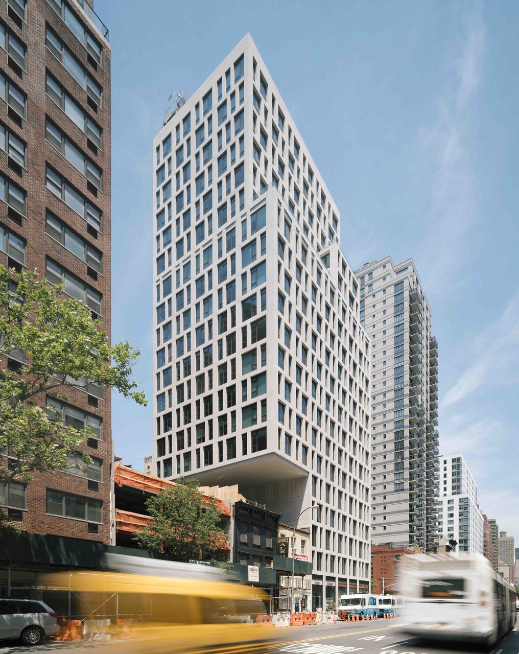
View attachment 352643View attachment 352642
Toronto already has something like that on McCaul Street...
creative-city-campus-d130416-1.jpg
From link.
 
Wait the T wasn't just a render placeholder? Why is Metrolinx trying to reinvent transit symbolism in the city? Is there gonna be an expensive brand-unifying with the TTC some years after this and the Crosstown open?
Metrolink hied a wayfinding expert and did surveys with random people and somehow decided that we need an extra redundedt symbol to tell people that something is a public transit stop or station. Metrolink is the only ones using it and all of the other public transit organizations in Ontario have basically said nope were not going to spend money just to add a stupid T symbol.

Some people have bought into Metrolink's logic about how it's supposed to regonolisze transit or help people who don't know what the various transit agencies stops and stations look like.
 
Wait the T wasn't just a render placeholder? Why is Metrolinx trying to reinvent transit symbolism in the city? Is there gonna be an expensive brand-unifying with the TTC some years after this and the Crosstown open?
Their thought process is to label it as a transit station rather than a TTC (or whichever transit agency) station. Make sense in the long run if/when full fare integration happens across the region.
 
Their thought process is to label it as a transit station rather than a TTC (or whichever transit agency) station. Make sense in the long run if/when full fare integration happens across the region.
In other words they created a problem that nobody actually had and solved it in an unnecessary way with a symbol that nobody actually understands what it means or cares to find out. I don't really know why we should praise them for that at all.
 

Back
Top