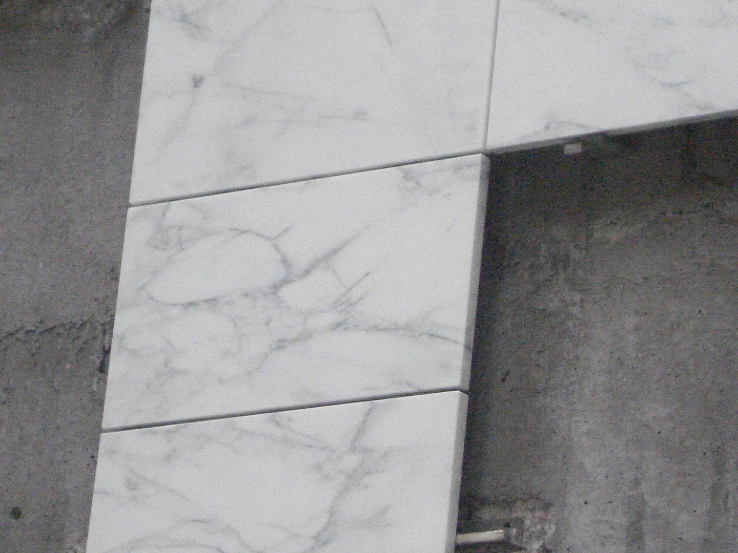
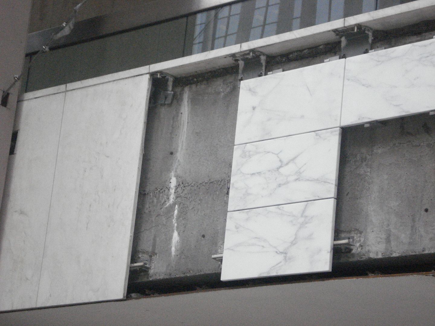
6306288264_b791ec48c9_b.jpg
Awesome shot! Compare with original rendering:
Fcp-Building-Rendering.jpg
 
Did some editing and voila!

6311482390_c91a27336a_b.jpg


Would it be a stretch to say this is the first Toronto project that gave us exactly what was shown in the rendering?
 
It looks so good, I'm very impressed. It's so odd to be seeing reflections in FCP, looks amazing, but odd after growing up with it the way it was.
 
Would it be a stretch to say this is the first Toronto project that gave us exactly what was shown in the rendering?

It's not a stretch at all, it's rare that a project comes in so close. I like how the dark corners turned out, I wasn't sure if it would work.
Terrific matching of the "after" shot vegeta_skyline.
 
Thanks. Likewise I wasn't sure about the 'bronze' colored corners either. I didn't think it was a bad idea, but I never imagined they would accentuate the building to this degree. Somehow FCP seems more slender and soars more, even though the dimensions changed only negligibly.
 
OMG. How fresh does FCP look right now. That recladding has done wonders revitalizing its presence on the skyline.

Trump? Nicht so gut. Could use an automatic recladding right now. lolz
 
The trading floor seems to be getting a set of two story windows -- much bigger than the old ones. What's going to be on the lower level? Exec's offices? (The King street windows was the side where they had a couple of execs offices, but that looks like it'll now be a floor lower or something?)
 
Please please please do the sidewalk next !
 

Back
Top