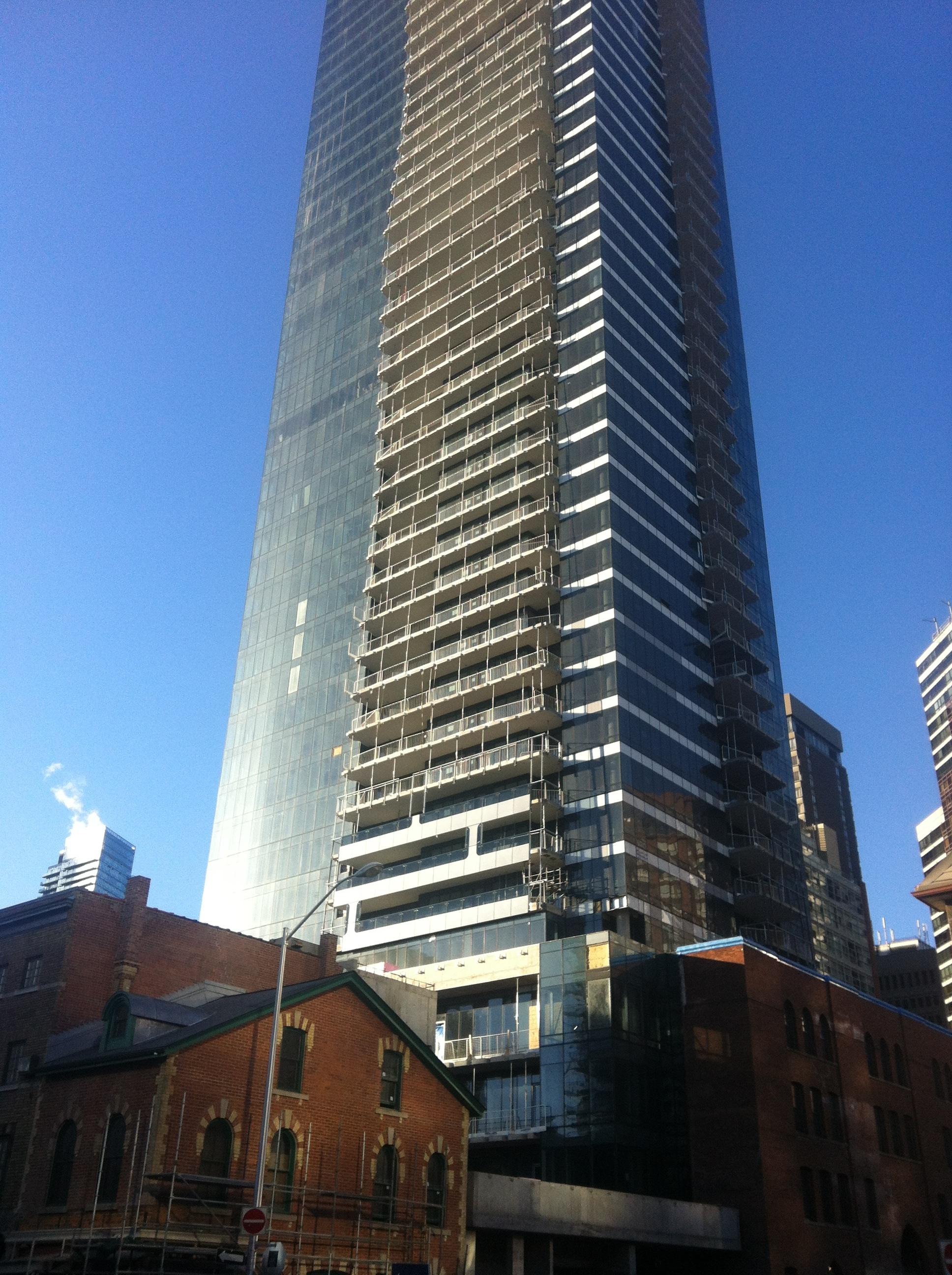
Those balconies give me a lot of hope for Massey Tower. I imagine that the wave pattern in the glass will be achieved in the same way.
 
The city already give out grants. Of course, it's chump change for something as extensive as this but, I'm surprised more businesses don't take advantage of it.

The former city grant program doesn't really offer a huge incentive for projects as large as this; it's always been more of a draw towards single family homes. The revised program offers up to 50% of eligible heritage work costs, but only up to $10,000, and is only available to properties that have been provincially designated. It's geared towards residential, not commercial.

The revised tax rebate program is only available to commercial/industrial buildings, offering a 40% rebate of taxes paid capped at 50% of eligible heritage work costs up to $500,000, but only for provincially designated buildings. Buildings within HCDs get up to $50,000.

Compare this to the US federal tax incentive, which provides 10-20% income tax credit for commercial/depreciable buildings, no cap. This can be combined, in many states, with a state tax credit, such as NY's rehabilitation tax credits that provide a 20% credit up to $5 million.

Little wonder projects such as Five are rare in Toronto; financial incentives are necessary in order to make preservation 'make sense' for many developers. Increased rents and higher unit prices are often just not adequate to cover the cost of heritage work.
 
Looks pretty neat to me

attachment.php

Yeah, looks good in that shot.

So the "frame" is really just fritt on larger glass panels - also seen in this shot here.
That's a bit different than what I expected.

 
Last edited:
Yeah that's not exactly what I thought they would do either, but I'm happy with it. I was worried they were just going to remove the aesthetic altogether, so this is a nice compromise.
 
It would have been better if the vertical "I" panels were exactly the same width as the fritted part.

They could have done that by adjusting the line of the horizontal fritted band to be above the bottom edge of the glass, so that the top "serif" could be on the balcony glass the same way it is for the bottom "serif". That way a narrower fully fritted vertical panel could have connected the two "serifs". The mullion spacing could have been adjusted to suit.
 
This is one cool glass box... I quite like the darkness of the glass.

The restoration of the buildings fronting Yonge is remarkable... Apart from the cost associated with restoring historical buildings, I think most aren't restored because there's a lack of civic pride. I mean why bother when you don't really need to? I think given the real-estate climate this city needs to rethink the laws or lack thereof that encourage absentee landlords and speculators to allow these buildings to rot.
 
I think "movie set" when I see these restored historical buildings juxtaposed with gleaming modernity. It evokes faux-history setups in Vegas or Disney themed parks. Until these buildings get messed up a bit with real people, shades, and signage, the impression will remain with me.
 
College park, that I can understand. So if that is what UD meant then sure, I agree actually. I personally like old buildings to show their age. I know in this case it was necessary, and they did a great job. But they do look like replicas right now.
 

Back
Top