I really don't understand Keesmaat. What exactly is it that swayed her on the new propoal? From what I recall, her main concern was height. Now the buildings are taller, but she heights that they will be more slender and cast less of a shadow... Regardless, I must give credit where credit is due with the preservation of the heritage buildings and the taller tower. It was the right call at the end of the day. I hope the building stays below 1000 ft as it's really just a pissing match. The density, 2000 units plus OCAD plus the art gallery, sounds great. I'm looking forward to visiting M+G when occupied to experience this bold development and the infusion of people it will bring to the area.

I'm interested to read the text of the OPA the city will be preparing for the proposal and the level of detail. I was surprised the applicant hadn't submitted an OPA originally with their rezoning proposal.
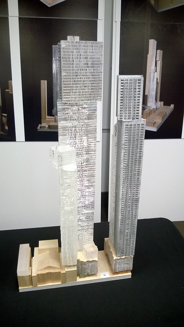
 
I watched the Agenda tonight (it will be online soon) and Mirvish appears to think that this is a much better proposal than the original (and he states that Gehry is thrilled with it as well).
 
I think I like this more than the original. I defended the original passionately because I feared any major concessions would be too great or even lead to outright cancellation - and I felt there were people who wanted a rejection. The original towers always seemed somewhat risky, but I had faith (and still do) that Gehry would've executed with minimal value engineering. I think the new rendering are slightly more understated, but still exceptional. In terms of scale I still love the height, more height, and losing one tower isn't a loss IMO. It probably makes the project more financially viable in that 2000 units is easier too sell than 2700. A part of me regrets we'll never see what could've happened at podium, but such is life. This is still tremendously exciting, with a little risk removed. Still nothing like it in the city.
 
While I do miss some aspects of the previous design, I'm curious to see where this design goes. It's clear to me, that what we're seeing will not be the final product. I really hope we'll see some more changes.
 
To add to greenleaf's account - in answering the question about what materials are likely to be used, a representative for the developer said "glass and precast". Precast? I appreciated the honesty in his subsequent response/explanation in saying that Toronto is not New York or London and Toronto economics would most definitely have to be taken into consideration in any final design concept.
.

glass and some kind of steel would have been much better.
 
14284048861_531f01e07d_z.jpg

I wonder how the design will handle the wind load with such a wide / top heavy design?
 
Looking far better and more context sensitive, IMO. Massing seems much more relaxed than the relentless wall the previous proposal offered.

Still a shame to lose the building on the West side of Duncan St., hopefully parts of it can be disassembled and stored for later use.
 
While I do miss some aspects of the previous design, I'm curious to see where this design goes. It's clear to me, that what we're seeing will not be the final product. I really hope we'll see some more changes.

My sentiments exactly. This is an early vision yet to be tweaked, adapted and approved. Sort of, but not quite, placeholders to test the water. Plus the PoW and (arguably) the two best warehouses are saved - details that had me very torn over this project. This is such a huge win, long after I gave up on this project as being whittled down to a disappointing quasi-Gehry. Surely he wants what will likely be one of his last projects to leave an impression. In his home town.
I'm happier and more optimistic about this project than ever.
 
At 92 storeys, that's above a thousand feet or damn close. Will our height dorks finally get a bona fide "supertall" to swoon over?
 
Last edited:
As a first rendering of the new revision, I think we can be hopeful. From what I read, this was drawn up very quickly. I would expect it to evolve as things progress. I think we should feel hopeful.
 
Colour me optimisitic. This feels less daunting and overwhelming than the imposing trio of towers tightly clustered together. I look forward to more articulation and refinement of the design. As it stands, the buildings strike me as more complementary to one another - there's more of a "converstation" going on between them. I guess the devil is in the details - cladding, quality of materials, colour and texture - but so far it's very exciting. I'm also betting this version is significantly more realistic and manageable in terms of dealing with the extremities of our climate.
 
One quibble - I dislike how the Anderson facade is integrated into the project - it looks very out of place.

AoD

I gathered from hearing conversations at the meeting that HPS wants better integration of that facade as well as the interplay between the podium and the Royal Alex. These are refinements which will happen.
 

Back
Top