Lol what an ungrateful bunch. This project is more ambitions than anything we've seen in a long time.

I don't get it, why should we be grateful? This is arguably the worse version of a project that has been in the works for nearly a decade. You can say "well at least this has a better likelihood of being built", but if the finished product is smaller and uglier than what had been initially been planned, what's to get excited about?
 
This design took a bit but it’s growing on me now. At least they kept the basic form of it. Still a “building block” look.the silver is nice. If they make it that metallic. The only thing I’m a bit sad we’re not getting is that cool rippled effect on the building. But as is they will add a lot still to the city.
 
Is the working title of this development now (Great Gulf) Duncan West?
Taken from the arch. plans:
Any other drawings? I can't find the documents anymore for the life of me.
 
This link - go to the application dated 21/12/18 - and the drawing set is in the documentation there - the latest drawings are dated Dec 23, 2020
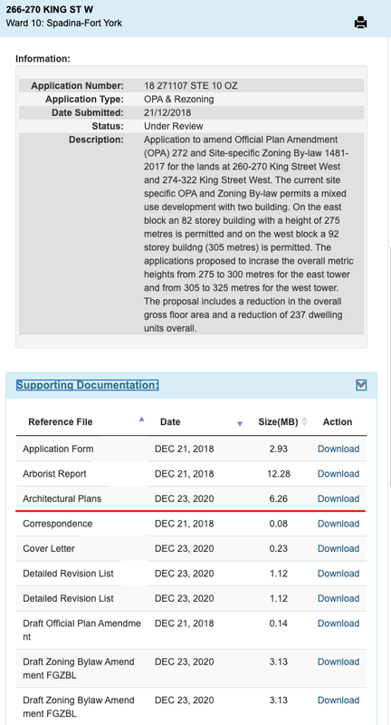
No signs of anything from Dec 23 but the new documents map is also a terrible experience so that may be on me!
 
The link I sent should automatically open on the project in question

Screen-Shot-2021-01-12-at-10-02-57-AM.png
 
The link I sent should automatically open on the project in question
Supporting docs is disabled for me! Hopefully I can find a fix as this will severely impact my progress drawings 😅
 
Quite possible 212 King is going to be considered "Duncan East". Even though we got nowhere near what we wanted, we're still getting a Gehry and a SHoP on the very same city block. I'd say that's progress.
 
My reaction to @ADRM's initial post with this update was a 🙁. However, I have gone back and looked at the new render and details a couple of times since then, and I think I am starting to come around.

Of course, a big disappointment is that they are no longer seeking the height increase. This increase would have been especially welcome in light of the recent 212 King West proposal, as assisting this project to still be the standout for this part of the skyline. On the bright side, I suspect the decrease in proposed height can be chaulked up to a desire to proceed without the delay of a rezoning, meaning the project may get off the ground soon.

The rest of the design has the potential to be great, just as the previous one did. For both the current and previous design, its success will depend on details and materials.

The use of two facade treatments remains, and there remains interesting flexion in the metallic finish. The watermark imprints on the glass section also look extremely unique. Yes, the pixelated bits are not 100% unique, their use here looks interesting and different.

The fact that this tower no longer looks like a direct descendant of 8 Spruce Street is not necessarily a bad thing and does not necessarily mean this building is a watered-down Gehry; in fact, it may be the next evolution of Gehry.

I am extremely curious about the material for the top section. If it does resemble granite, that could be something exceptional. I do have some concern since the architectural drawings show much of this to be a parapet. I hope it is enclosed to appear solid from above, since the top of these towers will be prominent from the CN Tower main and sky pods.

This project still is very much in the "time and materials will tell" camp, and could be absolutely stunning. Of course, the alternative that it will be something less than that remains possible as well, but I would rather turn the page and hope for the best.
 
Supporting docs is disabled for me! Hopefully I can find a fix as this will severely impact my progress drawings 😅
if you click on the various application numbers above the description, you'll get the docs relevant to those applications. Its a bit of a mess but once you learn it, it works well enough.
 

Back
Top