Is the working title of this development now (Great Gulf) Duncan West?
Taken from the arch. plans:

View attachment 293627

So this is how a mediocre architect tries to downgrade and impersonate the work of a master architect.
Very sad day. They really should take Gehry's name off it or state that it is a discount version of a Gehry design.
 
Taller tower is Duncan West, shorter is Duncan East?

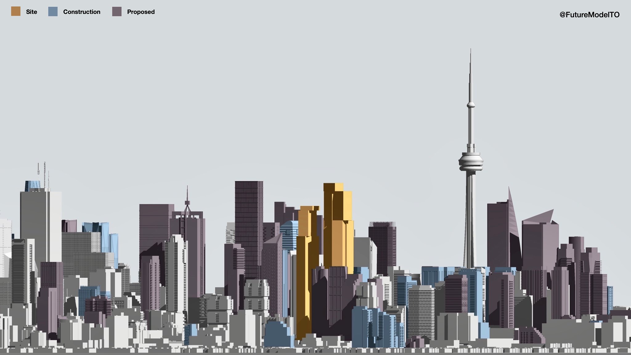
Below are massing models of the future tallest block in the city, comparing the current proposal with the previous:

50829191082_e09751367f_k.jpg

50829106606_caae0360f7_k.jpg


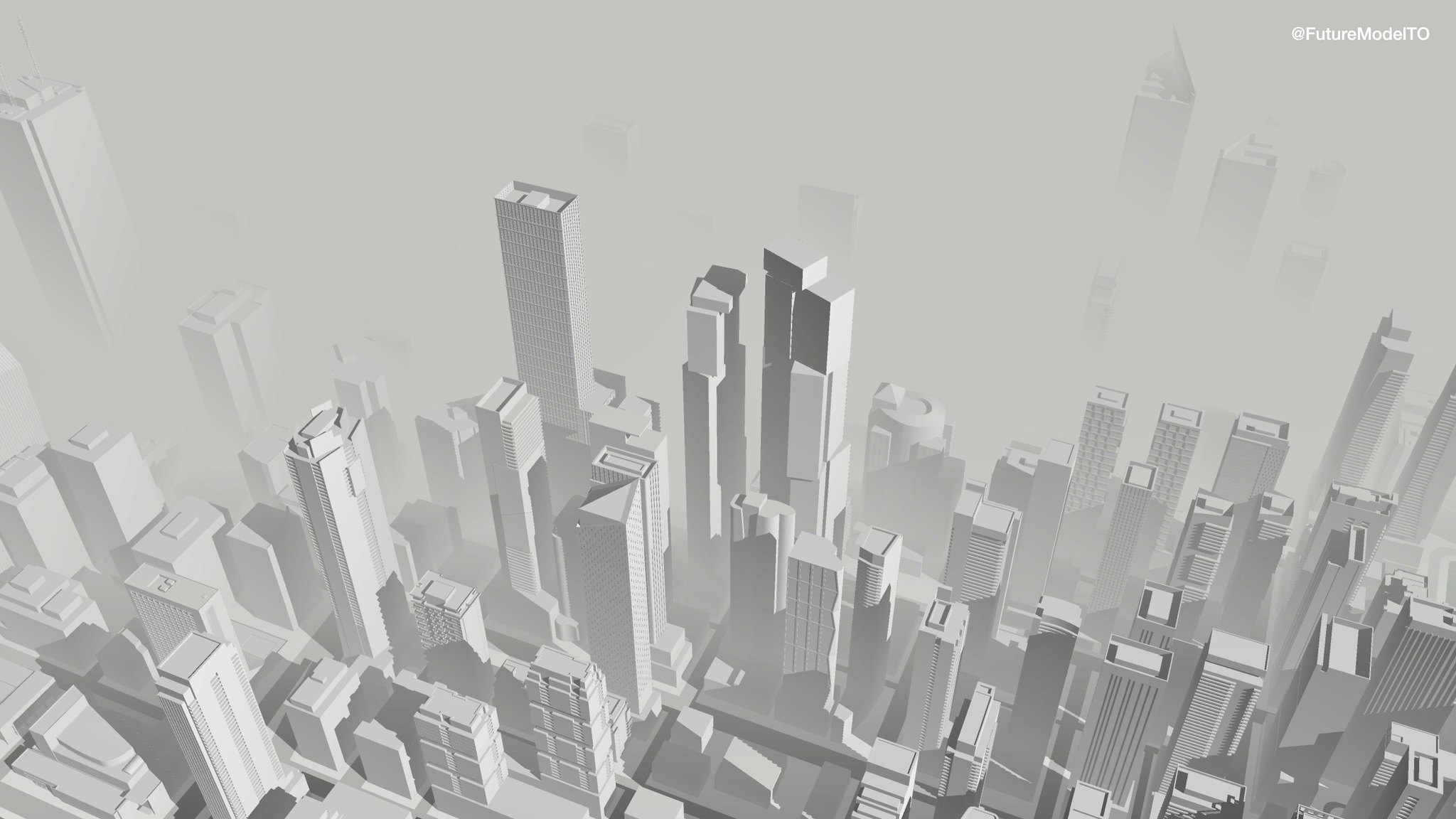
Edit: Additional graphics:
50829876202_05c87c25f8_k.jpg

50829040898_bfd3f3d99d_k.jpg
 
Last edited:
So this is how a mediocre architect tries to downgrade and impersonate the work of a master architect.
Very sad day. They really should take Gehry's name off it or state that it is a discount version of a Gehry design.

I'm fairly sure the new design is still a Gehry design.

the models were hand built on the same platform as the old design.
 
Taller tower is Duncan West, shorter is Duncan East?

Below are massing models of the future tallest block in the city, comparing the current proposal with the previous:

50829191082_e09751367f_k.jpg

50829106606_caae0360f7_k.jpg

Looking at this makes me feel like the existing condo is like the movie UP. huge buildings surrounding the little guy lol.
 
The previous iteration would have been phenomenal, but I'm not disappointed by this new version either. To my eye, they still look like nothing else in the city, and will become a pretty iconic pair of buildings if they live up to their plans...

That said, I really think they should go back to the drawing board with regards to the tall, boxy, plain curtain wall podium on the west tower... it just doesn't fit.
 
The massing looks way better now IMO.
It's certainly a more efficient design, and perhaps a better use space on the site - specifically with the taller West building. The previous iteration was quite flat and narrow, aside from the massing protrusions.

I've updated my previous post at the top of the page with additional graphics, in addition to these perspective views below:
50829040908_57dad6e687_k.jpg

Very interesting seeing the height of the Financial District make its way west along King Street. Intensification and redevelopment of sites bordering University Avenue is the likely a given now:
50829787311_0f40948eb7_k.jpg
 
They don't look as nearly as looming over everything as they did before their heights got nerfed down.
 
It's certainly a more efficient design, and perhaps a better use space on the site - specifically with the taller West building. The previous iteration was quite flat and narrow, aside from the massing protrusions.

I've updated my previous post at the top of the page with additional graphics, in addition to these perspective views below:
50829040908_57dad6e687_k.jpg

Very interesting seeing the height of the Financial District make its way west along King Street. Intensification and redevelopment of sites bordering University Avenue is the likely a given now:
50829787311_0f40948eb7_k.jpg
Well done.
It’s now the cladding I’m worried about. Other wise so far so good. Grade level not as impressive.
Maybe if they could put that (wavy glass overhang) idea back into the design.
 

Back
Top