Im sorry there are no towers in Toronto or Canada for that matter which resemble anything close to these. If there are, they are too short to have any presence/significance and I guarantee the materials will be way different. I think this project will be iconic.
Really?! Randomly assembly or stacked blocks le mass, see below. Yes I agree that the Gehry towers might have better fit and finish but that stands to be seen. Right now the only signficant difference in their form is that they utilize more cantilevered floors and some rotation. They will also be taller (presence) but if that's their claim to fame as a Gehry building that's pretty sad.

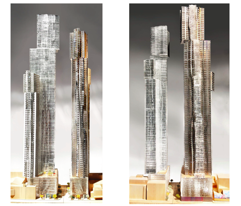
remember when the Gehry towers were suppose to look like this. How low they've gone.
6448-25470.jpg


Arranging various sizes of blocks into a building has been around for a long time already. Pretty disapointing from what is suppose to be a 'special' building. I hope the cladding redeems it.

129-46600.jpeg
23091-138635.jpeg
8866-26321.jpg
18422-123254.jpg
6448-142676.jpg
 
Last edited:
^The towers you've shown as comparable are all stumps and 99% of people would never even know they are there. The Gehry towers are much nicer than any of those especially with the cladding, height, and 3d look they have. The original 3 amigos toilet paper wrapped design was never going to happen. The execution would be next to impossible, and materials would be beyond expensive. Studio units would be starting at 2 million to get those built.

Compromises need to be made to actually build something in real life, and overall I think once finished many will be pleasantly surprised with the end product.
 
No balconies?
I don't think Gehry really does balconies...
-----

I'm in the position that I think this could have been a lot better. The 8 Spruce Street version of this project was that lot better...before they switched to the glass and silver version of what we're seeing now.

But I also think it's ridiculous to claim that the current the version is boring, mundane and the same. While there is certainly glass box theme to it, this won't be your ordinary glass boxes. Not by a stretch or an imagination.

My biggest concern here is Great Gulf. Who some of their more recent projects are left wanting via value engineering. So I hope this doesn't end up looking like spandrel and oil canned crap with a Gehry "flavour" added to it, IMO. That would be a real embarrassment to the world.
That's very well said. And we can be thankful that there are 2 words that have nothing to do with this amazing Project:

Concord Adex. 😄
 
I think there was zero chance that either of the first 2 evolutions would ever have been realized. Expensive, complicated and impractical on such a large scale. They've now created something still quite distinct that the local market can bear. Couple this with the near by mid rise King project I would say it will be worth looking up in the entertainment district.
 
Last edited:
As I said in a series of comments yesterday, the FORMA two-tower tall stack of boxes is in its way subtly intriguing and very "respectful" of the Toronto skyline which is mostly other boxes, the main exceptions being the CN Tower and City Hall, our most iconic curvaceous buildings.

I for one would have liked some titanium wrap at the bottom levels, but hey maybe Frank is through doing that (looks so good in L.A.).

May it rise even better than advertised!
 
^The towers you've shown as comparable are all stumps and 99% of people would never even know they are there. The Gehry towers are much nicer than any of those especially with the cladding, height, and 3d look they have. The original 3 amigos toilet paper wrapped design was never going to happen. The execution would be next to impossible, and materials would be beyond expensive. Studio units would be starting at 2 million to get those built.

Compromises need to be made to actually build something in real life, and overall I think once finished many will be pleasantly surprised with the end product.
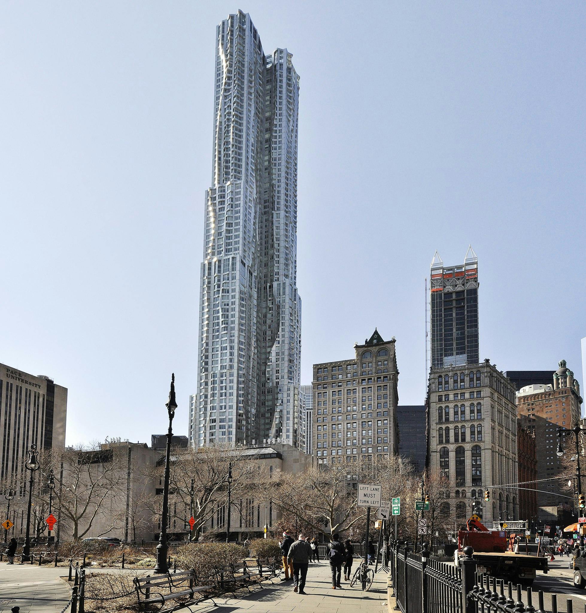
That's exactly my point Travis, the only difference between the buildings I've shown and Gehry building is the existing ones are "stumps". Taking a well establish style and applying it to a taller building isn't anything special and has little to do with progressive architecture. Simply applying existing forms to a new scale is a technical feat at best and a novelty at worst.
 
Really?! Randomly assembly or stacked blocks le mass, see below. Yes I agree that the Gehry towers might have better fit and finish but that stands to be seen. Right now the only signficant difference in their form is that they utilize more cantilevered floors and some rotation. They will also be taller (presence) but if that's their claim to fame as a Gehry building that's pretty sad.

remember when the Gehry towers were suppose to look like this. How low they've gone.View attachment 389259

Arranging various sizes of blocks into a building has been around for a long time already. Pretty disapointing from what is suppose to be a 'special' building. I hope the cladding redeems it.

View attachment 389246View attachment 389247View attachment 389248View attachment 389249View attachment 389252

Bro you are talking about Toronto remember. Any bold innovative design will get watered down. Just be glad we are getting these.

Hopefully it will inspire future generations of Torontonians to create a more innovative and chaotic skyline. Toronto skyline is just way too manicured. Takes away from the chaotic nature of a big city.
 
Part of the problem is we never really got "real" renders for previous iterations. So it's almost impossible to compare this to even what's shown above.

The other renders it's hard to tell what's actually going on, what kind of materials we're looking at, and there's certainly no idea of how they'll look in the surrounding context.

I'm inclined to say I like the previous iteration a little more but at the end of the day it's apples to oranges imo.
 
Last edited:

Back
Top