Which of the four finalist design teams' concept do you prefer?

  • Moriyama & Teshima Architects + Acton Ostry Architects

  • Patkau Architects + MJMA

  • Provencher Roy + Turner Fleischer

  • Shigeru Ban + Brook McIlroy


Results are only viewable after voting.
The Moriyama & Teshima design was my choice and I'm pleased that it won. Once again, I think some in this thread are conflating flashy architecture with good architecture. The winning design isn't particularly flashy, but I think it will be very good. It doesn't have any weird tricks up its sleeve; it's not a funny shape, it doesn't have any curved glass or canted columns. It's not gimmicky. But it gets the details right. Even without the sloping roof, the interplay between the wood fins and the textured glass is pretty magical. The interiors use the warmth of wood to great effect, and the floating staircases add a bit of drama. Everything about the design is crisp, minimal, and well-executed.

It boggles my mind that anyone would compare this design to the forgettable dreck that is the Waterfront Innovation Centre. That's quite a hot take.
 
ah, why not.

Atriums are the easy way out in terms of creating an interesting building in section. The double-height "Breathing rooms" of the winning entry are very strong, and functional too. They serve as smaller atrium type spaces but are also a space of respite in a way that a busy atrium can never be.

They aren't small, looks to fit 20-30 people. How does that provide 'respite'? Both Shigeru & Patkau have a large atrium, but they also provide intimate scaled area for 4-ish throughout that volume. I'd say they both have a better take on spaces for relaxation.

In terms of function, the winning proposal as not the weakest; the 3-bar approach allows flexible room sizes along the length of each bar,
Both the Shigeru & Patkau schemes did this as well, but with larger areas.
The 3 bar approach means the middle bar doesn't receive natural light, nor do the circulation areas.

while still having the breathing room spaces at each end to create an interesting experience in section.
Again, both achieve this, but a full height atrium provides a far more interesting spatial experience.

Look at the sectional perspective of the project, above - there are lots of different types of spaces beyond just the double-loaded corridors.
Yes, but to get to them, you have to go through the corridors. Thats the point, the corridors are the main way someone would experience the building. You have to actively seek out the breathing rooms, shoved to the sides. With Patkau, they made it so when you step out of your class, you're in their community space - the strongest aspect of their scheme IMO.

You can argue that subjectively, you feel it's not as beautiful for a building to lack an atrium, but the idea that an atrium adds functionality doesn't make sense to me.

An atrium is far more functional than the double height spaces:
- an atrium promotes interaction and the sense of community while the breathing rooms separate & fragment the student body.
- with an atrium the building is easily understood to newcomers: you can see the entire building when you walk in, and understand where to go.
- Passive air flow: As explained by both Shigeru & Patkau, the atrium draws air out of classrooms up and through the building. It acts as the building's lungs. You can't do this with double height spaces, so MTA had to add separate shafts on either end.
- natural daylighting. The atrium brings light into the middle of the building & circulation areas, while MTA's centre & corridors have to be artificially lit.

they injected a ton of functionality and useable space to each floor
A nice way of saying cramped, or cheaper.

A typical full-height atrium that cuts through every floor, eating up space and transferring noise? I don't find that functional, and it's certainly not creative or groundbreaking.
Atria are a more efficient use of space because they integrate all of the above mentioned functions into one area. Most critically, I'll repeat, is the vertical and horizontal circulation. MTA use up floor area for all of this too, but in separate instances of vertical chimneys, breathing rooms, corridors, etc. An atrium does all of that in one broad stroke, so yes, it is more functional and more creative - all while providing a more dramatic space.

a more functional take on an atrium space.
I'll give you acoustics, though. It would be quieter.


Anyways, I don't know why I'm feeling so against this scheme. What we're getting is still a nice building, (@junctionist the waterfront innovation centre isn't even in the same universe as this project.) I guess it's a little disappointing that the Patkau or Shigeru scheme could have been the type of building that people would travel to come visit. The winning scheme just doesn't inspire that kind of excitement.
 
While I think M&T design has its qualities, it's a rather missed opportunity to not take the Shigeru Ban proposal. I agreed with #106 that George Brown probably doesn't need a competition if this is the type of architecture they're looking for. Though, to be fair, they would have gotten similar if they are to commission Ban or Paktau or who have you.

The winning design is nice, in the way that every massive tall wood buildings are being conceptualized and designed these days, that the overwhelmingly monolithic wooden interior is quite interchangeable with many of such projects. The facade treatment and wooden fins look rather stale and better compositions of similar design have been done elsewhere, years ago. They also seems to oversimplified the structural design. But I do think the corridors are quite nice.

Ultimately, I think that tall massive wooden technology are still very much evolving. There aren't enough architecture qualities in the winning proposal to make this a remarkable piece of work to be remembered a couple years down the road. But then perhaps George Brown College wasn't looking for something remarkable anyway.
 
I’m happy with this choice, it was my favourite design, it’s the most severe, and the most “wood” looking.
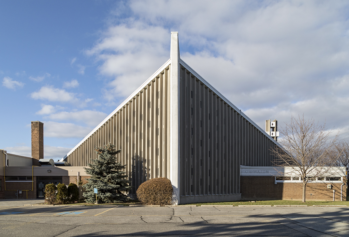
I love that it looks like a church.
If built as depicted the very articulated vertical lines will really show off the materials and add a deep rich texture to the neighbourhood.
 
And what's with this talk about local architects getting all the jobs?
I said that basically everytime there is an international design competition for a building in this city, it seems that the winning proposal is from a local firm (local can also refer to firms situated anywhere in Canada).

I would like to see the other proprosals that didn’t make the final four.
 
I said that basically everytime there is an international design competition for a building in this city, it seems that the winning proposal is from a local firm (local can also refer to firms situated anywhere in Canada).

I would like to see the other proprosals that didn’t make the final four.

Which of the offices that I listed (3XN, Rogers, Gehry, Larsen) are from Canada?

And weren't the four finalists shortlisted based on past projects and office resume? I don't think any other offices even got to design.
Maybe I'm wrong, but from following past architecture competitions, that's how they seem to go.

I don’t think there are many international competitions in Toronto, or other Anglo Canadian cities to begin with anyway.

I do wonder why say Michael Green wasn’t Invited. I don’t remember seeing an open cal for RFQ for this. I only remember an article saying that there will be a competition from the main blog about this. Perhaps this is an invited competition of some sorts?

Either way none of the leads for these teams are versed in massive wood construction really, and I’d say it’s the partnering architects who have had more experience in that front. Even Ban, if I’m not mistaken, only has that hybrid tall wood building in Vancouver. I may be mistaken but none of the other firms even have something similar in the works.

While massive talk wood buildings are not rocket science per se, but these are certainly interesting composition of teams. Will be an interesting project to follow nonetheless.
 
I don't see 'church' but do see a nod to the cabin.

In your imagination, place a large cross somewhere on the upper reaches of the structure and you have something strongly resembling a church from 1968 in a prosperous suburb. This would be particularly the case if you imagine the building consisting only of everything above the top horizontal band. This is not really a criticism. Those churches were often the only serious attempt in those suburbs to erect something that wasn’t purely utilitarian.

But maybe my imagination is a little overactive here.
 
Its pitched roof is its only point of departure from the ordinary office buildings and condos we see around the city.

Going by this comment, I suspect you are someone who just looks at the shape of a building and takes no time to investigate further. I'd encourage you, and a lot of other forumers, to look more closely at the experience of a building, its materiality, its detailing, its environmental tactics and systems, etc. etc. There is a lot more to see and experience of a building beyond a massing.
 
Last edited:
They aren't small, looks to fit 20-30 people. How does that provide 'respite'? Both Shigeru & Patkau have a large atrium, but they also provide intimate scaled area for 4-ish throughout that volume. I'd say they both have a better take on spaces for relaxation.

Those little booths that the Patkau/MJMA proposal? Not a chance of getting any respite there. I've experienced academic buildings that use that method. It ends up being loud, and it's not separated in any way from the major volume around it; people approach you to socialize when you are trying to do work, and it's not an easy place to focus. The moment I saw those in the MJMA presentation I thought to myself, "Yeah, no thanks." From my experience as a student, those booths do not suffice for respite or study space. They are more of a small-group socializing space.

Both the Shigeru & Patkau schemes did this as well, but with larger areas.
The 3 bar approach means the middle bar doesn't receive natural light, nor do the circulation areas.

The middle bar is where spaces that don't require natural light are placed. Not everywhere in a building needs to be programmed or open or flexible. That's the tired notion that everyone in the architecture world seems to operate on currently, but creating a middle bar for easily accessible services frees up everywhere else as a perimeter space with natural light and easy access to ventilation. The circulation receives less light in this proposal, but again, I disagree with the new notion that all circulation space needs to be a dramatic experience and with plenty of sunlight. Plus, a lot of the stairs in this project have plenty of access to daylight.

Yes, but to get to them, you have to go through the corridors. Thats the point, the corridors are the main way someone would experience the building. You have to actively seek out the breathing rooms, shoved to the sides. With Patkau, they made it so when you step out of your class, you're in their community space - the strongest aspect of their scheme IMO.

You don't need to use corridors to access the breathing rooms; vertical circulation moves up and directly past them, looking over them.


I'll agree with you that it's not the most exciting or striking scheme, but I think it's more resolved and I appreciate that it takes a critical view of the central, full-height atrium concept that has become an overused/fallback approach for every new building. Not every space in an institutional building needs to be huge, open, and flexible, and certainly they don't need to be intensely social without any respite. A lot of current academic buildings suffer from this and I'm really glad that Moriyama took the risk of putting the very sexy notion of the massive atrium aside. It's less striking, but it will be more rewarding for students in the end.
 
In your imagination, place a large cross somewhere on the upper reaches of the structure and you have something strongly resembling a church from 1968 in a prosperous suburb. This would be particularly the case if you imagine the building consisting only of everything above the top horizontal band. This is not really a criticism. Those churches were often the only serious attempt in those suburbs to erect something that wasn’t purely utilitarian.

But maybe my imagination is a little overactive here.

Parkwoods United Church (1964)
Architect: Eb Zeidler
ParkwoodsUnited.jpg

Photo credit: Bob Krawczyk

Annunciation of the Blessed Virgin Mary Church (1964)
20180122_2018_5D_1400x950.jpg

Photo credit: Vik Pahwa

1a70a427.jpg

Photo source: Wikipedia
 
In a sheer stroke of irony, this beautiful thing with an innovative wood construction is going next to the Waterfront “Innovation” Centre which is anything but innovative.
 
  • Like
Reactions: DSC
Going by this comment, I suspect you are someone who just looks at the shape of a building and takes no time to investigate further. I'd encourage you, and a lot of other forumers, to look more closely at the experience of a building, its materiality, its detailing, its environmental tactics and systems, etc. etc. There is a lot more to see and experience of a building beyond a massing.

I do find the interior quite lacking as well? There's a lack of clarity on the overall design and structural detailing. They have shown some interesting elements but they looked to me like a hotchpotch of ideas rather than anything coherent. I have a hard time thinking that this is some great design, massing or otherwise. I think M&T has done some pretty good work in the past but I think this is far from their best.

Granted, I haven't seen much more for the other schemes to make an informed judgement to say if they are better or worse.
 
Going by this comment, I suspect you are someone who just looks at the shape of a building and takes no time to investigate further. I'd encourage you, and a lot of other forumers, to look more closely at the experience of a building, its materiality, its detailing, its environmental tactics and systems, etc. etc. There is a lot more to see and experience of a building beyond a massing.

Not really. I've been active on this board for more than a decade and commented on all the elements you mention numerous times on countless buildings. I want the experience of the building to be outstanding, including its materials, fine details, environmental profile, and layouts. But I want an interesting profile and massing too because it's so uncommon to see those elements used to build buildings of landmark quality in Toronto. Design competitions are great opportunities to build something "for the love of architecture" that checks off all the above boxes, not just some.
 

Back
Top