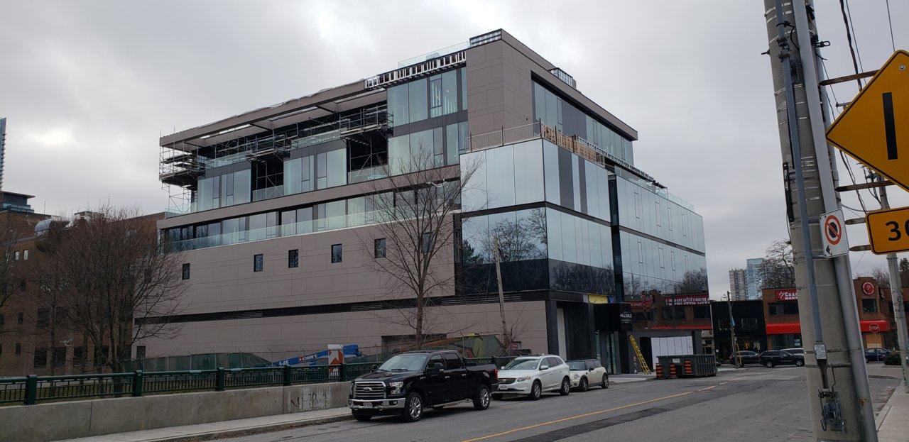
East side this afternoon, by me

20181222_131359.jpg
 
"looking" like an office building isn't entirely offside! This is true mixed use - retail and restaurant at grade, offices above, and then 14 residences.

The residential portion only takes up the top 3 floors;
 
The Shoppers ads along the Yonge sidewalk, plus the low overhangs look awful. The Yonge frontage should emphasize where Shoppers' floor is, because it doesn't it looks like there's some higgledy piggledy mess of a space behind there. The high degree of reflectivity on the windows does help in making sense of what's inside either, but I assume it can be better head at night-time with the lights on inside. The upper levels of the building work better, and the materials overall are very nice (other than it's practically mirror glass — yuck), so too bad the building as a whole is not more successful.

42
Those aren't Shoppers ads, they are temporary construction window films for a future lower level tenant.
 
Okay, thanks for that clarification. It's just the higgledy piggledy look that I have to complain about the for the Yonge frontage, which at this point is not giving me much cause for optimism.

42
 

Back
Top