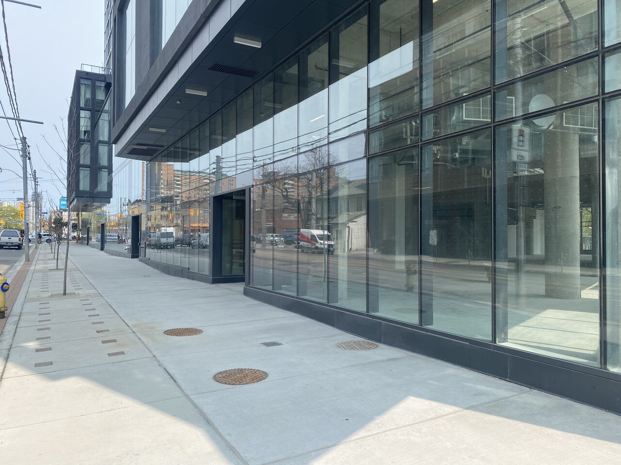
Street level coming together. A whole lot of glazing and grey.

67B9694B-5DD0-461E-BB16-C05013F40DB1.jpeg
9D8119EE-7318-4978-8BFA-48AADAE266AB.jpeg
7CFFDEE3-7C3A-46F2-B04C-964EB9BC157A.jpeg
93939BF1-389E-4A49-BACF-73AF884345B2.jpeg
35B3BE69-1660-42F4-97F0-384686611823.jpeg
 
Street level coming together. A whole lot of glazing and grey.

View attachment 475837View attachment 475838

Top Pic: A very clear example of too much glazing and space that looks inherently undemised whether it is or is not; bad retail design, most unfortunate. If there's an upside, it's actually not all that expensive to fix.

Bottom Pic: Nice to see those street trees doing well, in good quality planting conditions. Integrating some seating would have been nice.
 
Sheesh,
Street level coming together. A whole lot of glazing and grey.

9d8119ee-7318-4978-8bfa-48aadae266ab-jpeg.475837

Sheesh, could this block of sidewalk be any more grim, depressing, and lifeless? 100+ feet of glass and 100+ feet of concrete? It's not a place you'd want to spend a second walking on.
 
Sheesh,


Sheesh, could this block of sidewalk be any more grim, depressing, and lifeless? 100+ feet of glass and 100+ feet of concrete? It's not a place you'd want to spend a second walking on.
Hey, it could be worse - it could be a gas station. Oh wait...
 
Top Pic: A very clear example of too much glazing and space that looks inherently undemised whether it is or is not; bad retail design, most unfortunate. If there's an upside, its actually not all that expensive to fix.

Bottom Pic: Nice to see those street trees doing well, in good quality planting conditions. Integrating some seating would have been nice.
Are inherently un-demised retail spaces bad retail design? Are walls of glass at grade bad retail design? They're bad architectural and urban design, especially the glass, but I'm not sure about the retail angle. I'm assuming the goals are maximum flexibility and visibility / transparency. And I'm assuming those goals are met. Otherwise, we wouldn't be seeing these in new developments all over the place.
 
Are inherently un-demised retail spaces bad retail design?

Yes ( in terms of exterior appearance ), actual walls on the inside that are not load-bearing are not required in advance of leasing; however, larger units tend to preclude a variety of retailers from being potential tenants as it brings the total rent out of their price range and also has them taking on space they simply don't need.

Are walls of glass at grade bad retail design?

Yes; because they result in lower customer footfall, lower rates of 'discovery' and less 'branding' of retail identity, and rarely create any interior visibility (see window wrap) Retail works best with deep, but narrow units which result in lots of space for storage, back offices, washrooms as well as areas to display things which then frees up the street-facing windows for inviting displays.

I'm assuming the goals are maximum flexibility and visibility / transparency. And I'm assuming those goals are met.

Flexibility, as noted, occurs when one chooses not to build non-structural walls pre-leasing, that's fine. But it shouldn't appear to be that way from the outside. There is no material change to functionality from giving the street wall 'apparently' demised units.

On the second point, see window wrap above. Units heavy on glazing end up seeing fridges, freezers and shelves up against said glazing, which then requires drywall and/or window-wrap up against said glazing.

Otherwise, we wouldn't be seeing these in new developments all over the place.

Have to disagree. We see this because it makes the architect's life easier, because it's cheaper for the client, and because neither understand what works from a retail perspective, and/or don't care.
 
What does POPs stand for? I just purchased my first condo in the building. Closing is later this month. Exciting times!
 

Back
Top