Maybe if the darker finish had a variegated finish, similar to weathered copper, it would be more interesting and sophisticated.
 
I quite like the one on the left, the lighter colour will make the building facade stand out from the all the greys and silvers found in nearby CBD offices or condos .... and I feel this is not as strong of a bright blue as many are concerned about (vis-a-vis Accolade @ Eglinton + DVP ... which I thought was pretty cool)
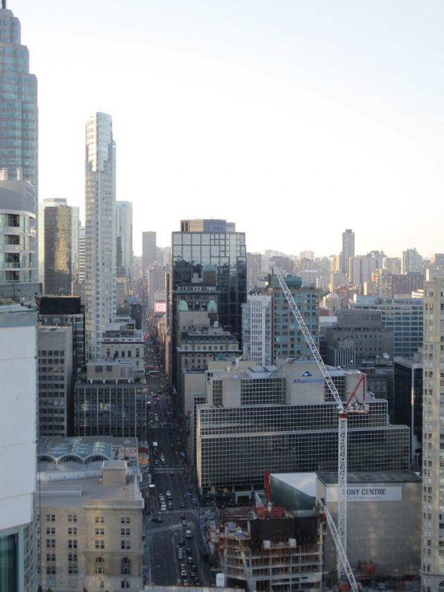
 
Just looking at the shot posted by cruzin4u a while back, a silver-esque like cladding would fit in MUCH BETTER in a shot like this, than the wacky blue.... holy cow, the more i think of it, the blue cladding would be multiplied by a billion here! :eek:


By cruzin4u here:
urbantoronto-1910-5471.jpg


http://www.urbantoronto.ca/news/2011...e-yonge-street
 
we already have a silver building just a few blocks away with Commerce Court W. Lets have something really different here! We need the occasional building to stand out rather than blend in... something like this does:

BLUE-TSHUMI.jpg
 
I agree, this building needs to stand out, not fit in. I prefer the cladding on the right. It looks much sleeker and less cheap condo like than the cladding on the left.

Now, if they could use the colours in the way the building posted above this post uses it, I'd say it would be PERFECT!
 
Last edited:
why would you present them that way? that is not with "full glass", that is with full spandrel panels. how the heck are the people going to be able to see out? the original cut and paste job was accurate... though of course on the actual building they wont be simply repeated like that but with be arranged somewhat randomly to achieve a patternation like we see in the render.

You're right, my mistake. I thought the black was black glass and the other slots simply had nothing in them. Assumed this based on the renders which have only white spandrel and not white + black. That and not use to glass with zero tint in Toronto.
 
I will +1 the Accolade sentiment. I will give it accolades as I like it.

+1 more which gives us +5 on this page alone for Accolade. Its been slandered enough on UT, so its nice to see it getting some respect. There are those who'll never accept any spandrel's on a building, let alone that much... But the dashing color makes up for it considering the bleak gray-scape that is typically created by apartment complex's across this city. Having said that, of course I wouldn't want that kind of treatment on a landmark tower in the city's core.
 
I don't know most buildings by name. But I looked up Accolade and I think it looks great.

For the L tower, my first choice would've been red :p. Neither of the two "test panels" (if they are indeed their choices) look good to me.
 

Back
Top