ProjectEnd
Superstar
Bill wouldn't do window wall at grade. But your point is taken - would be nice to break this up a bit more.Another lovely design with lots of character neutered by an unrelenting expanse of window wall at grade.
Bill wouldn't do window wall at grade. But your point is taken - would be nice to break this up a bit more.Another lovely design with lots of character neutered by an unrelenting expanse of window wall at grade.
Bill wouldn't do window wall at grade. But your point is taken - would be nice to break this up a bit more.

My take is that work-live units are more in demand due to the current situation. With so many retail units opening up on main streets as small businesses struggle, at the same time so many more people are working from home who may want to host clients. They are better served by ground floor units with direct sidewalk entrances rather than condo suites accessed down long hallways. There are a number of buildings in the GTA now with live-work units that do present a nicely varied face to the street with welcoming signage. The sidewalks in front of these buildings might not be as lively as they would be were there a Rabba on the main floor (or similar), but if those less demand for those shops, well, the live-work units do fill a need!They replaced the retail units with Live-Work units?
What a great disappointment. The great hope I had for this site was connecting the commercial retail of Bayview Avenue with the intersection at Eglinton and Bayview.
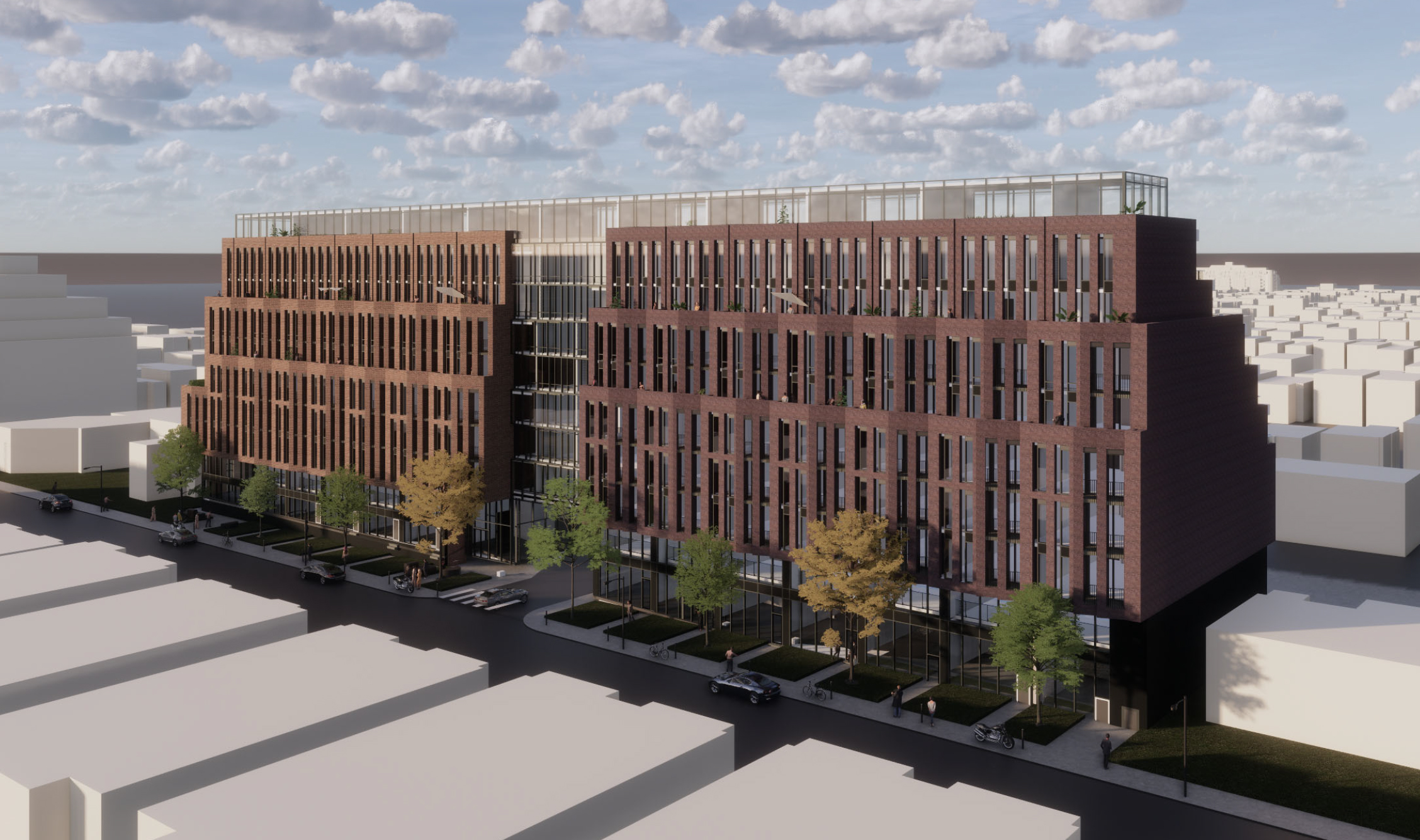
Site Plan Application to permit the proposal for 5 additional lots to the north and south of the subject site have been acquired by the Owner. The expanded subject site now includes the properties municipally known as 1710, 1712, 1714, 1716 and 1736 Bayview Avenue. The revised proposal continues to propose a 9-storey (31.5 metres including the mechanical penthouse) mid-rise development fronting onto Bayview Avenue. The overall site area has increased from 2,504.2 square metres to 3,974.2 square metres and the frontage on Bayview Avenue has increased from 65.7 metres to 103.4 metres. As a result, the gross floor area (¿GFA¿) has increased from 10,879 square metres to approximately 16,931 square metres, and the number of residential units has increased from 123 to 216. The previously proposed ground floor retail space has been replaced by 12 live-work units fronting Bayview Avenue.
Previous proposal: Zoning By-law Amendment application for an 9-storey, 31.3 metre high mixed-use building totalling 10,879 square metres of gross floor area. The proposal consists of 123 dwelling units, retail at grade, and 77 parking spaces in a two-level underground parking garage. The proposed floor space index is 4.34 times the lot area. See Rental Housing Demolition application 20 153939 NNY 15 RH.
BDP Quadrangle: 9 storeys
The current proposal at 103 metres, expanded from the original proposal of approx. 64 metres, while making sense to build intensification near the LRT, is considered monolithic. There's minimal clear separation in building massing in the middle at the driveway to the underground parking, so from the streetscape, you have a massive wall presence. Aside from what the Quadrangle architect says about the design fitting into the neighbourhood in the last community meeting, Quadrangle can do much better for the neighbourhood and future owners. Just look at what Quadrangle put together for Etobicoke: https://www.bdpquadrangle.com/portfolio/reinaDoubt Disney would let a barely-known local developer whose webpages for some of their projects are broken and redirect to Chinese sites, use their name.
On a side note:
They really seem to like having their projects look like they ran out of paint and just gave up. Here's a render for another one of their projects at 3200 Dundas that I found on their website. Should be a safe estimate of what they're planning for here, and I can't say I like it.


"You don't see a lot of brick in the city used in this way. The façade has movement and a unique texture that makes the building feel luxurious. It's akin to a woven blanket that welcomes you in," says Heather Rolleston, Principal and Design Director at BDP Quadrangle.
Behind the walls of this glazed "reveal" section, residents would be treated to a concept space known as The Nest, a series of shared open spaces linking the two halves of the building with community hub amenities.